|
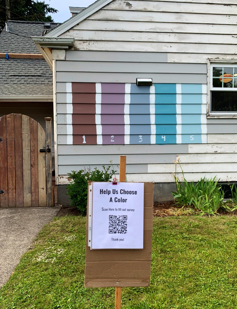
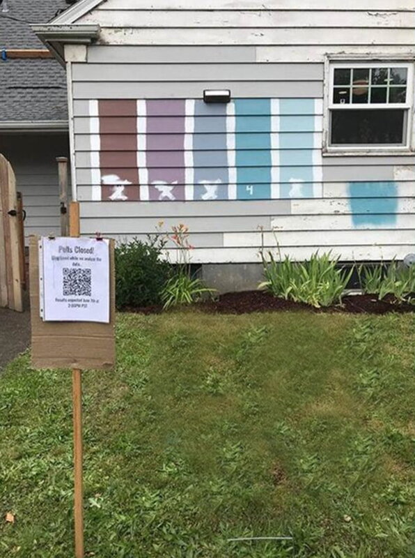
I recently read that the COVID-19 shutdown has spurred a significant boost in home improvement projects. I guess that there’s always a silver lining if you look hard enough. Thankfully the home improvement giants like Home Depot and Lowe’s, and other smaller hardware stores, have been open to support the demand. Nothing better than fixing up your home when you’re seeing lots more of your “four walls” than you ever imagined. I’ve also noticed an amazing uptick in my website’s traffic directly related to my blog posts that discuss choosing paint colors and give general color advice. Thanks for checking out my prior blog posts in this area – it’s much appreciated. Paint colors are a fundamental decorating issue, and one of the biggest decisions most of my clients make when they purchase a home is choosing their exterior paint color. It's a huge decision - and one that you want to get right. Along those lines, here’s a story I came across on how a family from Portland, Oregon decided on a paint color for their exterior – they let their neighbors, and then the whole internet, decide. Wow, that is way more than “second opinion!” I’ve included a link to the original article below, but here’s a summary just in case the link disappears at some future point in time: Oregon Family's Public Vote for New House Color Goes Viral (by reporter Janiane Puhak of Fox News; 26 May 2020): “There’s no place like home, so it all should be just right. One Oregon family is dazed that a public vote for the new paint color of their house went viral on social media, with more than 2,000 entries from over 20 countries pouring in overnight. The Landreth family of Portland recently combined a home improvement project with a learning moment for middle schooler Grace, who was tasked with completing a school project about documenting data, KOIN reports. To bring the lesson to life, the family painted five colors on the side of their house and created a QR code for passersby to scan with their smartphones, leading to a Google Doc to vote for a favorite choice for the fresh paint. The poll exploded in popularity when neighbor Michal Naka tweeted out a photo of the project on Monday, which has since gone viral with nearly 13,000 likes and 6,300 shares. “We went to bed last night and had about 60 people walking by, and we’re like, ’60, that’s crazy!'” Brian Landreth, Grace’s father, told KOIN on May 25. “Currently, there’s more than 2,000 entries.” Now, through the magic of the Internet, the dad and daughter say they’ve received responses from over 20 countries around the world. Participants can rank five shades: a muted “Rocky Mountain” brown, “Wild Orchid” purple,” an “In Good Taste” slate blue,” the turquoise “Blessed Blue,” and “It’s Well” sky blue. “Please help us decide by ranking the following colors for our house,” the survey says of the numeric grading scale. “1 being amazing and 5 being ‘I seriously can't look at that color every day.’” Twitter commenters seem partial to the turquoise blue hue.” https://www.foxnews.com/real-estate/washington-family-public-vote-new-house-color-viral My Take on the Color Options Hmmmm….how to say this diplomatically….I’m afraid I wouldn’t choose any of the colors presented. My initial take was that the colors are all way too vivid, too “saturated” to be pleasing on the exterior of a home. Even the brown is too vivid. But I wouldn’t necessarily suggest a dark brown exterior in the suburban setting that I can discern from the photo. I must admit I’m influenced by the fact that I grew up in dark brown home in the suburbs, and I never really liked the color. When my parents changed to a pleasing white siding (when I was a teenager), it was a happy day! For the Langreth family, if I had to choose 1 of the 5 colors that they considered, I would choose #3, the gray-blue color, but I wouldn’t have chosen that particular shade. It’s ironic that the color (from Miller Paints) is called “In Good Taste Slate Blue.” So what’s wrong with the colors options that the Langreth family presented? In my opinion, this is a perfect example of when you look at a small color chip, and admire a color like #4 - the turquoise “Blessed Blue,” and then you mentally extrapolate that it would be just as pleasing on the 2,000 square feet of siding on your home. Unfortunately when it covers that much surface area the color might end up being a tad too much in the end. Now, turquoise and teal are my favorite colors, so I’m a fan of this hue. But…you can see from the small patch of the exterior, that it’s too bright. Such a color needs to be very grayed down. Actually, I rarely recommend green, teal, or turquoise for the exterior of a home, but it depends on the landscape. Wooded, green grass, beach, desert, modern, urban? Too many variables for a “one size fits all” analysis of green here. Suffice to say, I would strike #4 and #5 from my list. I remember when my husband and I were living in Colorado Springs (our first home years ago), our backyard neighbors painted their home a vivid blue. They weren’t home the day the new color went up, and of course we didn’t say anything to them. Then, about a week later, we noticed the painter came back and repainted the entire house with a more “grayed down” version. Sigh of relief…thank you, good neighbors. What Color Did the Langreth Family Pick? What color did the Langreth family finally choose? A week later an article from KPTV reported that “more than 150K votes from around the world” chose #4 - Blessed Blue. Yes, the bright turquoise. Oh my! The family seems happy, and after all, they turned it into a democratic vote, very gracious. You can get the updated story from Miller Paint's Facebook page:
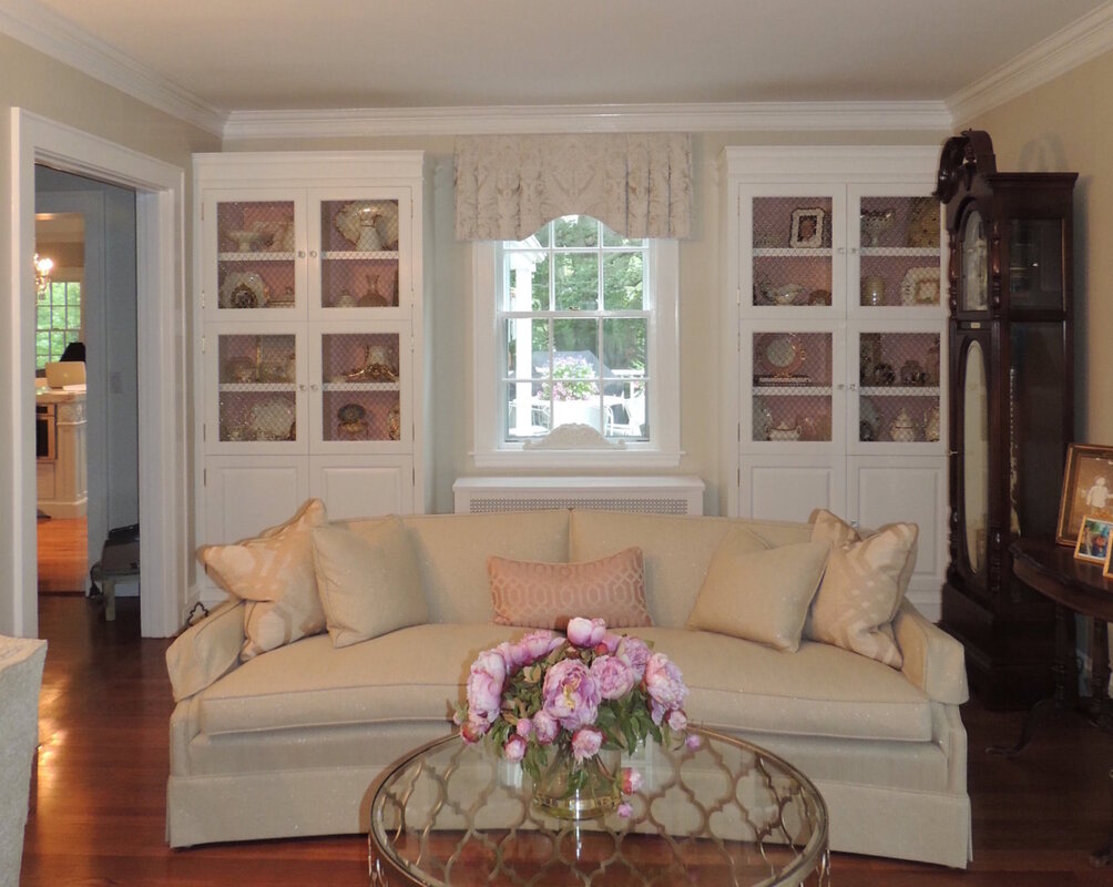
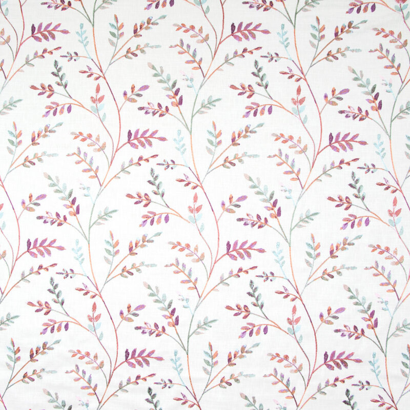
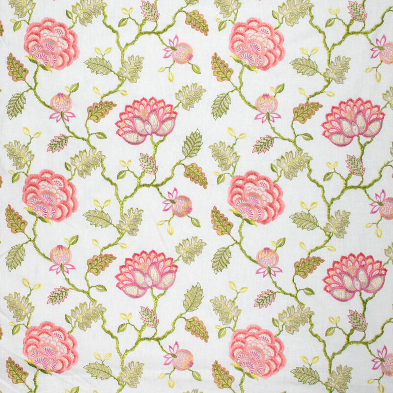
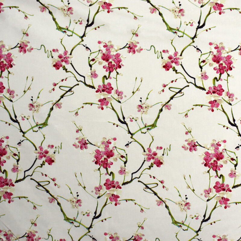
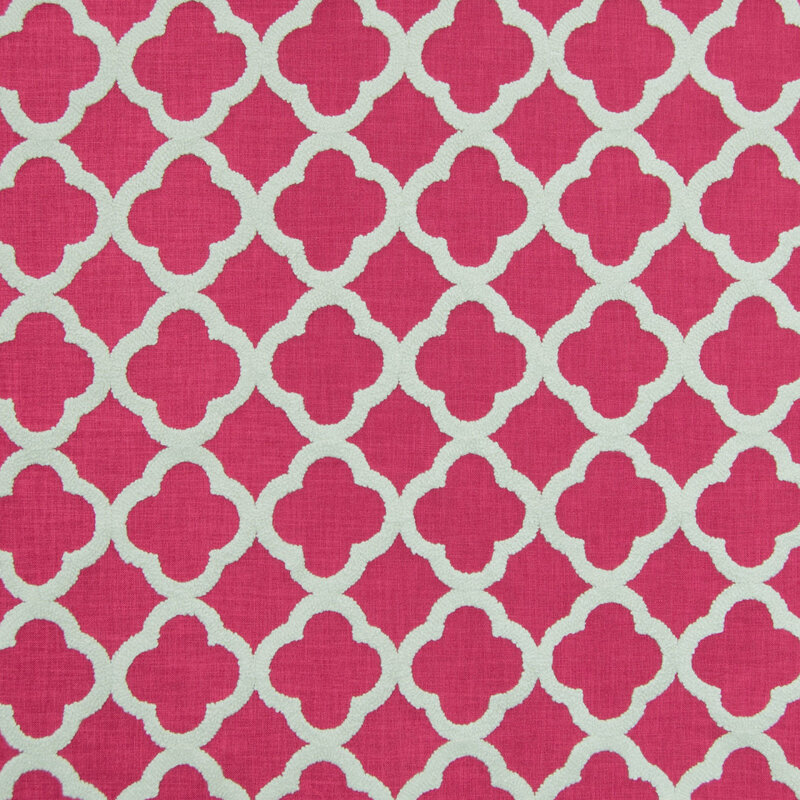
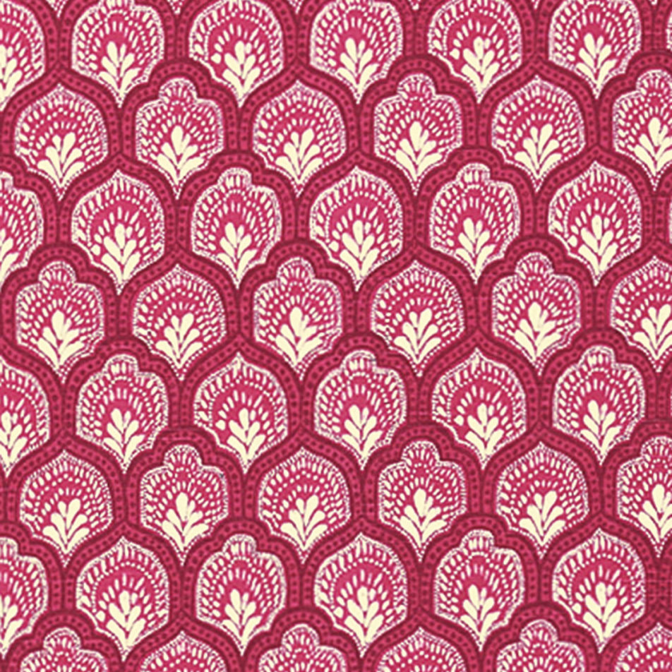
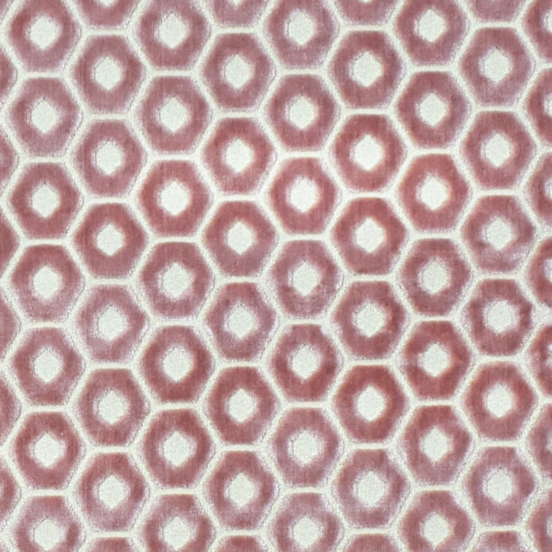
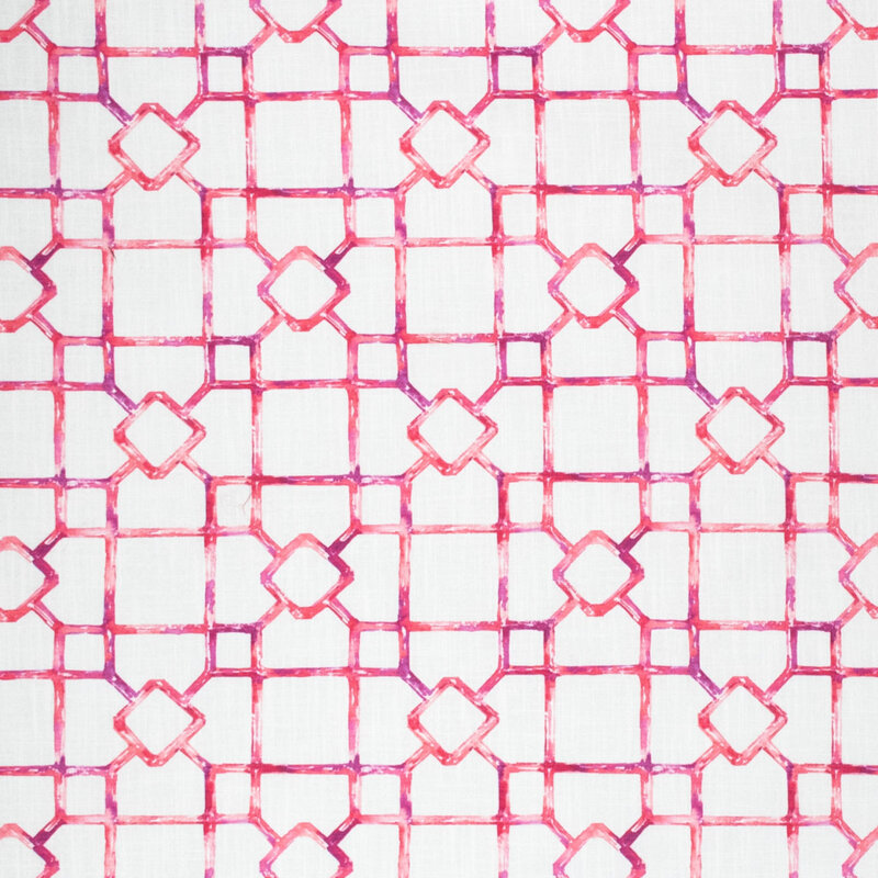
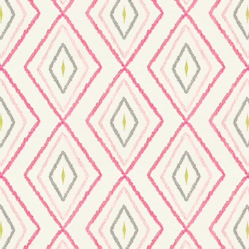
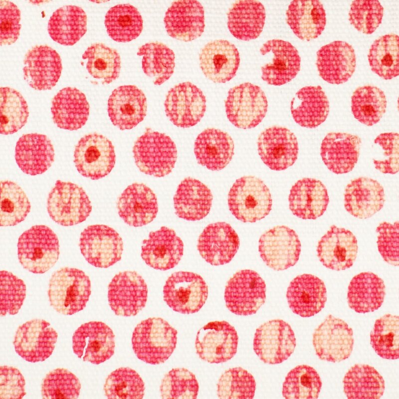
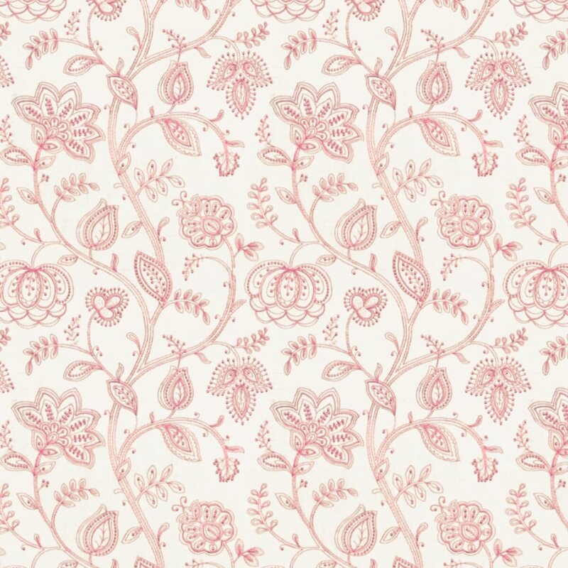
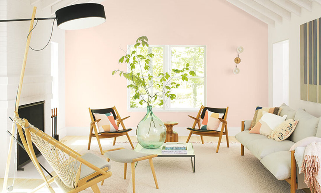
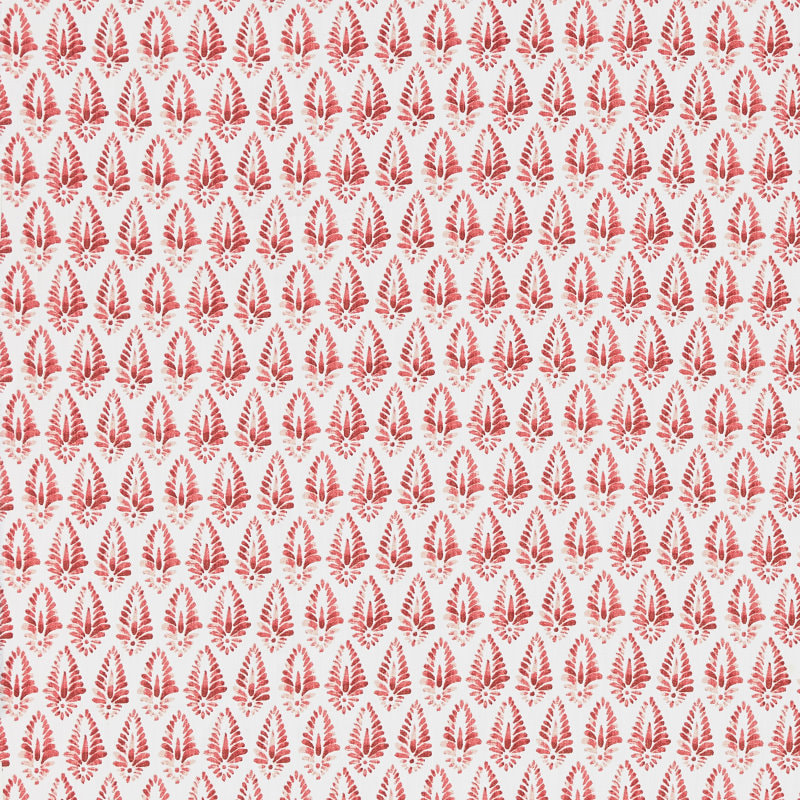
https://www.facebook.com/pg/MillerPaint/posts In my last post, I discussed decorating with the color Red, and I briefly touched upon the topic that decorating with Red is remarkably different from decorating with Pink. That’s curious, don’t you think? After all, decorating with all values of a color (from light to dark) works fairly well with blue, green, and neutrals of beige and gray. But definitely not with red and its lighter companion pink. What makes pink so special? Well, I’m not sure, but perhaps because pink is inherently perceived as soft, and red is inherently perceived as loud, they are just different. So, here are some general design guidelines for decorating with pink. I like pink. I have done numerous pink bedrooms (for little and not-so-little) girls, and it’s always a happy endeavor. And the joy of the young clients in choosing their paint color (with only a few options presented, naturally) and their fabrics is also just delightful. I’ve also done other rooms (family and adult spaces) with pink as the accent color, and they have been refreshing and happy, like in this Lexington, MA living room below: When decorating with pink, I have always found it best to find an inspiration fabric to start the fun. Sometimes it is the motif (floral is pretty predominant, but geometrics are strong lately, and there are lots in pink to choose from), sometimes the intensity of the pink is the draw, and sometimes a fabric just starts the spark. Here are some great current pink fabrics that are available from my vendor, Greenhouse Fabrics. Additionally, here are some excellent pinks from another one of my vendors, Stout Fabrics. One thing you’ll notice about these designer pink fabrics is that they are generally monochromatic: pink and white or pink and ivory. If there is an accent or second color, it is usually green. From a color specialist perspective, I find that so curious because in the interior design field, we generally don’t embrace too many “complimentary color” parings like red and green. But pink and green are certainly compatible as the fabric swatches shown above attest. Pale pink goes well with green, and bright pink (hot pink or fuchsia) goes very well with blue, as they are very close on the color wheel. Rules of Thumb When Decorating with Pink:
Well, that’s a wrap on the color pink. Let me help you navigate the intricacies of pink! As subtle as the color is, it demands a careful eye to make it sing with the rest of the décor.
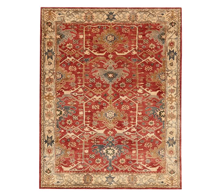
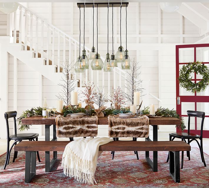
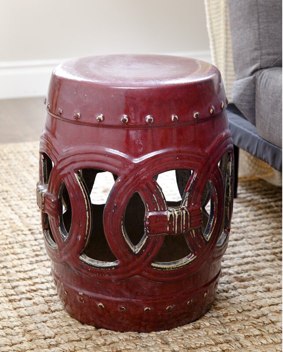
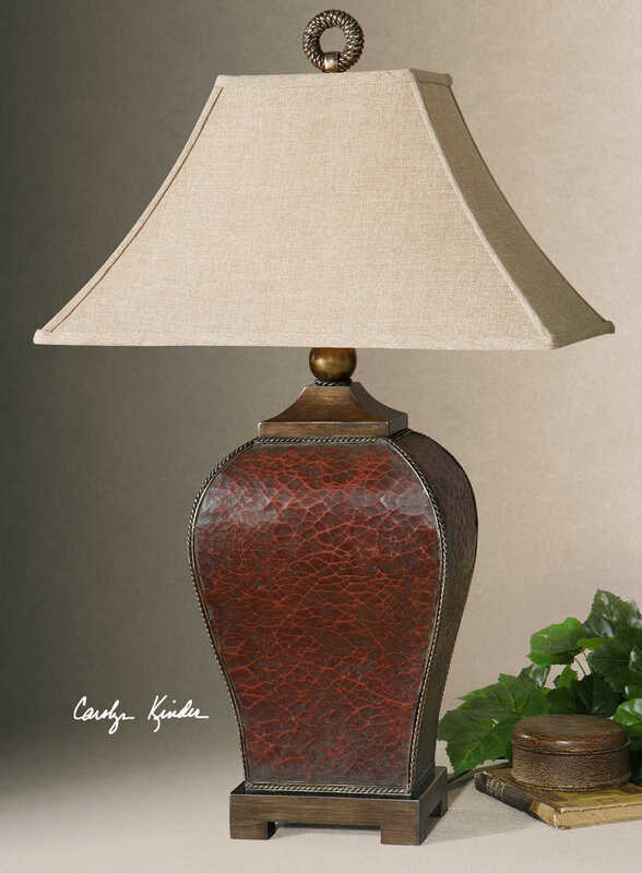
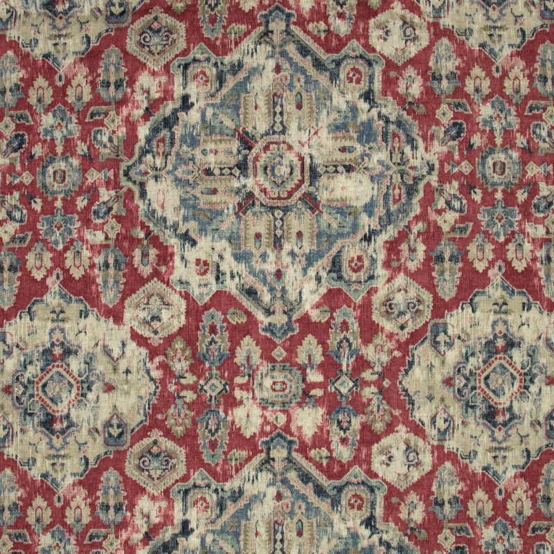
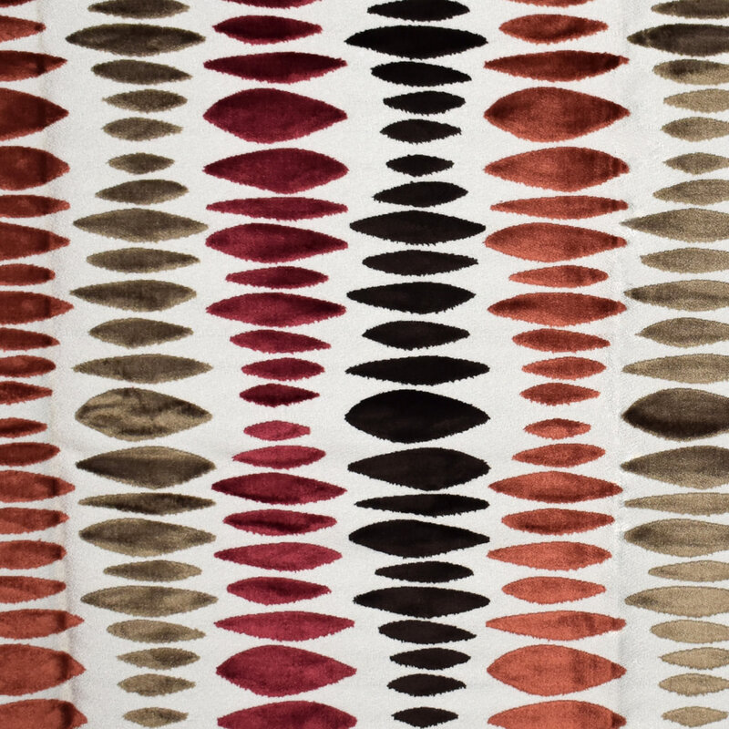
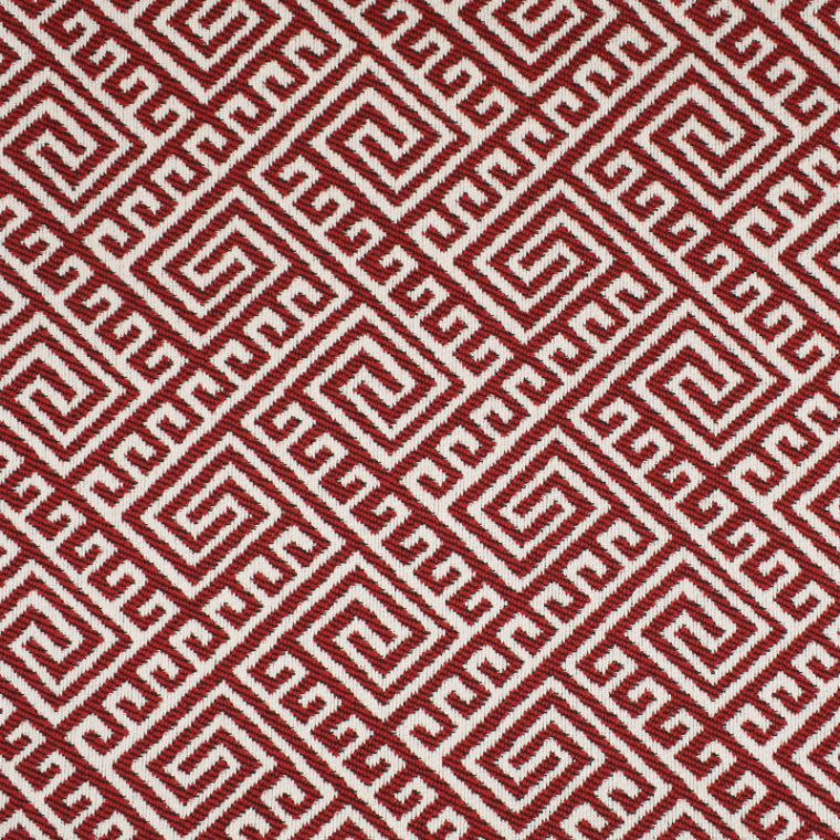
Since yesterday was Valentine’s Day, it got me thinking about decorating in reds and pinks. A lovely and delicious subject for this week’s blog post! So here’s some advice about the color red. I’ll save pink for another blog, because my recommendations for how to treat pink are very different from how to treat red. Get your Valentine’s Day chocolates from your honey and sit down, read, and enjoy…. Red is bold, warm, and has a decided “point of view.” In decorating, most people think reds are tricky; probably because reds pretty much compel you to have and take a point-of-view. Not surprisingly, during the recent 8 years of the gray trend, red was not a super popular color in home decor. Some ditched the color altogether in their décor because they needed a decided change from the more Tuscan palette of golds, reds, and greens. However, in 2018, Benjamin Moore declared Caliente Red (AF-290) as their Color of the Year, so there must have been some recent design impetus for their selection. See my blog post from 2018 on Caliente Red here. Honestly, when Caliente Red came out as the COTY, I was surprised. Now, two years later, I can truly say that I have not had one client even toy with the idea of painting an entire wall (or room) red in the past two years. And there’s a reason for their reticence -- commitment. Well, that‘s a perfect Valentines’ Day connection, right? Personally, I like the color red. I like to decorate with it as an accent because it’s fun and bold. This leads me to an important point on the situations where I often find myself decorating with reds with my clients. Nine times out of 10, when a client expresses the interest in decorating with red, it’s because they already have an Oriental carpet that they love that has red in it. Often, it was their Mother’s or Grandmother’s, and I have to say, I have seen some incredible antique wool Oriental rugs in perfect shape that can definitely be used as the inspiration for a room’s décor. Often the Persian rug has both red and blue, as described in my 2018 Caliente Red post. When Working with Red: DO identify if it’s a blue red (cool), a true red, or a brick red (warm) in your Oriental or Persian carpet, and take the color direction off of that. If it’s a cool red, you can pair with grays. If it’s a warm red, pair with beige or golden tones. For example, here’s a Pottery Barn Oriental rug that’s pretty versatile, with a very attractive somewhat “tribal” design in my opinion. I would say it’s a fairly true red, but the use of the warm beige tones in the border would steer me toward a warm color palette. So, just looking at the rug as the inspiration jumping-off point for a renovated interior, I would go for a warm color palette. Here’s how PB used the rug in a fairly updated interior: Note that the red door makes the color scheme make sense — hey, that color on the door could very well be Caliente Red. Please remember that any color (used as an accent) needs to be incorporated in at least 3 places in a room to have the décor work well. My guess is that the wall color is akin to Benjamin Moore’s Cloud White, a nice creamy white with a warm undertone. DO use red accessories to bring the color scheme to life – accessories like Chinese ceramic stools, trays, ceramic lamps, pillows with red accents. Remember, a little red goes a long way. Actually, pillows that pick up the “right red” are extremely useful in interior décor. Here’s a Chinese stool from Wayfair that I’ve used with a client to judiciously bring in some red. Also, here’s a lamp from Uttermost, and I’m pleased to remind everyone I am an Uttermost dealer. https://www.uttermost.com/ DO pay attention to fabrics, that you find and love, that incorporate red AND another color. Such fabrics will be really important to bring a room to life, whether in pillows, upholstery, table runners, draperies, or other soft furnishings. Here are some red fabrics (paired with other colors) from my vendor Greenhouse Fabrics: When looking, you’ll probably find many red and white fabrics that would easily fit into a décor as pillows. The fabrics shown below are also from Greenhouse Fabrics. I particularly like the fretwork patterns in red and white - beautiful for an upholstered chair, too. DO pay attention to the undertone of the flooring in a room with red. If it’s mahogany wood, then you can use a red fabric successfully. If it’s a yellow undertone (like golden oak), you should be looking to use a warm red (russet, clay, or the like). If it’s a neutral walnut color, you are fine with any red. Tile presents a whole other challenge. Just remember that yellow and red undertones are tricky together - but that’s probably best demonstrated by me in your own home. With a color consultation, I can show you what undertones to use in your wall colors and flooring colors to achieve a beautiful harmonious and interesting interior.
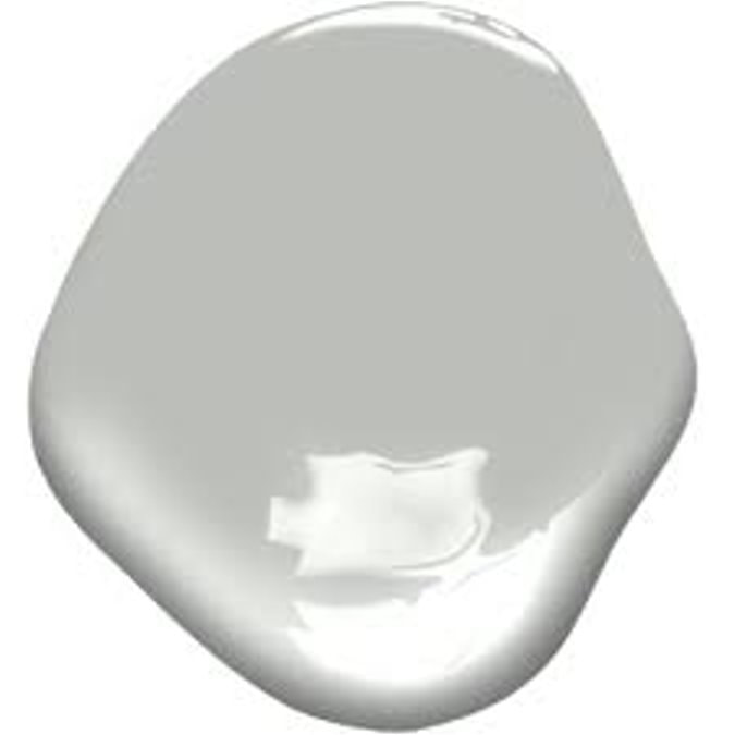
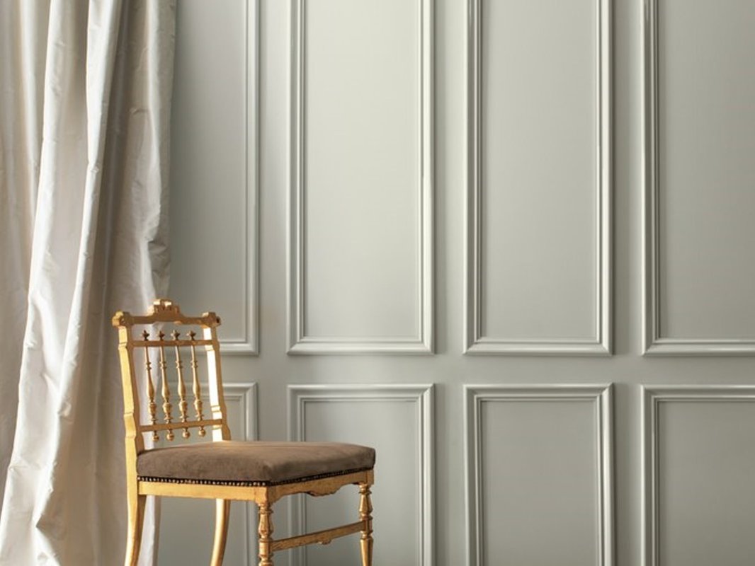
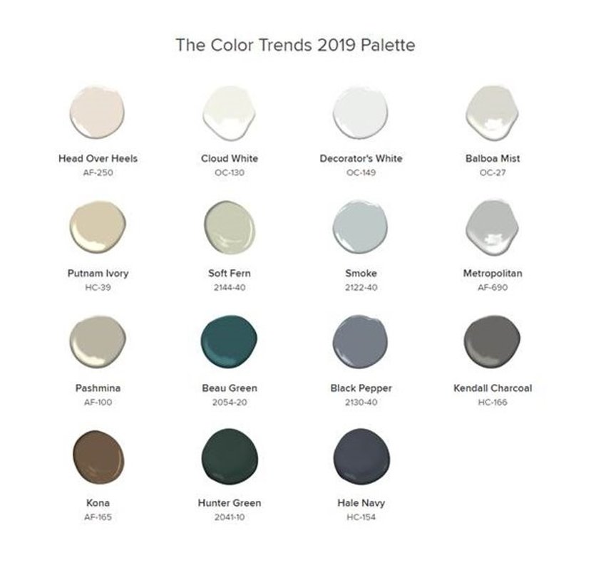
In closing, if you like red, embrace it! Hey, that sounds like a Valentine’s Day message too…… This week Benjamin Moore revealed their new 2019 Color of the Year….drum roll, please…AF-690 Metropolitan from their Affinity Collection…which is a………medium gray. Oh, meh. Even Benjamin Moore calls it “effortless” in their official release: “Comforting, composed and effortlessly sophisticated, Metropolitan AF-690 exudes beauty and balance,” said Ellen O’Neill, Benjamin Moore Director of Strategic Design Intelligence. “It’s a color in the neutral spectrum that references a contemplative state of mind and design. Not arresting nor aggressive, this understated yet glamorous gray creates a soothing, impactful common ground.” Here’s a look at AF-690 in a room setting in an image provided by Benjamin Moore. Please note that the walls look a bit lighter in this photo than I expected, but it is a beautiful photo of a room with umph and architecture………like the use of a neutral gray paint demands. Now that the 2019 Color of the Year (COTY) has been revealed, everyone is discussing it in their design blogs this week (do a Google search on it), and you will see some beautiful room photos. I don’t have any myself, as I have never specified this color before, and it does seem a bit curious to me that Benjamin Moore selected a fairly obscure gray that no one has been using or talking about as its flagship color for the year. But it is similar to Coventry Gray HC-169, which is a popular color, so don’t think that Metropolitan is too far out there. In the press release, Benjamin Moore calls Metropolitan “effortless” and “not arresting or aggressive.” What do we think about those adjectives? In designing for my clients, the last thing I want my clients to conclude about our color selection is “effortless” or “not impactful.” But, having had two days to process the revelation of AF-690, and put it in context with the other color happenings and trends in the world of interior design, I guess it’s not that surprising a selection for this year. Especially since the 2018 Benjamin Moore COTY selection of Caliente, (a bold red) was interesting, but in reality, it probably prompted very few to head back into red territory for their décor. On the other hand, aren’t we already full-throttle about 5 years into the “Gray Era?” Color trends usually last about 8 years. My own take on Metropolitan is that it’s a neutral color with a cool undertone (bluish in north-facing rooms, a tad greenish in other exposures), a nice backdrop for either stunning architecture or to use with fresher and clearer happy hues like watermelon, lemon, periwinkle, or aqua. The Light Reflectance Value (LRV), which is a percentage that describes the quantity of light reflected from a surface compared to black (0%) and white (100%), for AF-690 Metropolitan is 50.5%. That is why I call it a medium gray, instead of a light gray. You might look at photographs on the internet of rooms in Metropolitan and be convinced it’s a light gray. But the LRV parameter will ALWAYS give you an objective measurement of how dark it is, and the LRV on every color is published right there in the fan deck in the index at the back or on the back of a swatch…check it out. Benjamin Moore describes its Color Trends 2019 as “a corresponding palette of 15 harmonious hues that further amplify the cultured grace of Metropolitan AF-690.” The Color Trends 2019 palette ranges “from ethereal neutrals to frothy pinks to rich blues and greens.” These are their words. It is interesting to me how the whole palette is fairly cool. As for AF-690 Metropolitan, I can see this medium gray, with its LRV of 50.5%, pairing really well in a coastal setting with a clear and crisp cool palette, like those in the fabrics and paints of the Maine Cottage line: http://www.mainecottage.com/ But this coastal connection is probably the opposite of what the Benjamin Moore folks had in mind about Metropolitan, as evidenced by their urban-inspired video for AF-690: So How Do You Use Light or Medium Gray in Your Décor
The main thing to understand about neutral grays like Metropolitan is that they are indeed “supporting players” which absolutely require something else in the room to be the STAR, like:
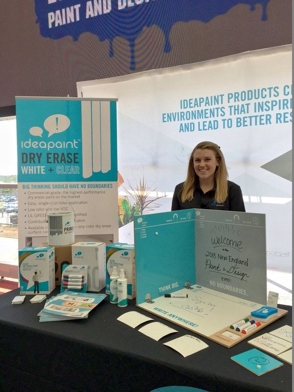
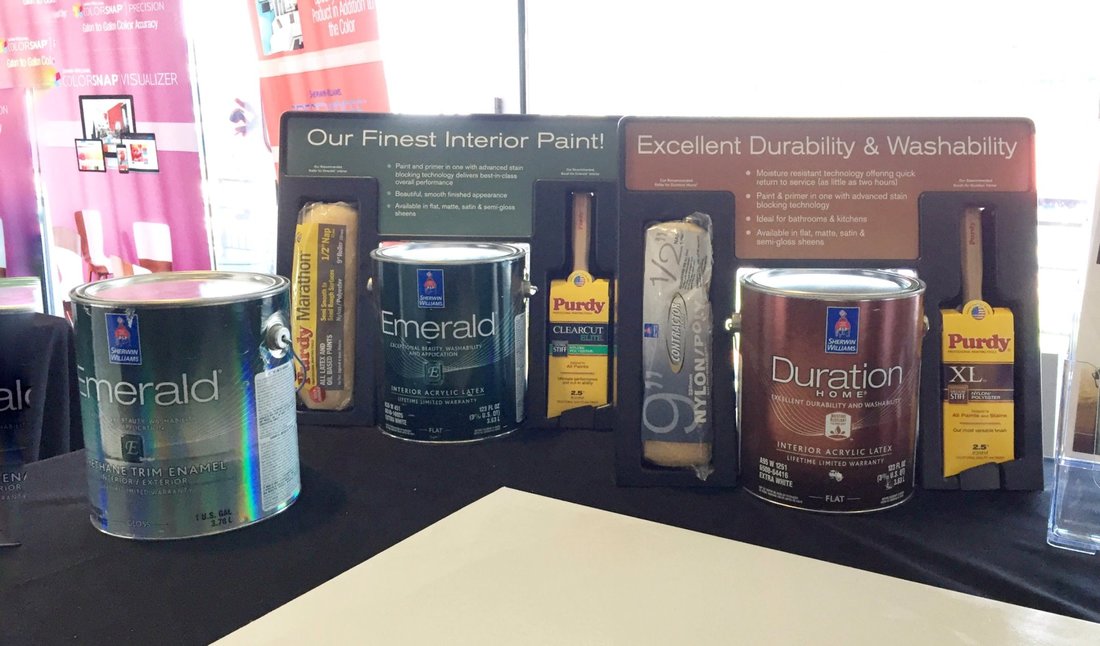
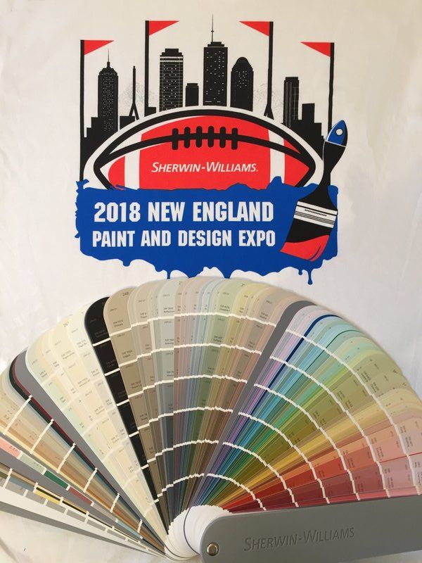
So, that’s a wrap on the Benjamin Moore Color of the Year for 2019: AF-690 Metropolitan. If you are totally confused at this point, you can always hire me to perform a color consultation to explain the LRV, value, hue, and other Color-speak words. Or, you can hire me to choose a gorgeous color palette and new paint color(s) for your home. You have to look at any paint color in the context of the room you are decorating with its own light and surroundings, and all the recommendations from the internet and paint companies will not guarantee a success - so we can work together to personalize the process for wonderful, unique YOU. You may have noticed that my April 2018 posts have been slim…but all for a very good reason you will certainly hear about in future blog posts! We just returned from a 16-day vacation to Japan, and in one word, it was amazing. I can’t wait to sort through the 1,000+ photographs and bring you design highlights in my upcoming blogs! But on to this week’s post which covers an event I attended yesterday at Gillette Stadium - the 2018 New England Paint Expo, sponsored by Sherwin-Williams; a show that introduced some cool new products that got my “Designer” brain working again. So what were the Paint Expo highlights? As you can see, it was a gorgeous day at Gillette Stadium where the show was held in the indoor concourse area next to the VIP seating. Wow, Sherwin-Williams put on a first-class show at a really cool venue! Here’s some information on the products that I found the most interesting: Ideapaint Magnetized Dry Erase Walls: Ever wonder how the tech companies acquire whole walls of dryerase board…and custom-color and magnetized to boot? In the photo below, Julia Romano of Ideapaint shows how her Boston-based company delivers that capability. This got me thinking that for my clients’ homes, a dry erase wall would be perfect for kitchens, mudrooms, playrooms, home offices, and over a planned “charging-station” area. Endless applications, and you can have it the same color as the rest of your walls, or perhaps a different color for a feature wall. I have seen lots of paint options in recent years for chalkboard walls, but chalkboard is so old school and messy…this Ideapaint concept is terrific. The magnetized dry erase wall starts with a layer of thick wallpaper with a magnetic medium that is applied over drywall - they call this the “pull.” Then a layer of paint (whatever color you want) and then a dry-erase sealer topcoat. Julia showed me how the rare earth magnets really stick to this wall, with enough holding power for school schedules, kids’ artwork, and all the other paper that transits through our homes and offices. There is also an option for a magnetized paint as the first layer, but the holding power isn’t as great as with the wallpaper layer. Their products won’t interfere with wi-fi reception either, which is an important factor in our wireless world. See more details at the Ideapaint website: http://www.ideapaint.com/ Sherwin-Williams 2018 Paints: Sherwin-Williams showcased all their paint formulations with new products for super quick-dry (Snapdry Door and Trim Paint), Loxon Self-Cleaning Acrylic Coating, Extreme Block Stain Blocking Primer/Sealer, Duration Home with Moisture Resistance Technology, and many others. Heather Bourgeois of Sherwin-Williams gave a superb talk on the Healthy Home Movement and recent advancements in paint products that work to actively work to reduce and neutralize harmful chemicals in our interior environments. We’re not just talking about minimizing the chemical footprint when applying the paint…we talking about paints that interact with formaldehydes, odors, mold, mildew and microbials to render them harmless. Wow, paint sure has come a long way in the past couple of years! I was grateful for the education on these new technologies and paint offerings to better advise my clients who are understandably concerned about improving their indoor air quality. I’m also intrigued by the Emerald Urethane Trim Enamel (shown at extreme left in the photo below) which represents a water-based hard-shell solution for trim. Sherwin-Williams also presented all their new 2018 colors and whole new fan-deck. I have all these new color tools in place and am excited by the new more vibrant color offerings. Can you tell the color palettes have changed from a few years ago? You can find more details on the Sherwin-Williams website at https://www.sherwin-williams.com Thanks Sherwin-Williams for inviting me to the show at Gillette Stadium!
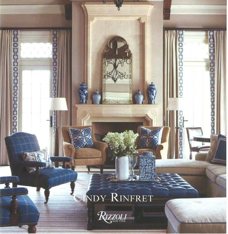
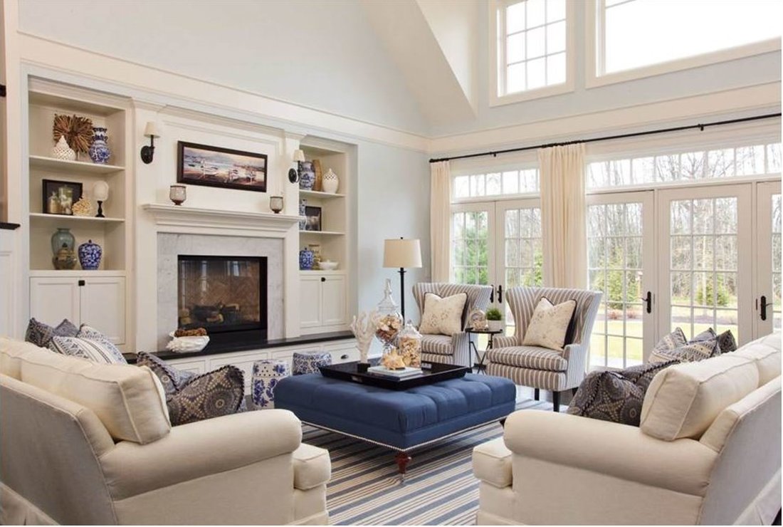
Call me to see all the new paint offerings and discuss the ins and outs of color AND paint technology that will brighten up your dream project. With the return of sunny longer days and color to our very brown and gray New England landscape, I’m ready for the refreshing feeling of Spring! Many of my clients are too since they are following suit in their interiors this Spring with plans for major remodels and redecorating refresh. So what am I recommending when a client asks for a palette that is on-trend but will stand the test of time? Navy and other blue hues. First, you must know I am a fan of blue, and I still adore the color that we painted our master bedroom 17 years ago (Benjamin Moore 2128-60 Beacon Gray). Crisp blue and white linens and darker blue draperies and upholstered chairs, can’t beat that. I am both soothed and energized by the color every day. Like in this photo from Cindy Rinfret, you can really see how Navy Blue brings interest to the room. As a designer, it’s my job to tell you the “why” something works in your décor, not just the “what.” So here are 5 reasons why the color Navy might be the perfect color in your family room, bedroom, mudroom, bathroom, or kids’ rooms.
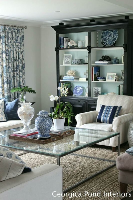
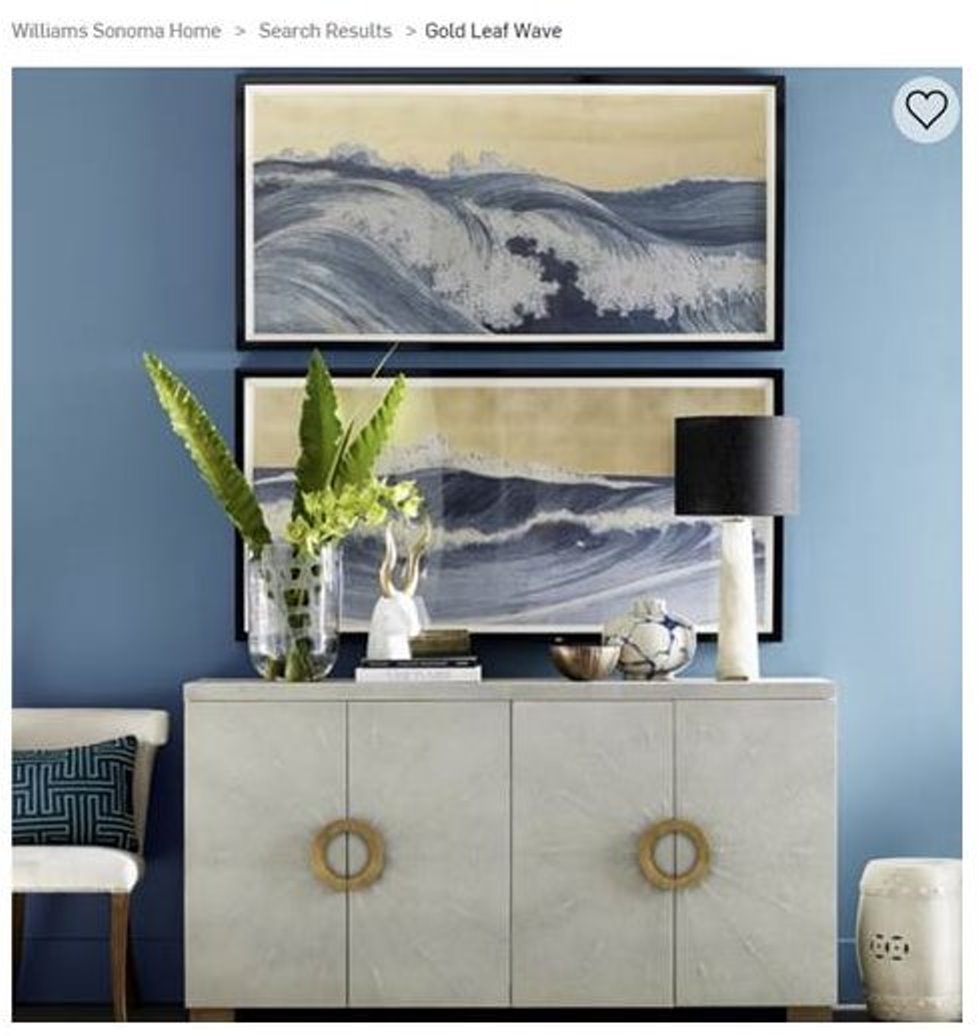
But Navy is also a major color in Asian-inspired decor, with beautiful blue and white porcelains (so popular now) and Japanese prints like the ones below from Georgica Pond Interiors and featured this Spring at Williams Sonoma Home. To give you a feel for the span of blues out there here are a few of my favorite Benjamin Moore Navy paint colors:
I know lots of designers like HC-154 Hale Navy, but I rarely select it for my clients because it is so very dark. But if you have a really sunny space, it might work for you. If you want to see all 371 of the blue paints that Benjamin Moore has go here: https://www.benjaminmoore.com/en-us/search?q=blue&category=color That’s all for our review today of Navy and ode to blue! When you’re out shopping in coming weeks, pick up some things you love in blue and white. And call me if you want to refresh a room with blue and need a paint consultation…we’ll choose just the right blue for you!
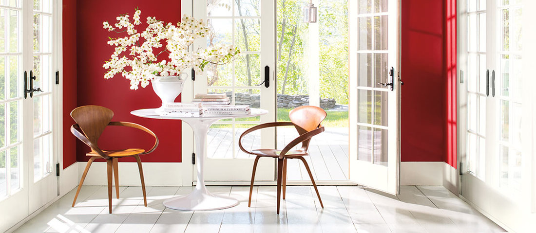
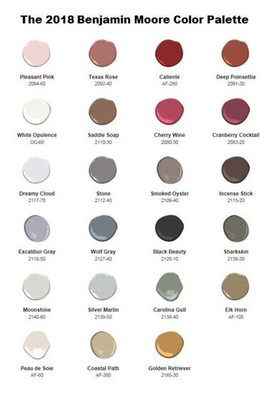
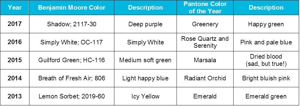
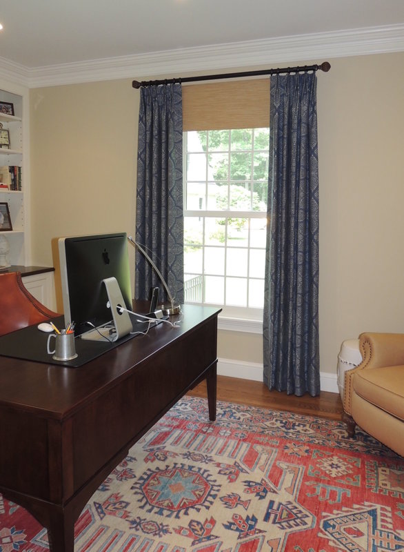
2018!! My goodness, can we possibly be ready to flip the calendar again? Let’s just say the color trend folks are always timely, so the announcement by Benjamin Moore of AF 290 "Caliente" as their 2018 Color of the Year comes right on-time. Well, at least right on time for High Point Market which started on 11 October, as discussed in last week’s blog post. Caliente!! What a beautiful red it is. Here’s Benjamin Moore’s announcement: "Caliente is the signature color of a modern architectural masterpiece; a lush carpet rolled out for a grand arrival; the assured backdrop for a book-lined library; a powerful first impression on a glossy front door. The eye can’t help but follow its bold strokes. Harness the vitality.” —Ellen O'Neill, Benjamin Moore & Co. You just have to watch Benjamin Moore’s video, it will get your whole body and soul in tune with RED: “Color of the Year 2018 | Benjamin Moore” If you want to see how it all fits together, here is Benjamin Moore’s entire Color Palette for 2018: For those of you that follow the color trends, you will note that Caliente is very different than previous years, where soft and muted colors were all the rage. For comparison, here are the “Color of the Year” selections by Benjamin Moore and Pantone from the past 5 years. So, how should you use "Caliente" and other vibrant reds in today’s interiors? Well, this is probably a good place to cover a topic that I’ve been meaning to discuss for a while. Since many of my clients have gorgeous red and blue Persian and Oriental carpets in their houses - 2018 could be the year to show off, celebrate and embrace the vibrant hues in these woven treasures. For example, here is a photo from a home office project I recently completed with a client where the carpet was the main inspiration for the colors in the room: If you are a lover of Persian/Oriental rugs, you are undoubtedly familiar with the variety of motifs, scale, and colors used in these rugs. Blues and reds are commonly seen together, and decorating rooms with these hued rugs demands careful and deliberate attention.
To help get it right I love to refer to a wonderful book by Arthur T. Gregorian entitled “Oriental Rugs and the Stories They Tell,” first published in 1967, and updated in 1978. If you recognize the name Gregorian from the Gregorian Oriental Rug Company in Lower Newton Falls, MA, it’s the same family. This book is a treasure, and excellent reference guide to explain the designs, weaving practices, and tell-tale motifs to discern between a Sarouk, Kazak, Herati, Heriz, Kerman, Keshan, Turkoman, and other types of rugs. According to the author, to really understand the styles and weaves, one has to have an accurate knowledge of the geography of the countries involved (Iran [formerly called Persia], Afghanistan, Turkey, Caucasus, Turmekistan, Armenia, and a handful of other locations whose names have shifted with the political winds in the past 50 years). Arthur Gregorian is right-on with his statement: “You who live with Oriental rugs never think of them as something foreign to you, for they are native to your Western culture, and make a strong, rich, colorful contribution to your home, your everyday living, and your happiness in life.” My clients with Oriental rugs really do consider them treasures, and often, they form our starting point on color schemes and room arrangement. For more information on designing with Oriental Rugs, you should check out a recent article from the Boston Design Guide, Jan 27, 2017 by Carly Stewart, who also references the expertise and beautiful rugs from Gregorian Rug. In her article Carly cites the following six main reasons for owning Oriental Rugs: 1. Lasting Appeal
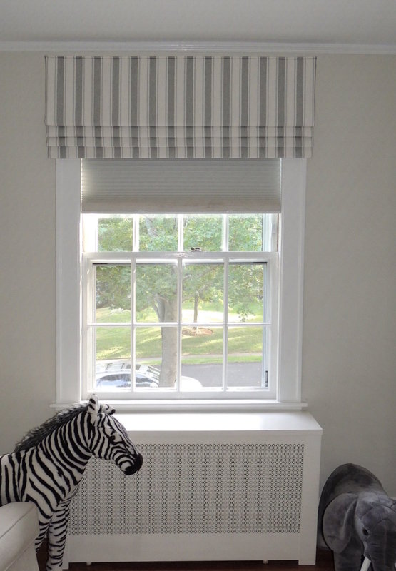
So, bravo to Benjamin Moore for going BOLD this year with Caliente, AF 290. I always enjoy designing with red, and hope the selection of Caliente will entice the world’s fabric houses to design more fabrics with red this year. With fall on our doorstep, and the kids already back-to-school here in Sudbury, our thoughts are shifting to preparing for the colder days ahead, and to getting our kids in a good frame of mind for some serious learning at school. And what’s essential to a good learning environment and happy days for everyone - a good night’s sleep! For good sleep, many people want their bedroom as close to blackout as they can get it, and room-darkening cellular shade with cordless control are one of my favorite solutions for the privacy layer in these bedrooms. Especially for kids! Comfortex Window Fashions makes one of my favorite cellular shade offerings in their NY plant - the Linen Weave cordless shade with ColorLux custom color, in both room-darkening and light-filtering fabrics. Two weeks ago I wrote a blog about my tour of the Comfortex Window Fashions plant (“Comfortex Shade Production Facility Tour” - 8/23/2017) in Watervliet, NY. In an odd twist of fate, while I was at their plant discussing their products Comfortex interviewed me (and some of the other designers) about their ColorLux program. Here’s their short video: “Color Lux: ThinkColor. ThinkGreen”. Since I find their product so good at controlling light I recently suggested a Comfortex Linen Weave shade in a room-darkening configuration for a client’s son’s room. As you can see in the picture, the shade fits nicely inside the window frame, and we put a crisp striped faux roman cornice on top for impact. The shade is perfect for a good nap or night’s rest for this most adorable and fun toddler, and the parents can rest comfortably knowing the cordless control is child-safe. If you want to learn more about the shades and the colors it comes in, here’s a link to the ColorLux program which offers cellular and roller shades in over 800 colors. Wow, talk about custom!
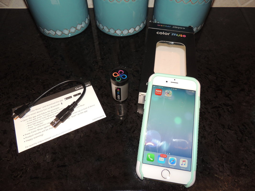
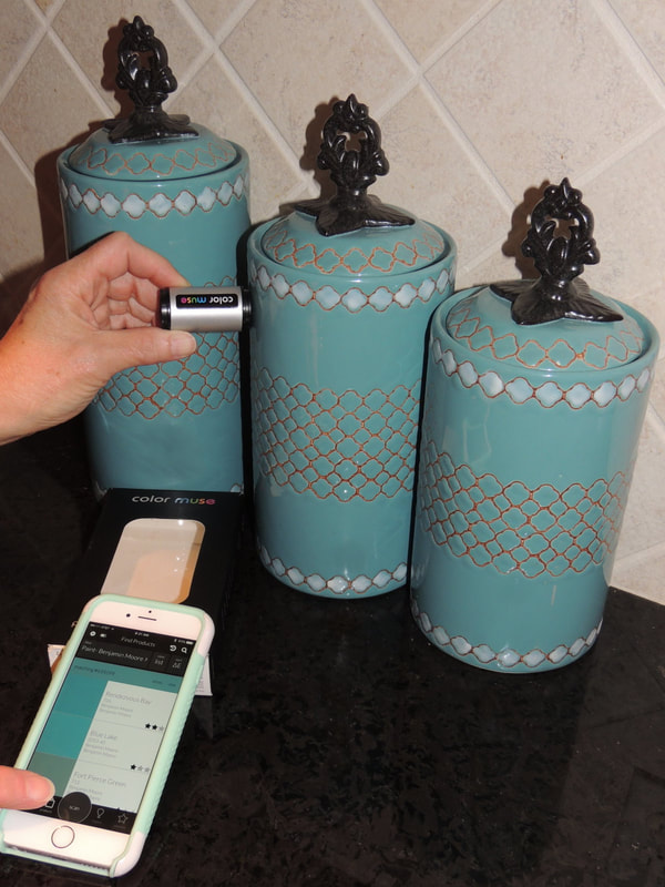
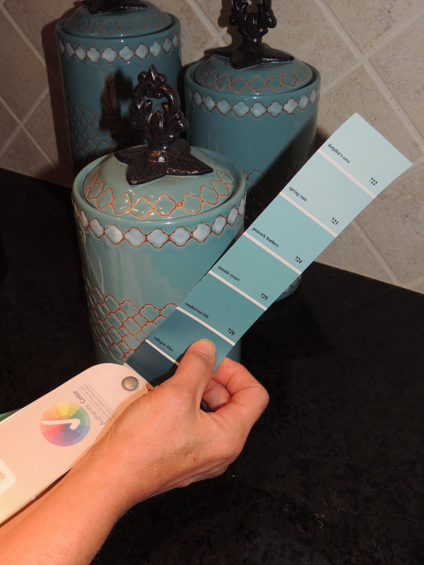
ColorLux Designer Cellular & Roller Shades I hope you’re ready for a wonderful crisp Fall, my favorite time of year! As I detailed in my last blog post on the “Top Ten Color Mistakes”, since colors are so vital to decorating I want to share my latest find—a digital tool for accurately “reading” colors: the Color Muse. Basically, the small Color Muse device has its own light source (charged by an internal battery that can be recharged with the included micro USB power cord), and you operate it through an app on your phone. The Color Muse works with an iPhone, iPad or Android phone. To demonstrate the Color Muse, in the photos below I have used the app to tell me the corresponding Benjamin Moore paint color for the teal canister in a kitchen. After a couple of seconds the Color Muse app chooses “Rendezvous Bay 726” as the closest paint color match. I concur! If you are interested in finding out more about the Color Muse, here is a link to more information on this fantastic product:
Color Muse Website If you need help matching colors in your home, I would love to demonstrate the Color Muse tool for you in your next interior home project! I just used it yesterday with a client who purchased a lakefront home in New Hampshire, and she is in search of the existing wall paint color to do some small touch-ups. In two minutes we identified the color…how cool is this techie product???  Today I’ll relate the top ten mistakes I see clients make when choosing paint and color schemes for their homes, either when they don’t have a practiced interior color sense, or a designer who can help them with this critical area. Don’t make these same mistakes, as repainting can be extremely frustrating, time-consuming, and expensive! TOP TEN COLOR MISTAKES YOU WILL NOT MAKE:1. When choosing a wall color, using the exact color taken from a rug, art piece, or fabric without regard to intensity of that color.
|
Barbara PhillipsBarbara Phillips, interior designer and owner of Center Stage Interior Designs, has delivered impeccable window treatments and design services to both residential and commercial clients in Massachusetts since 2001. Categories
All
Archives
March 2021
|














 RSS Feed