|
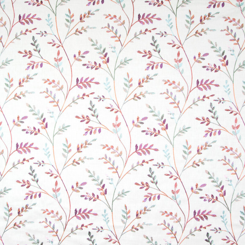
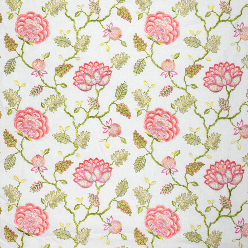
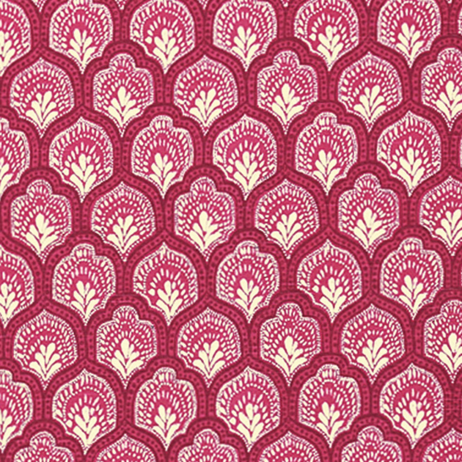
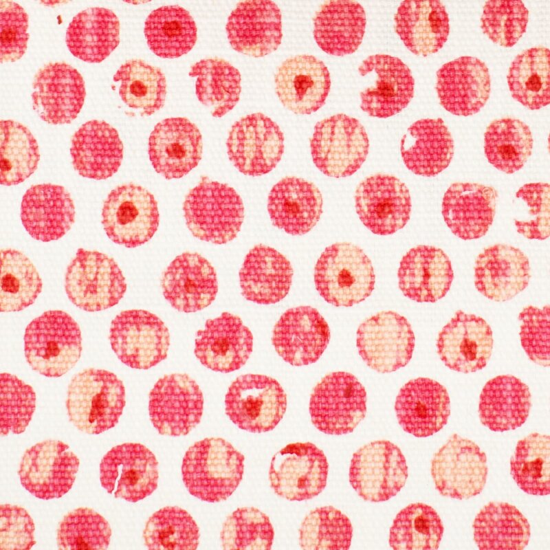
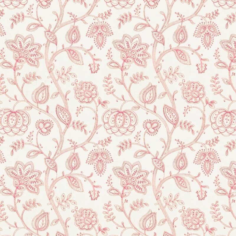
In my last post, I discussed decorating with the color Red, and I briefly touched upon the topic that decorating with Red is remarkably different from decorating with Pink. That’s curious, don’t you think? After all, decorating with all values of a color (from light to dark) works fairly well with blue, green, and neutrals of beige and gray. But definitely not with red and its lighter companion pink. What makes pink so special? Well, I’m not sure, but perhaps because pink is inherently perceived as soft, and red is inherently perceived as loud, they are just different. So, here are some general design guidelines for decorating with pink. I like pink. I have done numerous pink bedrooms (for little and not-so-little) girls, and it’s always a happy endeavor. And the joy of the young clients in choosing their paint color (with only a few options presented, naturally) and their fabrics is also just delightful. I’ve also done other rooms (family and adult spaces) with pink as the accent color, and they have been refreshing and happy, like in this Lexington, MA living room below: 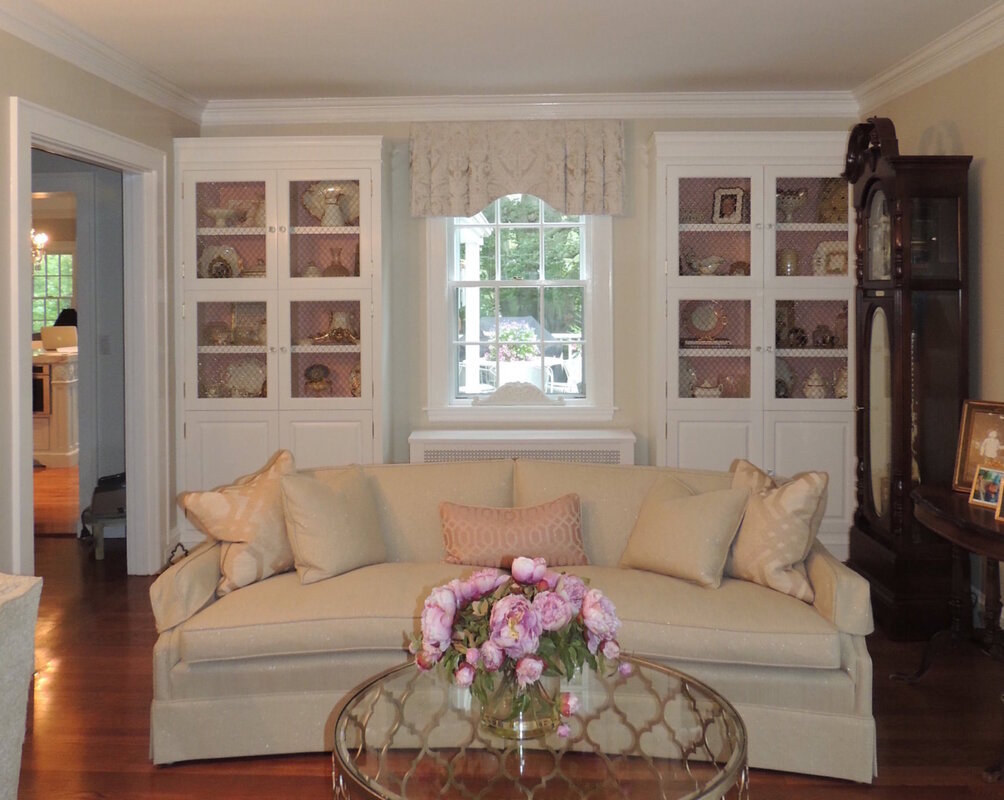 When decorating with pink, I have always found it best to find an inspiration fabric to start the fun. Sometimes it is the motif (floral is pretty predominant, but geometrics are strong lately, and there are lots in pink to choose from), sometimes the intensity of the pink is the draw, and sometimes a fabric just starts the spark. Here are some great current pink fabrics that are available from my vendor, Greenhouse Fabrics.
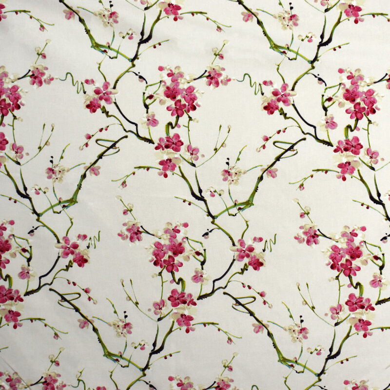
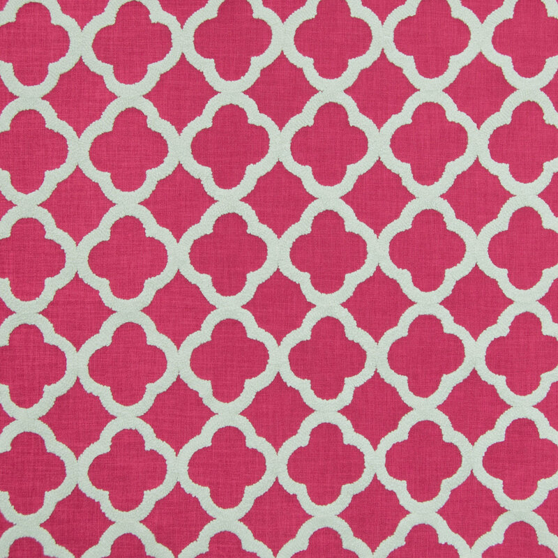
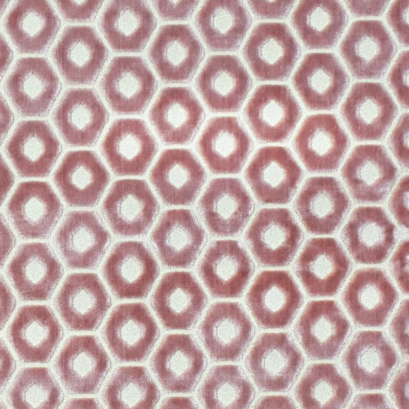
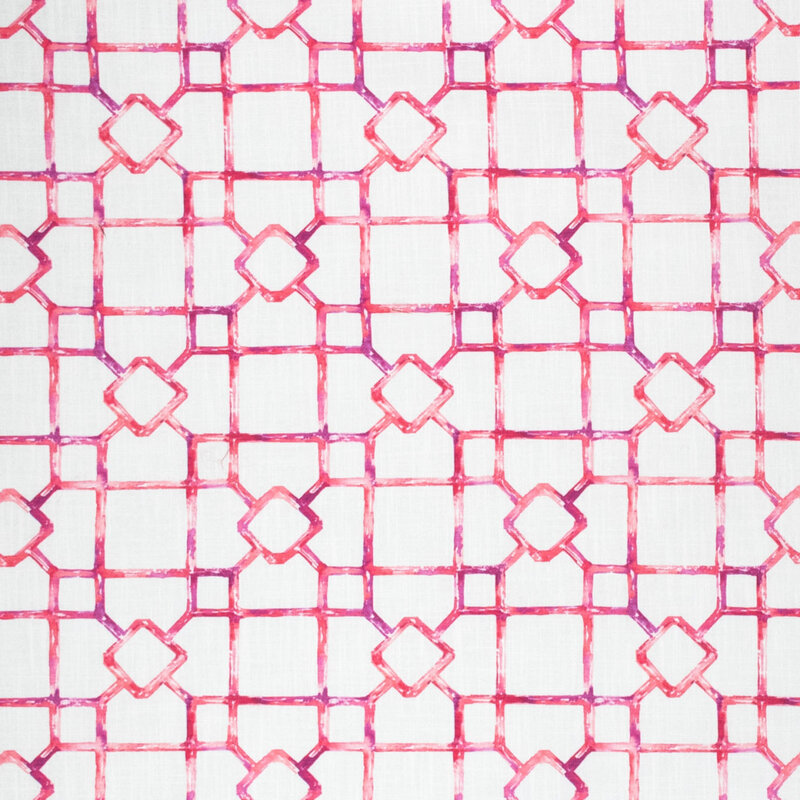
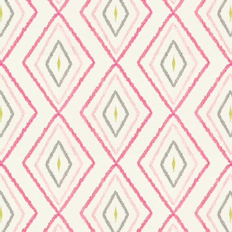
Additionally, here are some excellent pinks from another one of my vendors, Stout Fabrics.
One thing you’ll notice about these designer pink fabrics is that they are generally monochromatic: pink and white or pink and ivory. If there is an accent or second color, it is usually green. From a color specialist perspective, I find that so curious because in the interior design field, we generally don’t embrace too many “complimentary color” parings like red and green. But pink and green are certainly compatible as the fabric swatches shown above attest. Pale pink goes well with green, and bright pink (hot pink or fuchsia) goes very well with blue, as they are very close on the color wheel. Rules of Thumb When Decorating with Pink:
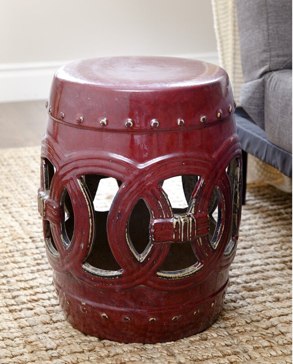
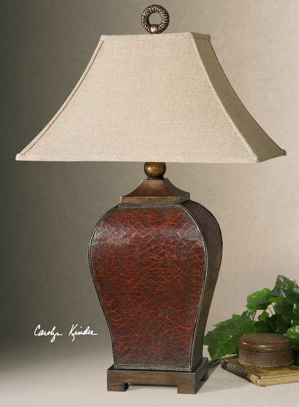
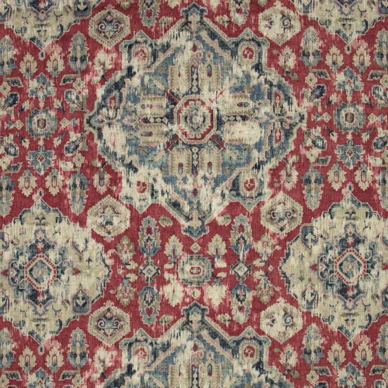
 Well, that’s a wrap on the color pink. Let me help you navigate the intricacies of pink! As subtle as the color is, it demands a careful eye to make it sing with the rest of the décor.  Since yesterday was Valentine’s Day, it got me thinking about decorating in reds and pinks. A lovely and delicious subject for this week’s blog post! So here’s some advice about the color red. I’ll save pink for another blog, because my recommendations for how to treat pink are very different from how to treat red. Get your Valentine’s Day chocolates from your honey and sit down, read, and enjoy…. Red is bold, warm, and has a decided “point of view.” In decorating, most people think reds are tricky; probably because reds pretty much compel you to have and take a point-of-view. Not surprisingly, during the recent 8 years of the gray trend, red was not a super popular color in home decor. Some ditched the color altogether in their décor because they needed a decided change from the more Tuscan palette of golds, reds, and greens. However, in 2018, Benjamin Moore declared Caliente Red (AF-290) as their Color of the Year, so there must have been some recent design impetus for their selection. See my blog post from 2018 on Caliente Red here. Honestly, when Caliente Red came out as the COTY, I was surprised. Now, two years later, I can truly say that I have not had one client even toy with the idea of painting an entire wall (or room) red in the past two years. And there’s a reason for their reticence -- commitment. Well, that‘s a perfect Valentines’ Day connection, right? Personally, I like the color red. I like to decorate with it as an accent because it’s fun and bold. This leads me to an important point on the situations where I often find myself decorating with reds with my clients. Nine times out of 10, when a client expresses the interest in decorating with red, it’s because they already have an Oriental carpet that they love that has red in it. Often, it was their Mother’s or Grandmother’s, and I have to say, I have seen some incredible antique wool Oriental rugs in perfect shape that can definitely be used as the inspiration for a room’s décor. Often the Persian rug has both red and blue, as described in my 2018 Caliente Red post. When Working with Red: DO identify if it’s a blue red (cool), a true red, or a brick red (warm) in your Oriental or Persian carpet, and take the color direction off of that. If it’s a cool red, you can pair with grays. If it’s a warm red, pair with beige or golden tones. For example, here’s a Pottery Barn Oriental rug that’s pretty versatile, with a very attractive somewhat “tribal” design in my opinion. I would say it’s a fairly true red, but the use of the warm beige tones in the border would steer me toward a warm color palette. So, just looking at the rug as the inspiration jumping-off point for a renovated interior, I would go for a warm color palette. 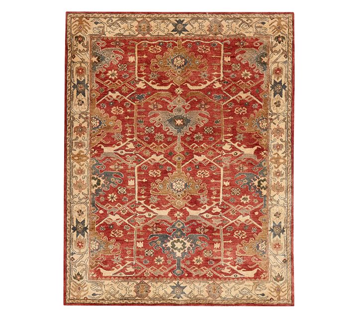 Here’s how PB used the rug in a fairly updated interior: 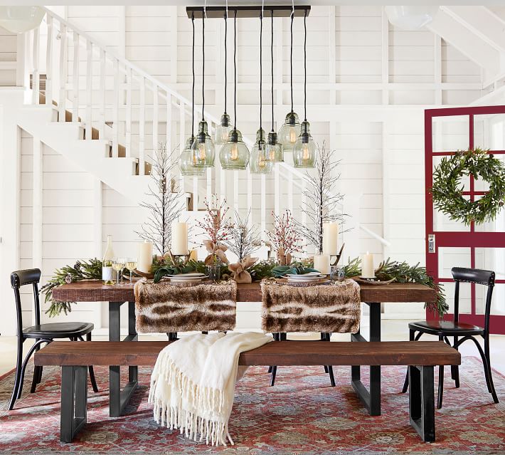 Note that the red door makes the color scheme make sense — hey, that color on the door could very well be Caliente Red. Please remember that any color (used as an accent) needs to be incorporated in at least 3 places in a room to have the décor work well. My guess is that the wall color is akin to Benjamin Moore’s Cloud White, a nice creamy white with a warm undertone. DO use red accessories to bring the color scheme to life – accessories like Chinese ceramic stools, trays, ceramic lamps, pillows with red accents. Remember, a little red goes a long way. Actually, pillows that pick up the “right red” are extremely useful in interior décor. Here’s a Chinese stool from Wayfair that I’ve used with a client to judiciously bring in some red. Also, here’s a lamp from Uttermost, and I’m pleased to remind everyone I am an Uttermost dealer. https://www.uttermost.com/
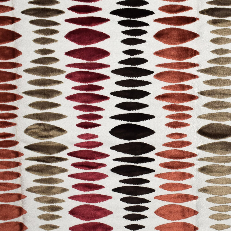
DO pay attention to fabrics, that you find and love, that incorporate red AND another color. Such fabrics will be really important to bring a room to life, whether in pillows, upholstery, table runners, draperies, or other soft furnishings. Here are some red fabrics (paired with other colors) from my vendor Greenhouse Fabrics:
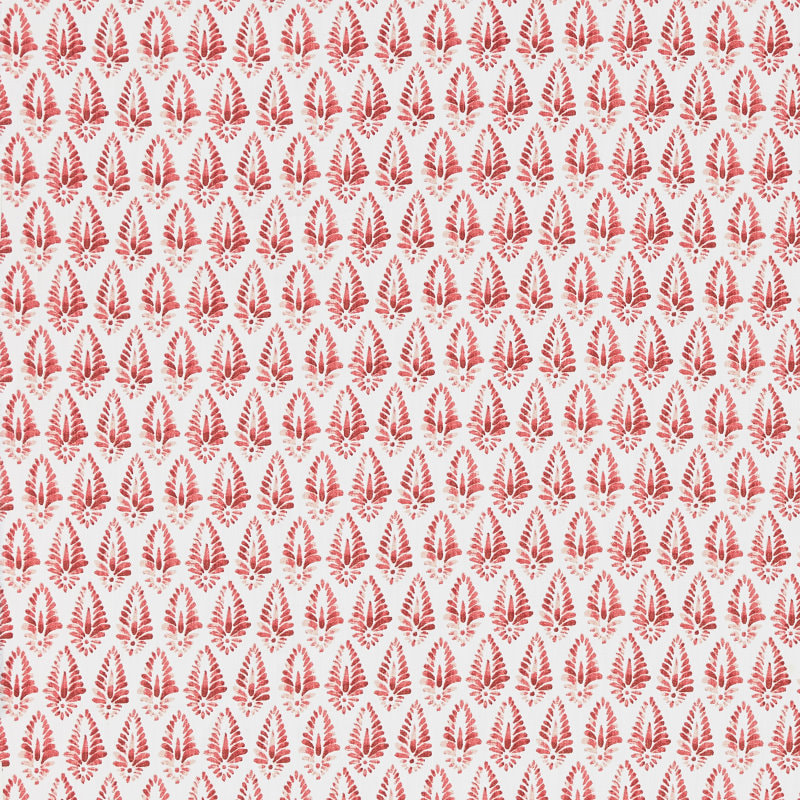
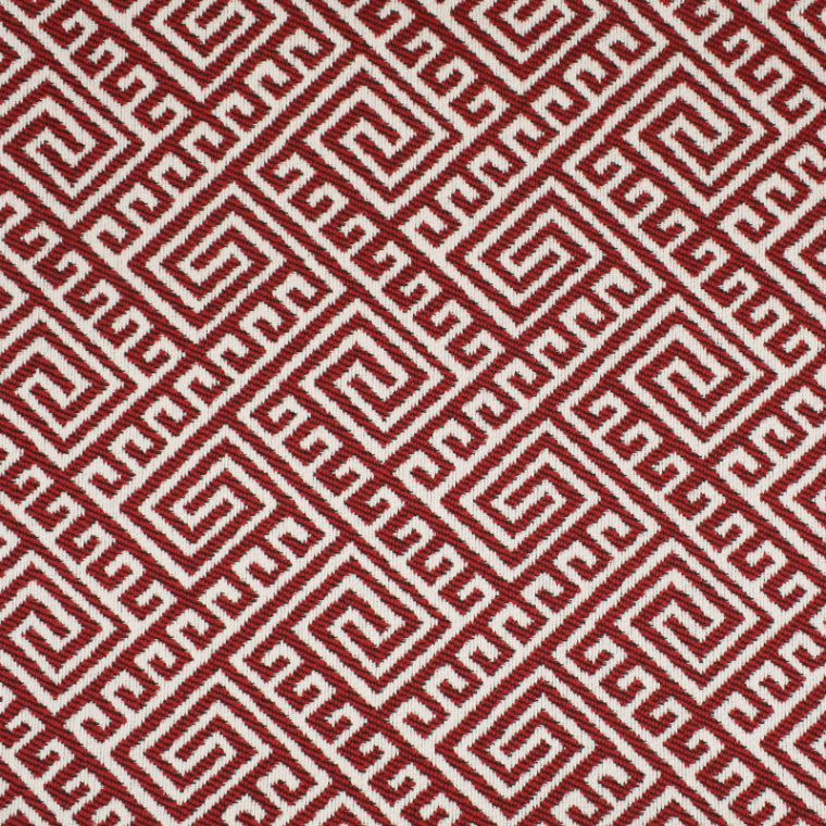
When looking, you’ll probably find many red and white fabrics that would easily fit into a décor as pillows. The fabrics shown below are also from Greenhouse Fabrics. I particularly like the fretwork patterns in red and white - beautiful for an upholstered chair, too.
DO pay attention to the undertone of the flooring in a room with red. If it’s mahogany wood, then you can use a red fabric successfully. If it’s a yellow undertone (like golden oak), you should be looking to use a warm red (russet, clay, or the like). If it’s a neutral walnut color, you are fine with any red. Tile presents a whole other challenge. Just remember that yellow and red undertones are tricky together - but that’s probably best demonstrated by me in your own home. With a color consultation, I can show you what undertones to use in your wall colors and flooring colors to achieve a beautiful harmonious and interesting interior. In closing, if you like red, embrace it! Hey, that sounds like a Valentine’s Day message too…… |

Barbara PhillipsBarbara Phillips, interior designer and owner of Center Stage Interior Designs, has delivered impeccable window treatments and design services to both residential and commercial clients in Massachusetts since 2001. Categories
All
Archives
March 2021
|
 RSS Feed