|
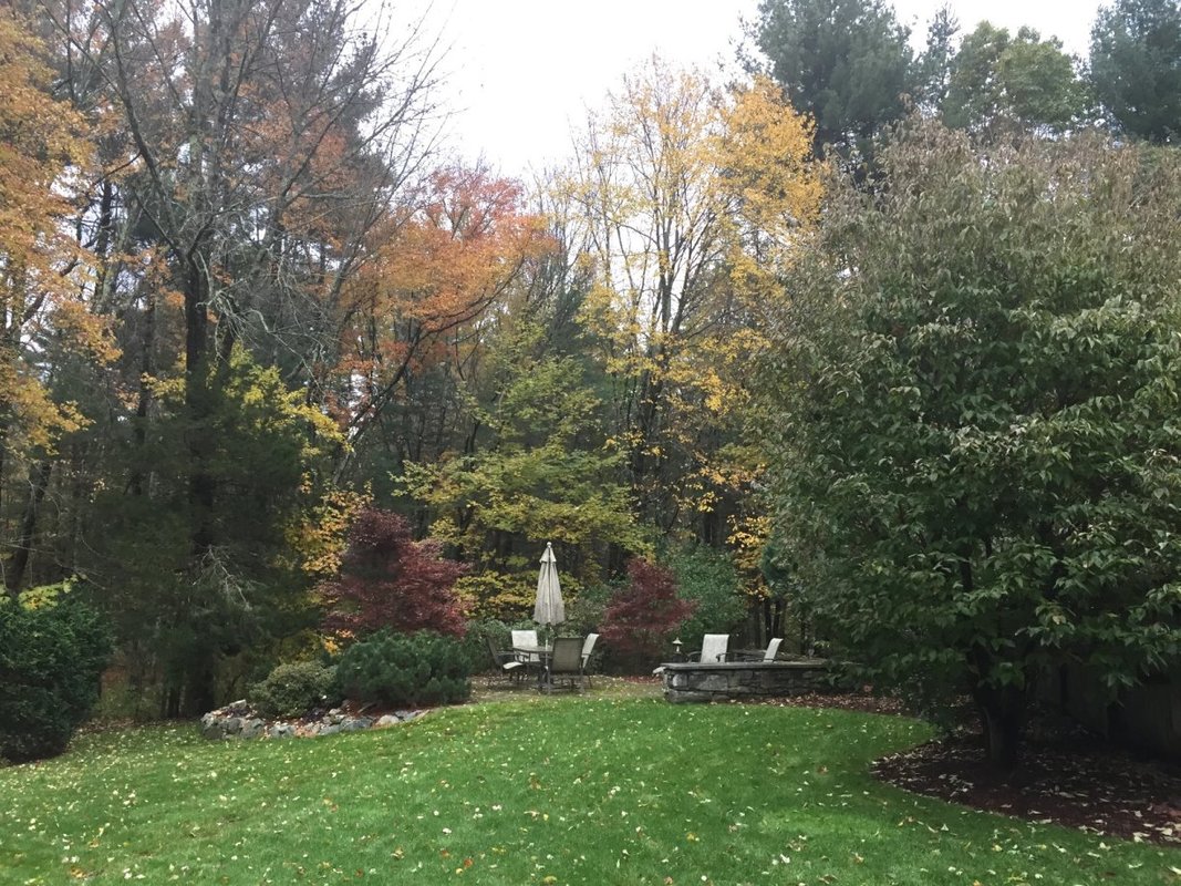
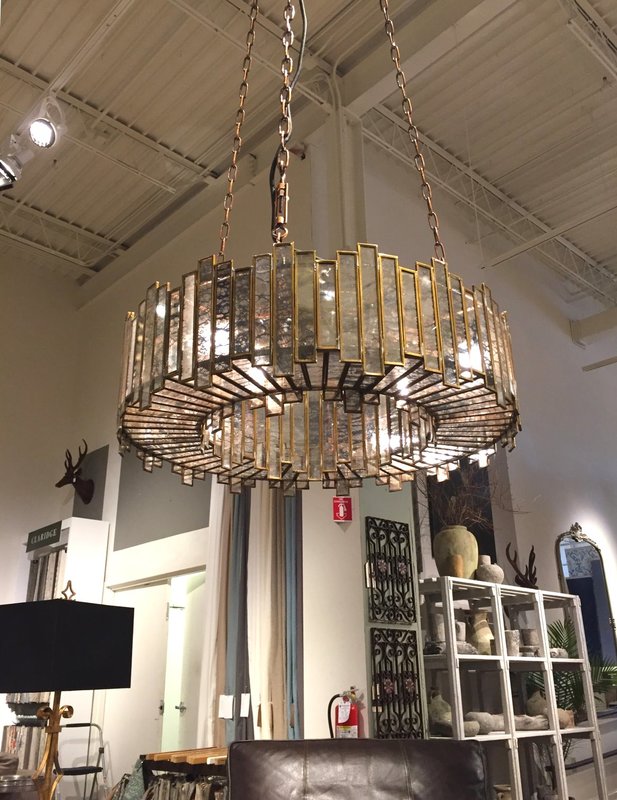
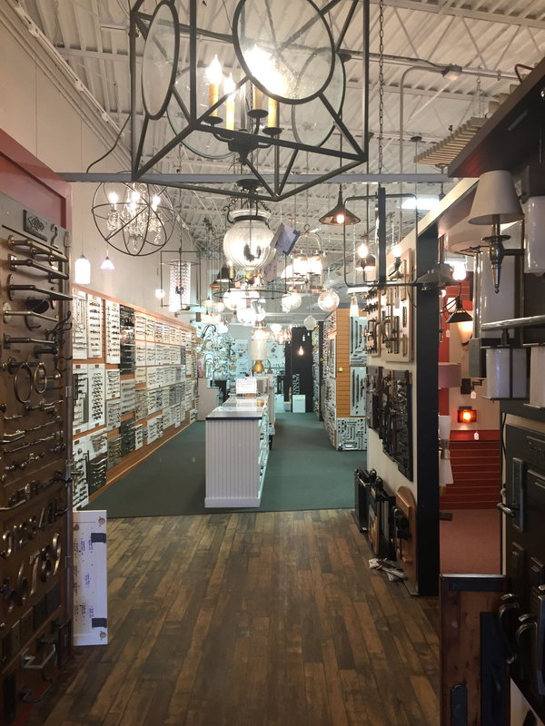
In September I came upon this sight at Home Depot - what a shocking reminder that the seasons are a-changin’ (if you don’t get this reference, you must be young). Witnessing how retailers switch in the blink of an eye from barbeques to snow blowers, I thought this week’s blog should address the similar changeover in our mental philosophy from Summer to Fall. Specifically, what 4 things you must absolutely do when Fall undeniably signals the change of seasons, at least from the home decorating perspective. 1) Get over it: Fall comes every year, and that’s a good thing. While you might want to preserve Summer forever (see my “Making Summer Last Longer Via Your Décor” from August of this year for helpful tips to make that exquisite summer feeling last longer than the calendar suggests), Fall inevitably comes, and that’s comforting and invigorating. Just look at how gorgeous the new landscaping in our backyard looks this Fall. We redesigned the plantings this Summer to be more like a Japanese garden after our spring trip to Japan. Watching the colors of the Japanese Maples and Red Maples come into their full glorious color in recent weeks has been uplifting. 2) Prepare Your Home Now for Holiday Guests: Today is Halloween, and you say you are having a Thanksgiving, Christmas or Hannukah get together? And your dining room doesn’t even have a table yet, your guest room is piled with your kids’ summer camp and school stuff from last school year, you need some kind of window treatments, and you need to have the painter fix last winter’s ice dam damage? Or perhaps your in-laws or college best friends are coming to celebrate with you in 4 weeks (oh my) or 8 weeks (better, but still panic city)? If that’s the case you might want to reread my blogpost from June titled “The Guest Room - 15 Tips for a Heavenly Stay”. But let’s look on the bright side – this might also be a great opportunity for you to: (1) clearly define a project that you have been procrastinating on, (2) call me and (3) get it done before the holidays arrive. Now! In January, after everyone has gone home, you’ll be able to reap the benefits of the professional design from your family’s enjoyment…think of it as a holiday gift that you gave to yourself. So, if this is the situation you’re in make time to call me today (978-440-7264) or contact me if you’re serious about making some pre-holiday improvements that require getting on the painter or carpenter’s or my schedule. 3) Plan Ahead in Your Lighting For Winter’s Darker Days: The change of seasons reminds us that it’s prudent and emotionally calming to think, plan, and act ahead. Just like the squirrel that’s scampering in your yard right now gathering acorns and storing up for the colder months. What does this have to do with interior home design? One area you should always review this time of year is lighting. We get so used to the bright summer days that we forget our dependence on artificial lighting for much of the year, and just how much lighting impacts your home’s interior ambiance. If you haven’t shopped for chandeliers and lighting in the past few years, the options (as well as bulb technology) have really changed. There are beautiful fixtures out there, including this new one at Arhaus, where the bulbs are cleverly concealed so that it would be pleasant to have it hang over a dining room table, in the center of a room, or over your bed. If you haven’t been to a lighting showroom lately, I strongly encourage you to take a look at the new options. Browse at stores other than Home Depot too, although Home Depot is a perfectly acceptable place to take a look too. In that vein I have a new resource for lighting and kitchen hardware, Needham Decorative Hardware, a terrific to-the-trade showroom in Needham, MA (see the photo below). I enjoyed shopping there with a client of mine this week and both their product selection and their staff designers are terrific. So, if you’re in need of new lighting, let’s check things out together. I bet you didn’t even know I did lighting, did you? Some of my favorite vendors are Currey and Co, Visual Comfort, Jonathan Adler, Hinckley, Circa and Uttermost. I often think of lighting as an opportunity for jewelry on your décor - functional AND pretty, you can’t beat that. 4) Get Outside and Enjoy the outdoors: Enjoy the change of seasons because what’s happening out there this Fall is pretty spectacular. Every day this week while walking or driving in my hometown, I’ve marveled at just how gorgeous it is. The woods nearby our home change daily and it is so invigorating to take walks in this spectacular landscape. Comparing this exuberance of Nature’s daily changes in our surroundings with the world of interior design, I find they are very similar. When you come home and your new window treatments that you planned for a few weeks or months are actually up, it’s a nice feeling and a push forward. I have been doing lots of projects this Fall with folks who just wanted to finally do it, and I can see the happiness on their faces at the “reveal.” Until next time, enjoy yourselves this Halloween! What a great day, when everyone can be a kid and dress up and embrace the wonder of stepping out of the everyday. After that, enjoy your change of seasons, wherever you live, because it reminds us of the refreshing cycle of nature. And don’t forget to prepare your home for the upcoming holidays - you will be glad you did.
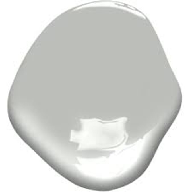
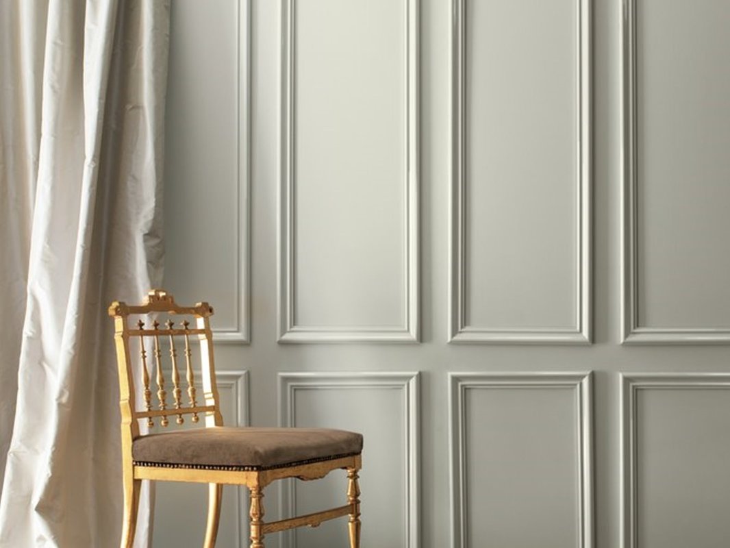
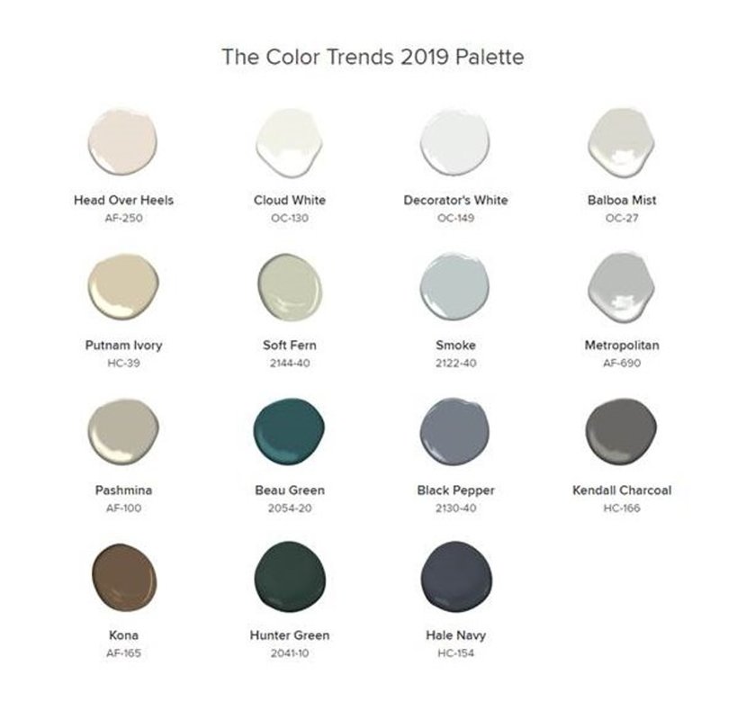
This week Benjamin Moore revealed their new 2019 Color of the Year….drum roll, please…AF-690 Metropolitan from their Affinity Collection…which is a………medium gray. Oh, meh. Even Benjamin Moore calls it “effortless” in their official release: “Comforting, composed and effortlessly sophisticated, Metropolitan AF-690 exudes beauty and balance,” said Ellen O’Neill, Benjamin Moore Director of Strategic Design Intelligence. “It’s a color in the neutral spectrum that references a contemplative state of mind and design. Not arresting nor aggressive, this understated yet glamorous gray creates a soothing, impactful common ground.” Here’s a look at AF-690 in a room setting in an image provided by Benjamin Moore. Please note that the walls look a bit lighter in this photo than I expected, but it is a beautiful photo of a room with umph and architecture………like the use of a neutral gray paint demands. Now that the 2019 Color of the Year (COTY) has been revealed, everyone is discussing it in their design blogs this week (do a Google search on it), and you will see some beautiful room photos. I don’t have any myself, as I have never specified this color before, and it does seem a bit curious to me that Benjamin Moore selected a fairly obscure gray that no one has been using or talking about as its flagship color for the year. But it is similar to Coventry Gray HC-169, which is a popular color, so don’t think that Metropolitan is too far out there. In the press release, Benjamin Moore calls Metropolitan “effortless” and “not arresting or aggressive.” What do we think about those adjectives? In designing for my clients, the last thing I want my clients to conclude about our color selection is “effortless” or “not impactful.” But, having had two days to process the revelation of AF-690, and put it in context with the other color happenings and trends in the world of interior design, I guess it’s not that surprising a selection for this year. Especially since the 2018 Benjamin Moore COTY selection of Caliente, (a bold red) was interesting, but in reality, it probably prompted very few to head back into red territory for their décor. On the other hand, aren’t we already full-throttle about 5 years into the “Gray Era?” Color trends usually last about 8 years. My own take on Metropolitan is that it’s a neutral color with a cool undertone (bluish in north-facing rooms, a tad greenish in other exposures), a nice backdrop for either stunning architecture or to use with fresher and clearer happy hues like watermelon, lemon, periwinkle, or aqua. The Light Reflectance Value (LRV), which is a percentage that describes the quantity of light reflected from a surface compared to black (0%) and white (100%), for AF-690 Metropolitan is 50.5%. That is why I call it a medium gray, instead of a light gray. You might look at photographs on the internet of rooms in Metropolitan and be convinced it’s a light gray. But the LRV parameter will ALWAYS give you an objective measurement of how dark it is, and the LRV on every color is published right there in the fan deck in the index at the back or on the back of a swatch…check it out. Benjamin Moore describes its Color Trends 2019 as “a corresponding palette of 15 harmonious hues that further amplify the cultured grace of Metropolitan AF-690.” The Color Trends 2019 palette ranges “from ethereal neutrals to frothy pinks to rich blues and greens.” These are their words. It is interesting to me how the whole palette is fairly cool. As for AF-690 Metropolitan, I can see this medium gray, with its LRV of 50.5%, pairing really well in a coastal setting with a clear and crisp cool palette, like those in the fabrics and paints of the Maine Cottage line: http://www.mainecottage.com/ But this coastal connection is probably the opposite of what the Benjamin Moore folks had in mind about Metropolitan, as evidenced by their urban-inspired video for AF-690: So How Do You Use Light or Medium Gray in Your Décor
The main thing to understand about neutral grays like Metropolitan is that they are indeed “supporting players” which absolutely require something else in the room to be the STAR, like:
So, that’s a wrap on the Benjamin Moore Color of the Year for 2019: AF-690 Metropolitan. If you are totally confused at this point, you can always hire me to perform a color consultation to explain the LRV, value, hue, and other Color-speak words. Or, you can hire me to choose a gorgeous color palette and new paint color(s) for your home. You have to look at any paint color in the context of the room you are decorating with its own light and surroundings, and all the recommendations from the internet and paint companies will not guarantee a success - so we can work together to personalize the process for wonderful, unique YOU. |
Barbara PhillipsBarbara Phillips, interior designer and owner of Center Stage Interior Designs, has delivered impeccable window treatments and design services to both residential and commercial clients in Massachusetts since 2001. Categories
All
Archives
March 2021
|





 RSS Feed