Barbara Phillips
  • Home
  • Portfolio
  • Services
  • About
  • Client Journey
  • Vendors & Resources
  • Blog
  • Contact
  • Home
  • Portfolio
  • Services
  • About
  • Client Journey
  • Vendors & Resources
  • Blog
  • Contact
Search

Top Ten Color Mistakes

7/23/2017

 
Picture
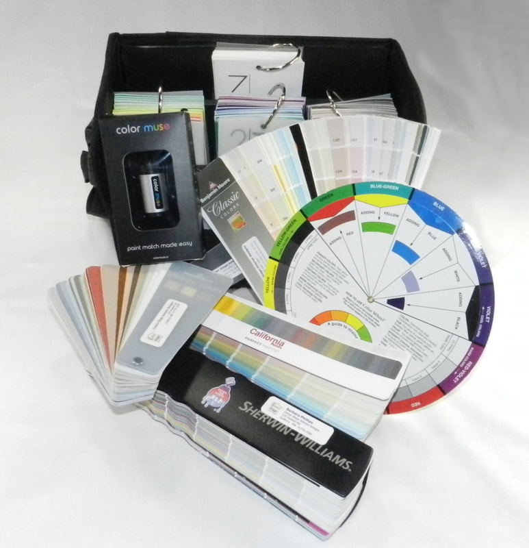
​Today I’ll relate the top ten mistakes I see clients make when choosing paint and color schemes for their homes, either when they don’t have a practiced interior color sense, or a designer who can help them with this critical area.  

​Don’t make these same mistakes, as repainting can be extremely frustrating, time-consuming, and expensive!

TOP TEN COLOR MISTAKES YOU WILL NOT MAKE:

​​1. When choosing a wall color, using the exact color taken from a rug, art piece, or fabric without regard to intensity of that color. 
  • Say you love the bright turquoise stripe on the trim adorning your crisp new white bedding, and you think painting the walls a turquoise will give you that tropical vacation feeling every day.  I like the inspiration!  But if you match that same color (that is in less than 1% of the bedding), and put it on your walls (which would represent about 60% of the surfaces of the room, WOW, it might be totally too intense for that restful feel.  Toning down the color, in value (the lightness or darkness) and saturation (the amount of pure color pigment) will give you the result you are looking for.  See our next blog post for information on the Color Muse tool which Barbara would use to identify the original turquoise color to make it a starting point for extrapolating and determining the best wall color.
2. Not testing color on the walls first with boards or swatches.
  • It is imperative to test your top 3 or 4 wall color choices on the walls themselves in different lighting, at different times of day, and on different walls in the space.  Colors will look vastly different at varying times of the day, and if you rely on selecting a color at the paint store (under extremely different lighting than in your own home), you may be sorely surprised!  How to avoid this mishap?  Test, test, test.  Barbara will order multiple swatches of paint colors from the paint companies for you (Benjamin Moore, Sherwin-Williams, and California Paints), and you can tack these up on your walls with blue tape, and the move them around.  Or, you can get the larger paper swatches from your local paint store, or purchase small cans for testing. But I highly suggest you don’t polka-dot your walls with painting 10 different colors right next to each other at the same time...a bit confusing, and more work for your painter on prep…but do what you must to test a color first.  
3. Accepting a “color match” of a paint color made from a different brand of paint.
  • This is one of my pet peeves, and I can’t stress this enough to my clients. It is essential that if you choose a “Benjamin Moore” color, you actually purchase it as a “Benjamin Moore” paint formulation.  Sure, Home Depot, Lowe’s and other stores will “computer color match” any color for you, including a Ben Moore swatch, but I guarantee you it won’t be exactly the same.  AND, more important, you will not be able to match the paint color down the line if you need more for touching up or an adjacent room.  And please buy quality paint to begin with, you (and your painter, be they a professional or your teenage daughter) will be much happier in the end.  By the way, my go-to paint formulation for Benjamin Moore is their Aura paint…goes on like a dream, doesn’t splatter, easy for no-show touch up of “paint holidays.”  An excellent product.   Sherwin-Williams and California Paints also have excellent paint formulations, just don’t select the ones based on cheapest price.  In paint, “you get what you pay for.”
4. Testing paint colors in rooms lit by incandescent bulbs that are no longer available for purchase.  
  • Excellent, I am so glad you are testing your paint colors on the walls before you decide on the perfect color…but…hello…the old bulbs in your lamps might steer you in the wrong direction!  New technology in bulbs and new federal regulations that phased out good old fashioned and energy inefficient incandescent bulbs really make this the perfect time to visit the hardware store and get some new bulbs to try out in your home in conjunction with trying out paint colors.      This should be the topic of another longer post, but suffice to say that bulb technology really does matter, and  you have lots of good choices now!  And one more thing…if you got an energy audit a few years ago and they replaced all your bulbs with the corkscrew ones that take forever to warm up, and emit cold bluish light, you might want to run to the store and check out the newer options….you  deserve good, pleasant light instantly!
5. Failing to consider the exposure of the room (North, South, East and West) when choosing paint colors.  
  • In New England, where I live, we tend have an aversion to “cold rooms” in the wintertime, and a color with a cool undertone will certainly contribute to making a room feel and look cold if it has a northern exposure.  So, that is when we consider a “warm gray” with warm, beige undertones as opposed to a “cool gray” with blue undertones in such a situation. So, you can still have a gray room with the popular gray trend, but maybe consider more of a griege (a new term for a warmer gray that mixes gray and beige, like my favorites Benjamin Moore Edgecomb Gray HC-173, or BM Alaskan Skies, 972). 
6. Choosing a paint color first and then trying to find a patterned rug or patterned fabrics to go with the color.
  • Occasionally, a client is able to totally redo a room and choose all new items, including carpet, furniture, artwork, paint color, and window treatments.   What fun!  Then we can plan the room perfectly and it all goes together.  In such cases, if you plan to use a patterned rug, I suggest you find the rug/carpet of your dreams first, and then work your color palette off of that rug (paying attention to #1 above, of course). Why?  There are way fewer carpets/rugs that might meet your design criteria and budget than paint colors!  We can always find a paint to go with a patterned carpet or fabric, but not so easy the other way.  Thinking of a solid, sisal, or seagrass rug for your décor?  Okay, you can pick a paint color earlier in the process when your options on the flooring are very broad. But expecting to find the perfect red/blue antique color washed Oriental in the size you want at the price you want that goes with your new paint color…well, you can always dream…
7. Cutting the formulation of a paint color by 10%, 25%, or 50% and expecting perfection (without testing).
  • I know the situation, having just experienced it myself with a new bluish-green color for my mudroom. You like two colors on the same paint strip, but one is too dark, the other too light…and you want a mix, somewhere in between.  So off you go to the paint store and have the color mixologist do his/her stuff to create your perfect color.    But, beware, if that color is green and you request “cutting” it by say 25%, you will invariably get a MINTY version of the green that you might not have anticipated. Generally, paint formulations can be cut like this, but beware of the “green monster” (special tip for all you Red Sox fans) out there.
8. Using the painter’s recommendation for color, sheen, brand of paint, and paint grade over the designer’s. 
  • Now, I’m not throwing all painters under the bus here (my painter Declan is a dream, and does a wonderful job with quality materials)...but I have had some issue with painters who confuse my clients at the start of the project by wanting to substitute different product formulations than what I recommend.  Now, I respect painters and their product knowledge, but I want you to be careful about painters who:
    • Want to paint all matte (it hides more imperfections so less wall preparation is needed, but some matte paints are not kid and hallway friendly at all)
    • Color match with a different, usually cheaper, brand of paint
9.  Not having something white in a room to register a color.
  • One of my favorite professors in Design School was adamant about this point, and she was right:  if you don’t have something white in a room, how can your eye really discern the subtleties of a paint color or other colors in fabrics, rugs, and accessories?  In Massachusetts, and in 80% of the cases, the millwork presents a great opportunity for fresh white paint (I like Benjamin Moore White Dove as my #1 trim paint for any color room).  A little white is a good thing, in my opinion, just like some black in a room is also a good thing…I particularly like some light/dark contrast and interplay in my interiors.  Anyway, you can put the white on the ceiling if nothing else!  
10. Liking the name of the paint, and taking it too literally for describing the color.
  • First of all, I want it to be known that I would love the opportunity to officially name a paint color!  All those evocative names out there in my paint fan decks, sparking imagination and stirring the creative juices.  But, what if you are choosing a paint color and didn’t realize that “Nantucket Gray” (BM HC-111) is really a nice, olive green?  Beware, the Benjamin Moore Historical Collection, a truly great set of colors, is just jam-packed with this naming subterfuge.   To wit, Newburg Green is blue, Hepplewhite Ivory is yellow, Bennington Gray is beige, Carrington Beige is green, Elmira White is griege, Montgomery White is golden, well, you get the idea.  So, just take some of the color names “in name only” and get the actual swatch.
Picture

Comments are closed.
    Picture

    Barbara Phillips

    Barbara Phillips, interior designer and owner of Center Stage Interior Designs, has delivered impeccable window treatments and design services to both residential and commercial clients in Massachusetts since 2001.

    Categories

    All
    Aging In Place
    All About Fabric
    Before And After
    Color Confidential
    Decorating Cycles
    Design 101
    Family Friendly
    Finding Inspiration
    Furniture Workshop
    Inside The Drapery Workroom
    New England Style
    Seasonal Decorating
    Technology In Interior Design
    Window Design
    Worth Visiting
    Your Questions Answered

    Archives

    February 2021
    January 2021
    December 2020
    November 2020
    October 2020
    September 2020
    August 2020
    July 2020
    June 2020
    May 2020
    April 2020
    March 2020
    February 2020
    January 2020
    December 2019
    November 2019
    October 2019
    September 2019
    August 2019
    July 2019
    June 2019
    May 2019
    April 2019
    March 2019
    February 2019
    January 2019
    December 2018
    November 2018
    October 2018
    September 2018
    August 2018
    July 2018
    June 2018
    May 2018
    April 2018
    March 2018
    February 2018
    January 2018
    December 2017
    November 2017
    October 2017
    September 2017
    August 2017
    July 2017
    June 2017

    RSS Feed

Home
Portfolio
Services
About
Client Journey
Vendors & Resources
Blog
Contact
Center Stage Interior Designs 
(978) 440-7264
Sudbury,  MA   01776

www.centerstageinteriordesigns.com  
Center Stage Interior Designs Copyright © 2001 - 2021
Privacy Policy
  • Home
  • Portfolio
  • Services
  • About
  • Client Journey
  • Vendors & Resources
  • Blog
  • Contact