 In today’s hectic world it’s not uncommon that getting around to decorating sometimes falls to the bottom of the “to do” list. Decorating takes time and energy. Sometimes it feels like just too much work to take on. Help might be the answer. So, if you’re struggling with defining and executing your interior design vision, here are 9 indicators that it may be time for you to ask an Interior Designer to assist you. 1. When you moved in, you accepted the previous owner’s paint colors that don’t quite go with your things, yet you’re reluctant to make a decision on new paint colors.
2. The rooms in your home don’t flow…the living room is red and Tuscan. The library is 1920’s Craftsman in navy and green. The kitchen all white and slick modern. The family room is mid-century modern with teak wood. Oh my! It’s like you’re at a museum and each room is from a different decorating era.
3. There is no artwork on your walls because….you just don’t own any!
4. You’re 35 and you don’t have a proper bed and headboard. Your mattresses are on the floor, and frankly, it’s getting harder and harder on your knees to get out of bed.
5. You have totally bare windows in every room of your house…and/or your neighbors are making snarky remarks at the neighborhood holiday party about the “wink, wink” need for shades.
6. The pillows on your sofa all came with the sofa…years ago.
7. You have a few “costly mistakes” around your house, probably ordered from a catalog company, and they are likely too big, too small, or too tall for your space.
8. You and your partner can’t agree on anything, decorating-wise.
9. You need a wider reach than the same old stores and catalogs like Pottery Barn, Frontgate, West Elm, Serena and Lily, Crate and Barrel, Wisteria, Ballard, CB2, Rejuvenation, and Restoration Hardware.
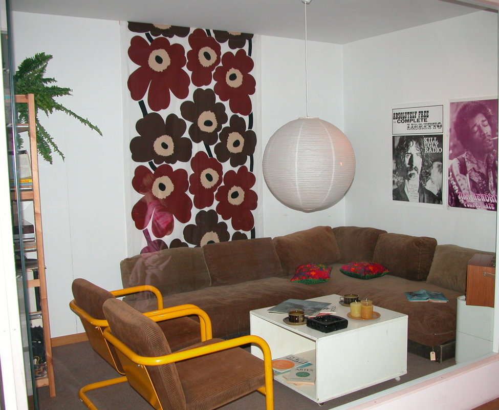
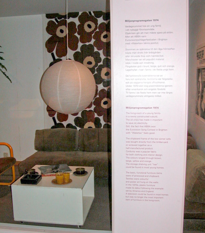
It all sounds pretty bleak and time consuming – doesn’t it? Rest assured, in the larger scheme of things, the time that you spend decorating will pale in comparison to the time that your decorating results will last and the enjoyment that you will receive from them. So, all is not lost. To inspire you to reach for a beautiful coherent design for your home, here are some photos of period rooms from museums we have visited during our travels. They illustrate how some elements of design are timeless, no matter the era or style. First, two photos I took at the Nordic Museum in Stockholm, Sweden…land of Ikea and mid-century modern. The photos show a 1974 living room in Sweden. (Gee, some of these design elements are still pretty popular.) The second photo has a caption detailing the design elements for this 1970’s interior (thankfully in English on the bottom).
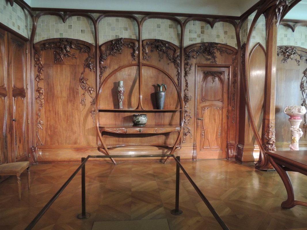
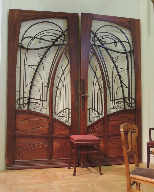
Next, some Art Deco rooms at the Musee D’Orsay in Paris France:
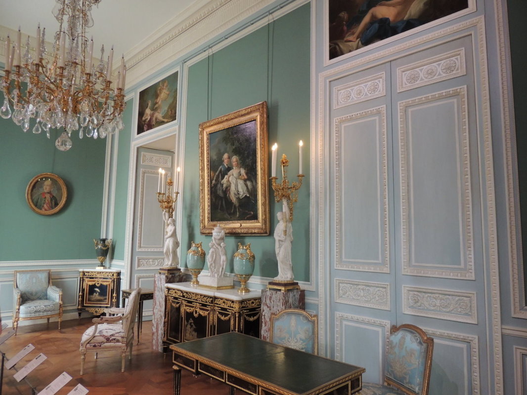
And some period French interiors (from the Louis XVI period) at the Louvre in Paris, France:
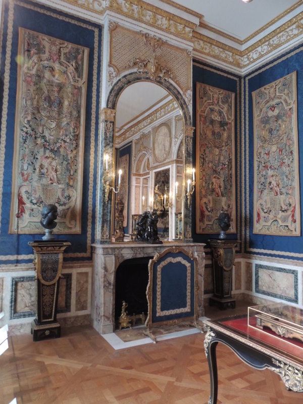
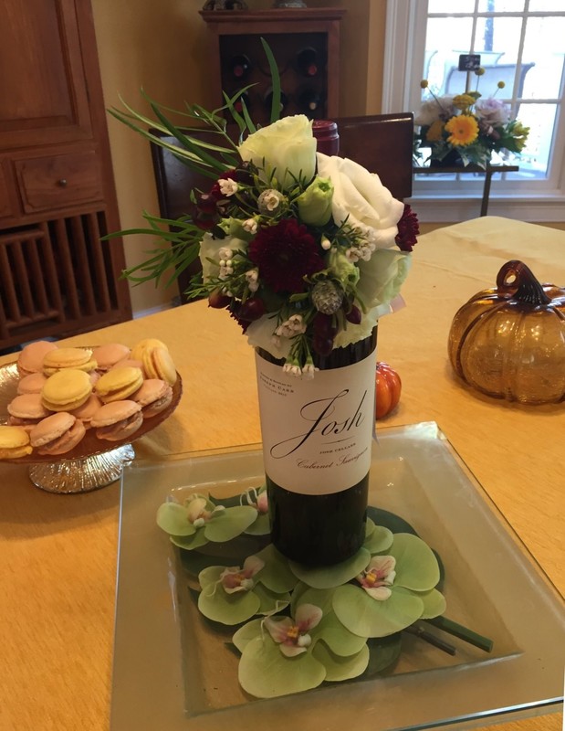
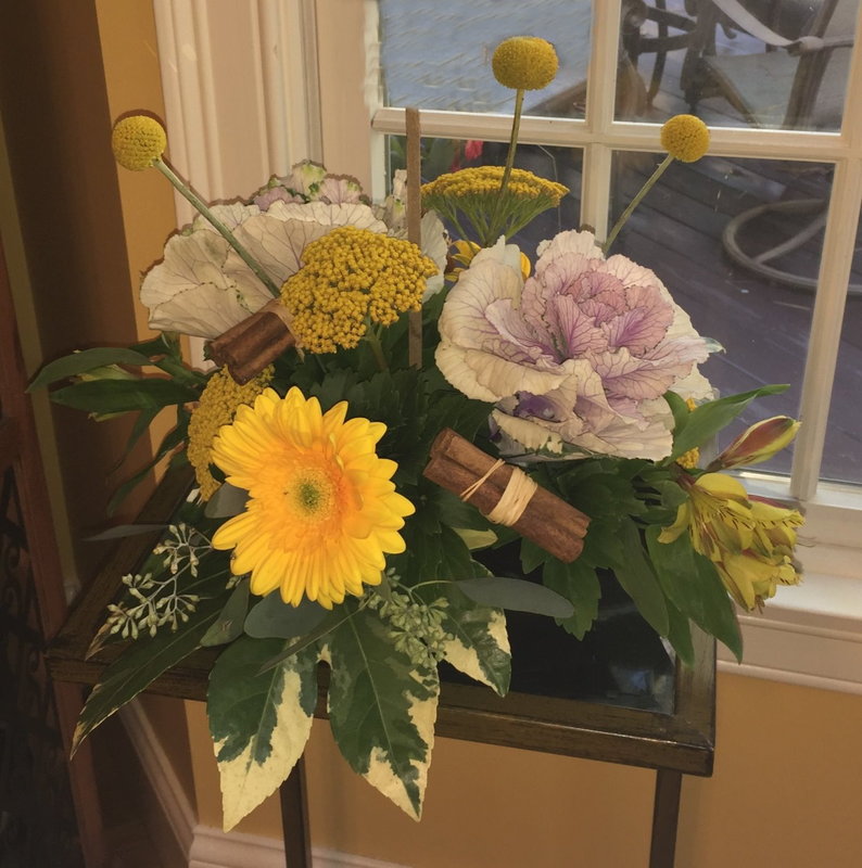
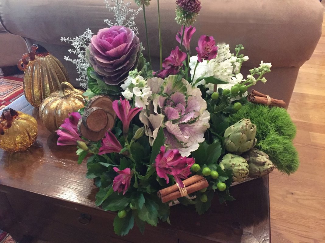
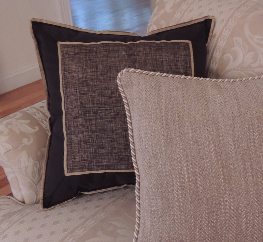
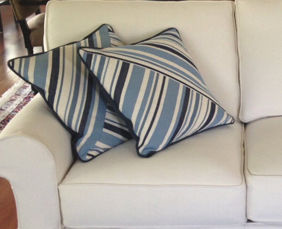
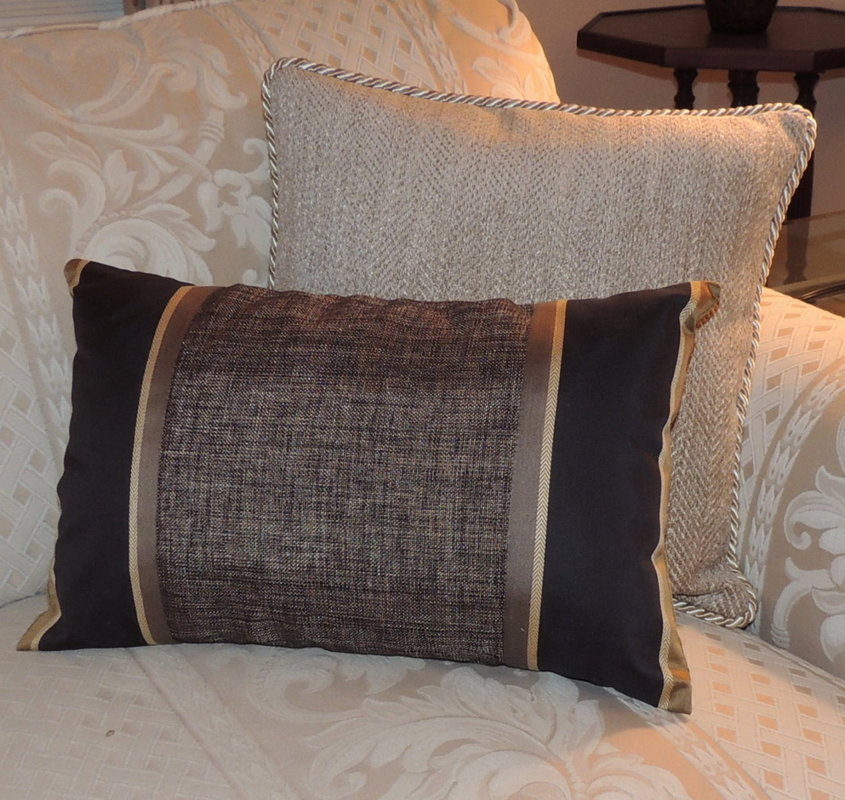
And finally, a dining room from the summer palace of Catherine the Great outside Saint Petersburg, Russia. 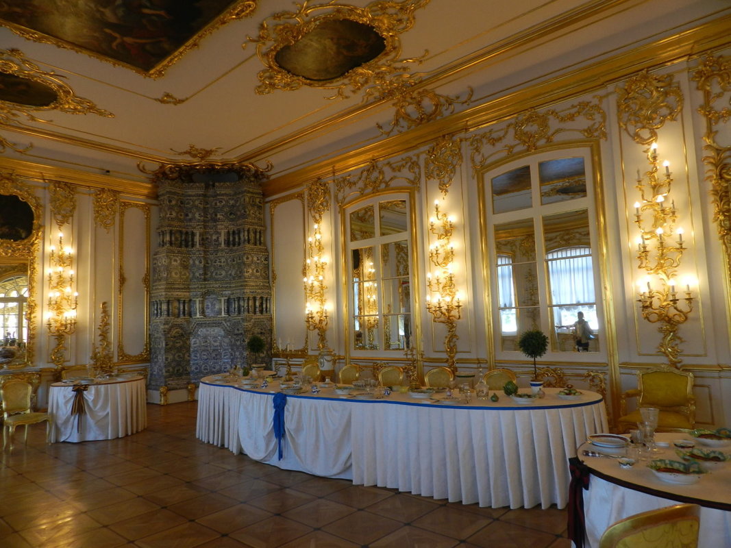 We’ve completed our quick review of the 9 telltale signs that it’s time for you think about calling an Interior Designer and put your decorating project onto the front burner (with a little inspiration thrown in to keep you motivated). So let me ask you, isn’t it time for you to get that decorating project that’s been on your list for a while done and get it done right? If you are struggling with any of these issues, give me a call. I can help!  Today’s post is about the dining room - making sure your lighting and tablescape are ready to give the right ambiance to your holiday meal. With Thanksgiving coming up this week, and Christmas just around the corner, I have been thinking about ways to make dining rooms more comfortable and inviting, thereby enticing your guests to linger at the table (and rave over your delicious food, funny jokes, and ultra polite children, naturally!) In conjuring the image of a holiday table that delights and invites, I initially think about the all-important element of lighting. Most dining rooms have a single chandelier over the table. How high should that chandelier be mounted? A good rule of thumb is that the lowest element should be 30” to 32” above the table in a room with an 8’ ceiling. If the ceiling is over 8’ tall, then the chandelier itself can be a bit taller (to visually fill the space more dramatically) and it can be mounted an additional 2”-3” higher for each additional foot of ceiling. Also important is the diameter of the chandelier. To arrive at a ballpark chandelier diameter (assuming a round chandelier), add the length and width of the room in feet (say 10’ + 14” = 24), and that will give you the best diameter (in inches) for your chandelier. So, in our example of a 10’x14’ dining room, a 24” chandelier is a good bet. But it is also important to consider the width of your table, and a chandelier should generally be at least 12” narrower than your table, to ensure that your guests don’t hit their heads or have to sit uncomfortably right underneath a light. Some designers use the convention of ½ to ¾ the width of the table for the proper width of a chandelier, but most definitely make it narrower than the table. The most important part of the dining equation is that the guests seated at the table can see each other and don’t have to dodge a crystal fob or metal arm to make eye contact that says, “That drumstick is clearly mine!” Here is a beautiful transitional fixture from Uttermost, the Boreas 7 light chandelier. What a lovely art piece that softens the room. And did you know I am an Uttermost dealer? (I know that’s a shameful promotion, but hey, this is an interior design blog after all and you are probably looking for design solutions.) 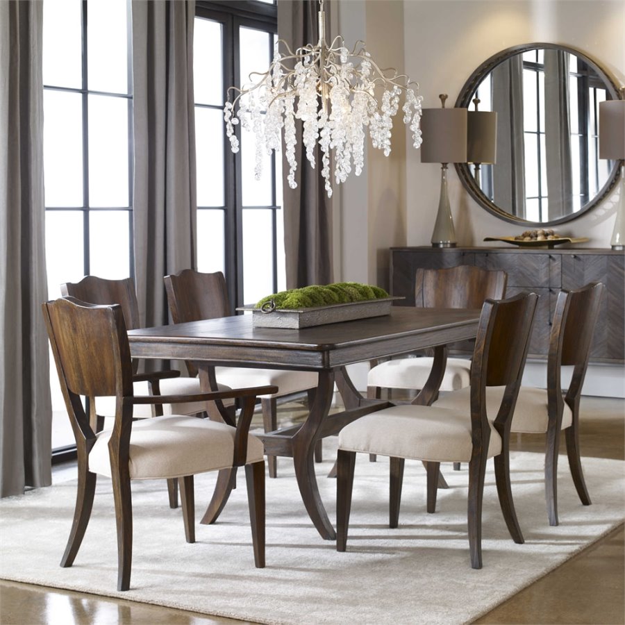 Another important factor in dining room lighting ambiance is the use of a dimmer on the chandelier and using other lighting sources in the room, like candles and lamps on a sideboard. You see, the light shining down from an overhead chandelier will cast harsh shadows on faces…and light sources lower to the table will counteract that effect. Who doesn’t look better in candlelight, anyway? Another solution to soften the light is to use individual shades on the chandelier bulbs or select a drum shade chandelier. Just like lighting in a bathroom where sconces on the sides of mirrors give a better glow to the face instead of a fixture directly overhead. Perhaps you are considering a rectangular or oval lighting fixture? I love all the options for rectangular and oval fixtures available today, and the abundance of these shapes will give you many options for a rectangular table, especially one that is narrow. Below is a photo from KW Designs (Del Mar, CA) which features a Jonathan Adler “Meurice” chandelier in a mid-century transitional setting. I love the use of wood in the room and the live-edge table (which, by the way, you can get here on the East Coast through me at Harden Furniture). 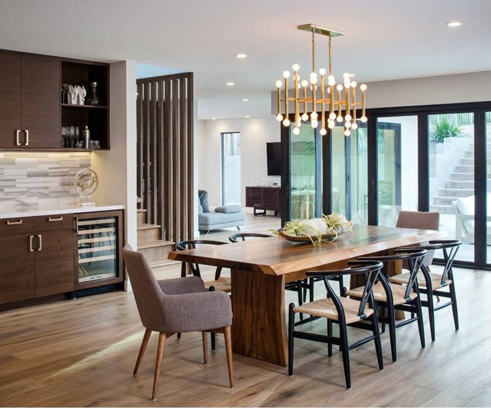 Another popular lighting option is the hanging of multiple smaller mini-chandeliers or pendants over a dining room table. I much prefer it when 3 or more are used rather than just a pair (just a designer thing……) Other proportion advice for the dining room: the area rug. For your dining room, you must find a rug size that allows the table and chairs to completely sit on the rug, even when the chairs are pulled out. For most dining room tables an 8’ x 10’ rug may be sufficient, but most certainly a 9’x12’. Of course, circular tables require round rugs. Here’s my last piece of advice for making your dining room comfortable for guests; nothing says “gracious entertaining” more than an arrangement of fresh flowers. Because it’s the holiday season yesterday I visited an Open House by Isabelle Zee, a floral designer in Sudbury who creates the most spectacular arrangements, each a sculptural work of art you wish would last forever. You can learn about her business, Les Bouquets Du Grillon, at her website: http://www.bouquetsdugrillon.com/gallery.html Here are photos of some of Isabelle’s custom creations that she showcased during the Open House. Amazing! Just remember the rule that your guests should be able to see each other across the table and therefore any center floral arrangement that you put on the table shouldn’t be too tall. And here is the arrangement I purchased from Isabelle for my own Thanksgiving table. I guess that I will have to use the “good china” to do justice to this centerpiece! 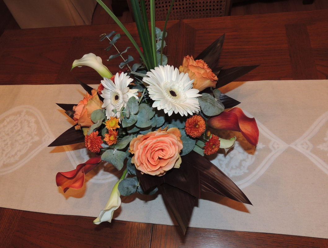 While attending yesterday’s open house it occurred to me that this coming Saturday, Nov 25th, is “Shop Local Saturday”. Since I heartily agree with the concept of supporting local small businesses in your town I wanted to share this news with all of my clients, especially those who in Sudbury and surrounding towns of Concord, Acton, Maynard, Wayland, and Weston. Sudbury has some wonderful artisans and shops for décor items, and I look forward to sharing news of other local business owners with you through my blog. It seems like great new small businesses are popping up in Sudbury and the surrounding towns all the time. Since I can’t seem to keep up with them all I’m grateful to my friend Ellen for introducing me to Isabelle Zee of Les Bouquets du Grillon. Buy Local!! Happy Thanksgiving! I have much to celebrate this year. Blessings to you and yours for a Happy Holiday.  Today let’s discuss using the often overlooked stripe fabric for upholstered pieces. Why don’t stripes get more attention in the fabric selection process? Well, one reason is that it is exceedingly hard for most people to envision a stripe on a piece of furniture when just looking at the swatch or a bolt of fabric. All that verticality...you start to get a bit wonky thinking the stripe will dominate and close in…jail cell mental image perhaps? But in smaller furniture pieces, like ottomans, stools, occasional chairs (not skirted), and pillows (especially!), stripes really add zip and tailored crispness. Especially paired with a bold wallpaper, like in this Thibaut photo I just received in my email. These striped stools really finish this beautiful entry space! 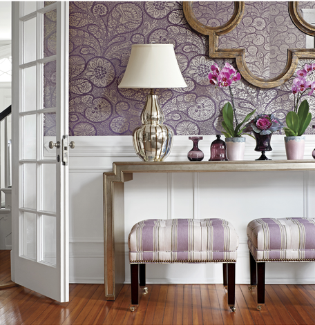 As another example, below is a fresh and inviting family room sporting several stripes, created by designer Garrison Hullinger in Portland, Oregon. 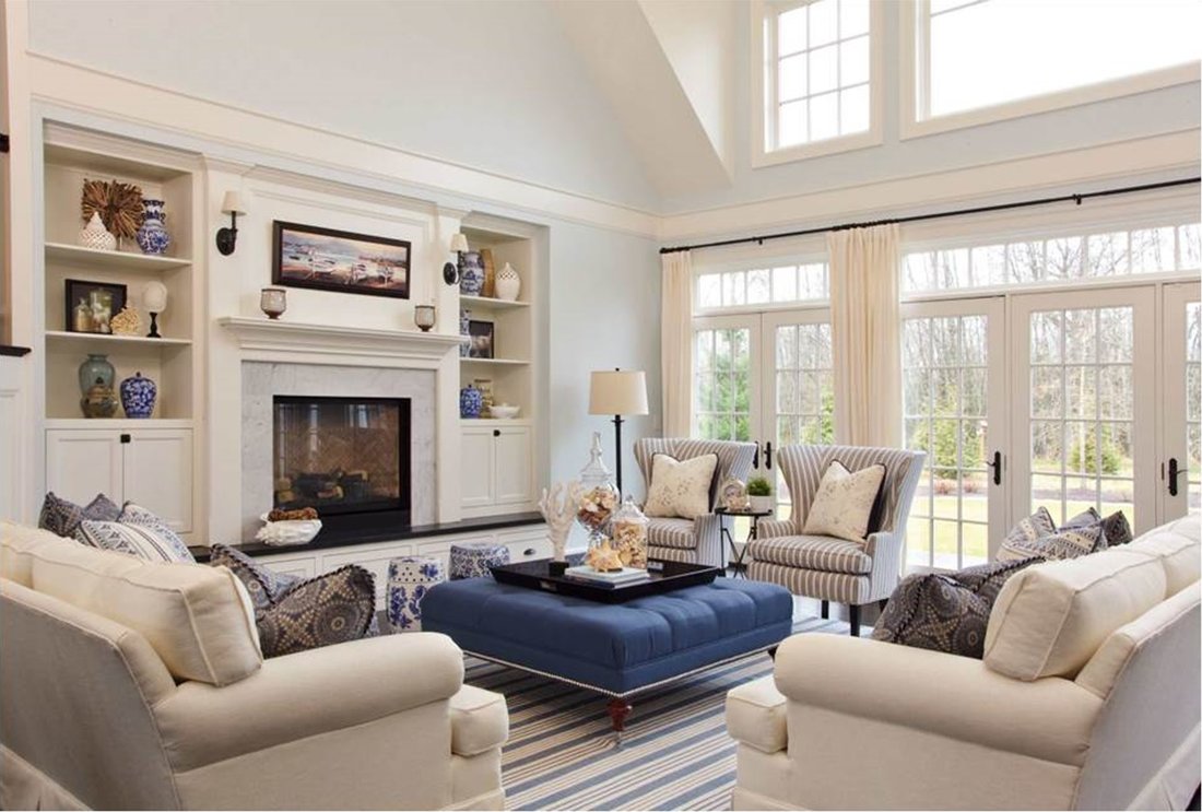 Stripes in a coastal décor is a classic look, but note how pretty and interesting the slender stripe looks on the wing chair…I love the way your eye goes to the mitered effect on the curve of the back of the chair (which has to be perfectly matched, naturally). The rug is a subtle and interesting stripe, with a different scale than the chair. This is such a calming interior that really could be anywhere, mountain cabin, coastal, suburban family room. For more inspiring interiors and stripes, here is a link to Garrison Hullinger’s Houzz site: https://www.houzz.com/pro/ghid/garrison-hullinger-interior-design-inc Below is a fan-back chair from Chairish (https://www.chairish.com/) that demonstrates a very effective way of finding the exact two colors for a striped fabric in the exact dimension you seek…make it with two different fabrics. By the way, Chairish is a cool site that pairs sellers and buyers of vintage furniture and décor. This center-stripe technique is perfect for updating a cherished family chair to harmonize with a casual or transitional décor. I would caution you, though, about making the center stripe too narrow, less than 6”. I personally am not a fan of the look where at first glance, you think it’s an actual narrow ribbon running down the chair similar to at a museum that indicates “don’t you dare sit here!” Just saying…make the width of that center stripe scream “Yes, please do sit yourself down right here and stay awhile!” This chair from Chairish looks super inviting, like a big hug; and note that it is paired with a red and white Oriental carpet…nice! 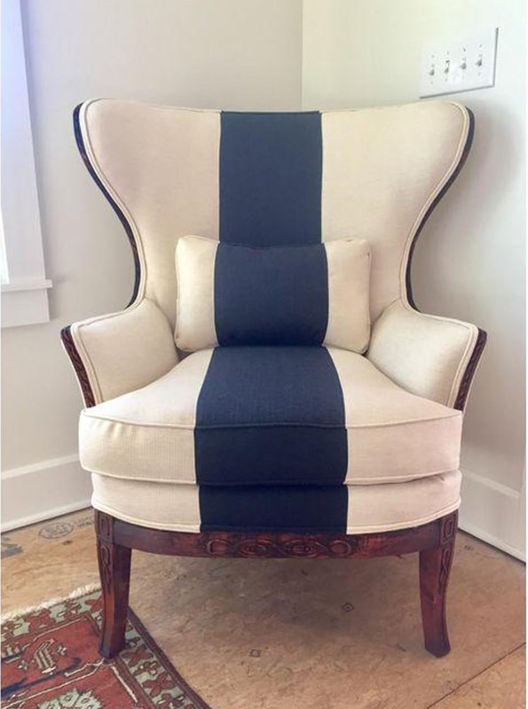 As a designer and fabricator, I love to use stripes in creative ways on pillows. This summer I fashioned lots of pillows from remnants, experimenting with stripes on the diagonal and mitered effects.
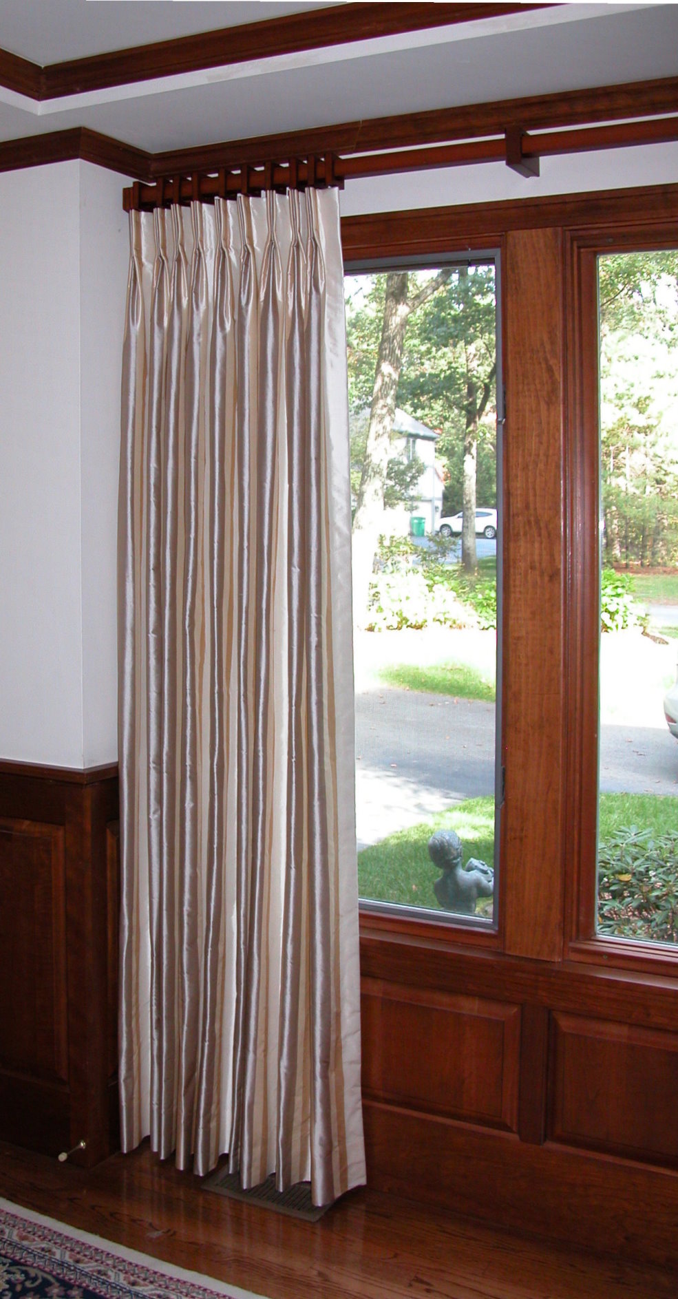
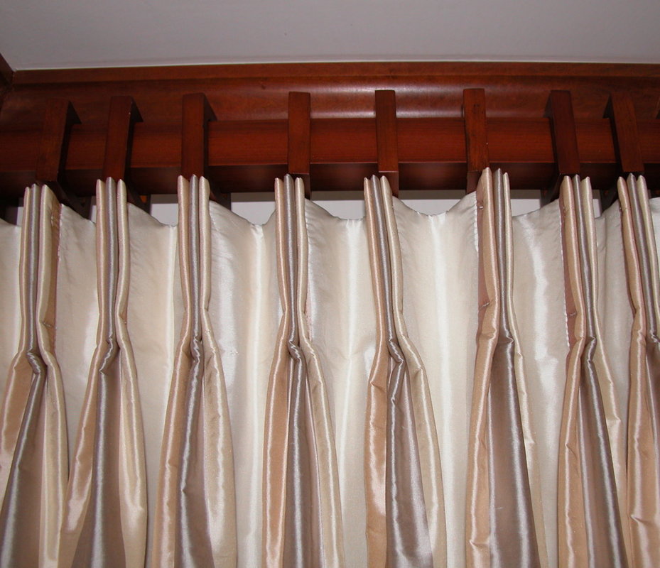
Stripes on window treatments are a natural…whether in children’s rooms, coastal settings, or more formal spaces. Below is a drapery panel treatment I did in a home office, with the subtle striped silk “pleated to pattern” (see Blog post “Pleating to Pattern”, 6/25/2017). Below that photo is a closeup of the pleat which I stitched down to further emphasize the stripe colors.
So, when you decorate your home I encourage you to consider using the “simple stripe” in your next décor project. Used creatively and thoughtfully, a simple stripe becomes sublime. (Note to my readers…I don’t actually think I have ever used the term sublime in a blog before…more coffee on this cold fall morning, please!) Happy day to you all as you prepare for Thanksgiving next week.  |

Barbara PhillipsBarbara Phillips, interior designer and owner of Center Stage Interior Designs, has delivered impeccable window treatments and design services to both residential and commercial clients in Massachusetts since 2001. Categories
All
Archives
March 2021
|

 RSS Feed