|
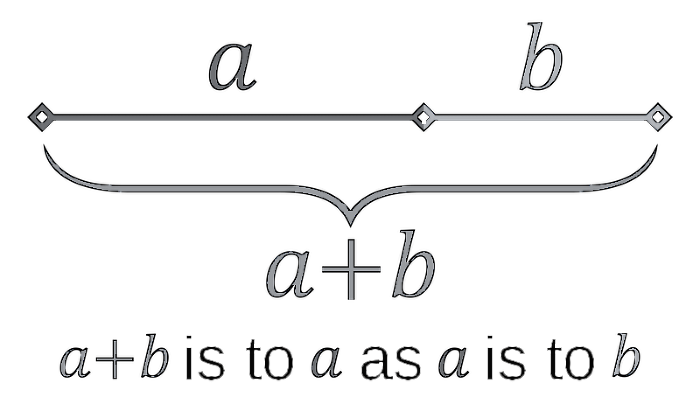
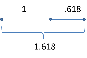
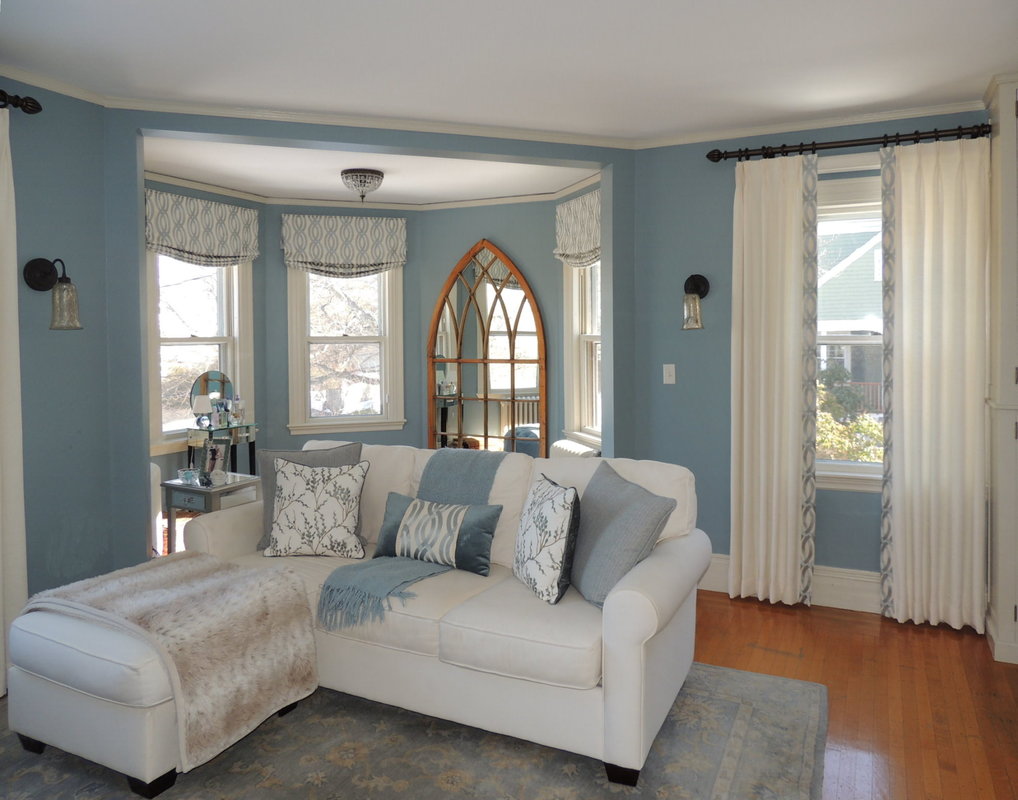
A designer friend of mine recently asked if I had any reference material to help her determine the proper proportion and scale for pillows on a sectional sofa for a client. “Well, yes,” I replied, “I did an article for a window coverings trade magazine a little while ago that addressed proportion and scale, and what a “pleasing proportion” is all about.” For definition purposes, scale is the size of something in relation or comparison to other things, and proportion is the relationship of the part or parts of something to the whole). So, here’s a little tidbit from that article to give you a small taste of proportion. Spoiler alert…there is math up ahead…but it’s algebra, and you can handle it… It all started with those genius Greeks Way back when the Greeks were building their masterpieces of sculpture and architecture like the Parthenon, they developed some “pleasing proportions” and a concept called the “Golden Section” or “Golden Mean.” From a geometric model, they developed a progression of numbers ― 1, 2, 3, 5, 8, 13, 21, 34 ― in which the two preceding numbers added to each other develop the next number in the progression. Thus, 1+2 makes 3, 2+3 makes 5, and so on. And this sequence forms the basis of proportions we’re all familiar with (think photo processing: 3x5, 5x8, 8x13, 13x21, etc.). They further developed the Golden Rectangle, also known as the Golden Mean, Golden Ratio and Divine Proportion. It’s a ratio or proportion defined by the number Phi (=1.618). Now that we know about Phi, our magic number, how do designers apply this to concept? Well, phi is everywhere--science, nature, human form, architecture, art, and everything beautiful, including your interiors! In the photo from Antiquefireplace.net, we see the graphic depiction of the golden mean ratio (looks like a nautilus) overlaid on a classic door opening. Such beautiful architecture, love that classic look and the floors. When we’re not designing the Parthenon, we can use the proportion of .618 when we are determining where to place something, and symmetric, right smack dab at the center, isn’t right. Think chair rail height. Think size of rectangular pillows. Think architecture of doorways and windows. Think placing your drapery pole either .618 of the space down from the ceiling, or up from the window (never exactly in between!) The Golden Mean applies to anything, vertically or horizontally…a 3x5-foot table or art piece is in a pleasing proportion, as are multiples of these dimensions (a room 12x20 feet or 15x25 feet). 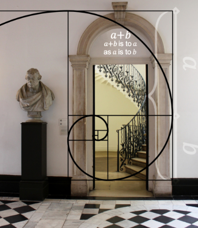 The Golden Standard The Golden Mean/Golden Ratio/Divine Proportion can be derived with a number of geometric constructions, each of which divides a line segment at the unique point where:
Phi = (a + b) / a = a / b = 1.618 If you take a line as 1, then a =.618, and b = .382 This division of a line at 0.618 makes a pleasing proportion versus an exact division of the line. Now, going back to our pleasing proportions of 3/5, 5/8, 8/13, etc, you will see these ratios are always very close to the Golden Mean of 0.618. Summing Up Thanks for getting through my Math rant. Can you tell I was a Math major for my undergraduate degree and geometry was pretty important in my mental marriage of math and design? All you need to remember is .618. Trust me. 
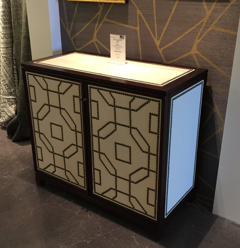
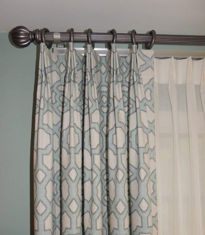
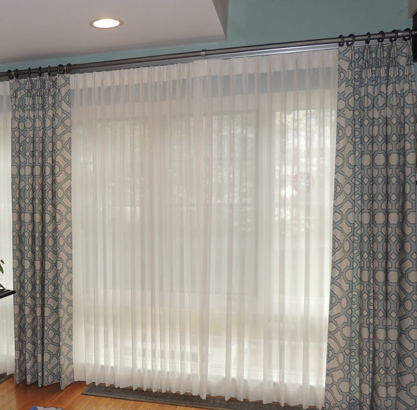
Overall, the Boston Design Market was an excellent show! Thanks, BDC for delighting us with your incredible design and business-of-design programs and feast for the eyes. Can’t wait to bring my clients to the BDC so they can take in all the scrumptious offerings in one easy trip.  One of the hallmarks of custom drapery fabrication of a patterned fabric into window treatments is “Pleating to Pattern.” Simply said, the layout of the fabric into pleats takes the fabric’s pattern into primary consideration, and this Custom technique (yes, with a capital C) is standard at Center Stage Interior Designs. Because you will find that the pleats make a pattern of their own too. Here is an example of a ready-made drapery from Ballard Designs that is NOT pleated to pattern. It’s a great fabric, one which my client Nicole (and I) absolutely adored to go with her living room painted in Benjamin Moore Wythe Blue (HC-143). 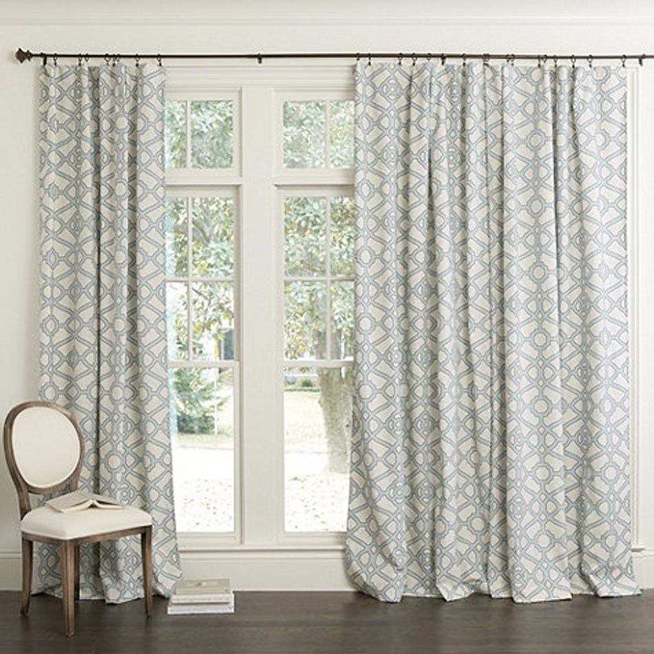 But…the fabric looks a bit slouchy on the window, and the haphazard pleating scheme was definitely not the tailored look my client wanted. So, here is the way I fabricated Nicole’s draperies “Pleated to Pattern.”
Here is another example of a gorgeous geometric fabric pleated to pattern in a dining room: 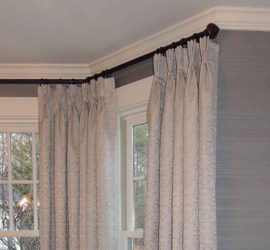 And, finally, a photo of an otherwise gorgeous room that has, regrettably, NOT pleated their custom draperies to pattern. I put this in the “what were they thinking category?” This photo is from Elle Décor Magazine, and their caption states, “In the master bedroom of an apartment on NY’s Upper East Side designed by Brian McCarthy, the armchair upholstery and linen curtains from Quadrille are custom printed with a fern-like pattern.” Well…in my opinion, if you get CUSTOM-PRINTED fabric, you should be able to control the pattern repeat so your custom draperies would be pleated to pattern. Can’t imagine how much this room costs, and really, I just love all the elements (maybe minus the zebra head). However, their custom workroom should have advised them of the pleating issue, and the designer/workroom team could have figured out a way to make the fabric work better. As a drapery fabricator and designer, I want to take these draperies back to my own fabrication studio in Sudbury and make them perfect… That’s it for our lesson of Pleating to Pattern. May all your patterns be pleasant and draperies pleasantly-pleated! 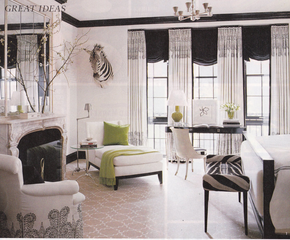  A few months ago, the Boston Design Center held a fun event where renowned Boston designers gathered in a seminar and got to give “thumbs up” (well, actually paddles saying “Love it”), or “thumbs down” (aka “Lose it”) to trends and styles that have been dominating the design scene for the past several years. The event, “Love it or Lose it: A Trends Forecasting Game Show” was a hoot! I thought I would share the list with you all… 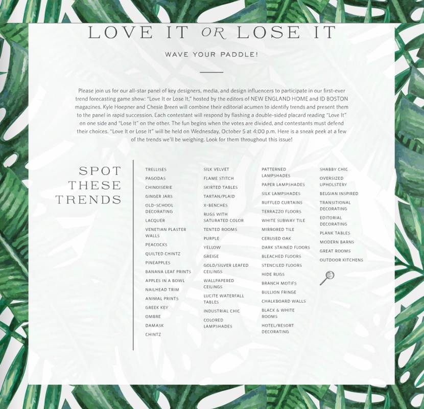 So what do you think…which are your top 5 “Love it” and top 5 “Lose it?” Here are mine:
Regardless of your choices (and mine), it’s interesting to contemplate the ebb and flow of design elements. The important thing is to articulate what you like to your designer, and why, and it’s perfectly okay to nix “what everyone else is doing.” After all, your interior should be Personal, Customized, and Comfortable for you and your family.  Welcome to my blog! Thanks for stopping by for a look around. For my initial blogpost, I thought I would give you an overview of the categories of topics I’ll be writing about:
The last entry, “Your Questions Answered” is the one where I need your assistance! While the past 16 years as Owner and Interior Designer at Center Stage Interior Designs have given me LOTS of ideas for blog entries, I really want to know what YOU are thinking and wondering about. So, if you have a design question, a design challenge, or idea you would like me to address, use the CONTACT FORM and send me you question. Photos are appreciated, too, because sometimes they say everything about a dilemma.  |

Barbara PhillipsBarbara Phillips, interior designer and owner of Center Stage Interior Designs, has delivered impeccable window treatments and design services to both residential and commercial clients in Massachusetts since 2001. Categories
All
Archives
March 2021
|
 RSS Feed