|
This week Benjamin Moore revealed their new 2019 Color of the Year….drum roll, please…AF-690 Metropolitan from their Affinity Collection…which is a………medium gray. Oh, meh. Even Benjamin Moore calls it “effortless” in their official release: “Comforting, composed and effortlessly sophisticated, Metropolitan AF-690 exudes beauty and balance,” said Ellen O’Neill, Benjamin Moore Director of Strategic Design Intelligence. “It’s a color in the neutral spectrum that references a contemplative state of mind and design. Not arresting nor aggressive, this understated yet glamorous gray creates a soothing, impactful common ground.” 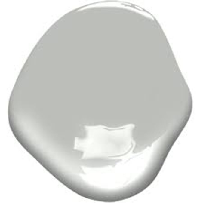 Here’s a look at AF-690 in a room setting in an image provided by Benjamin Moore. Please note that the walls look a bit lighter in this photo than I expected, but it is a beautiful photo of a room with umph and architecture………like the use of a neutral gray paint demands. 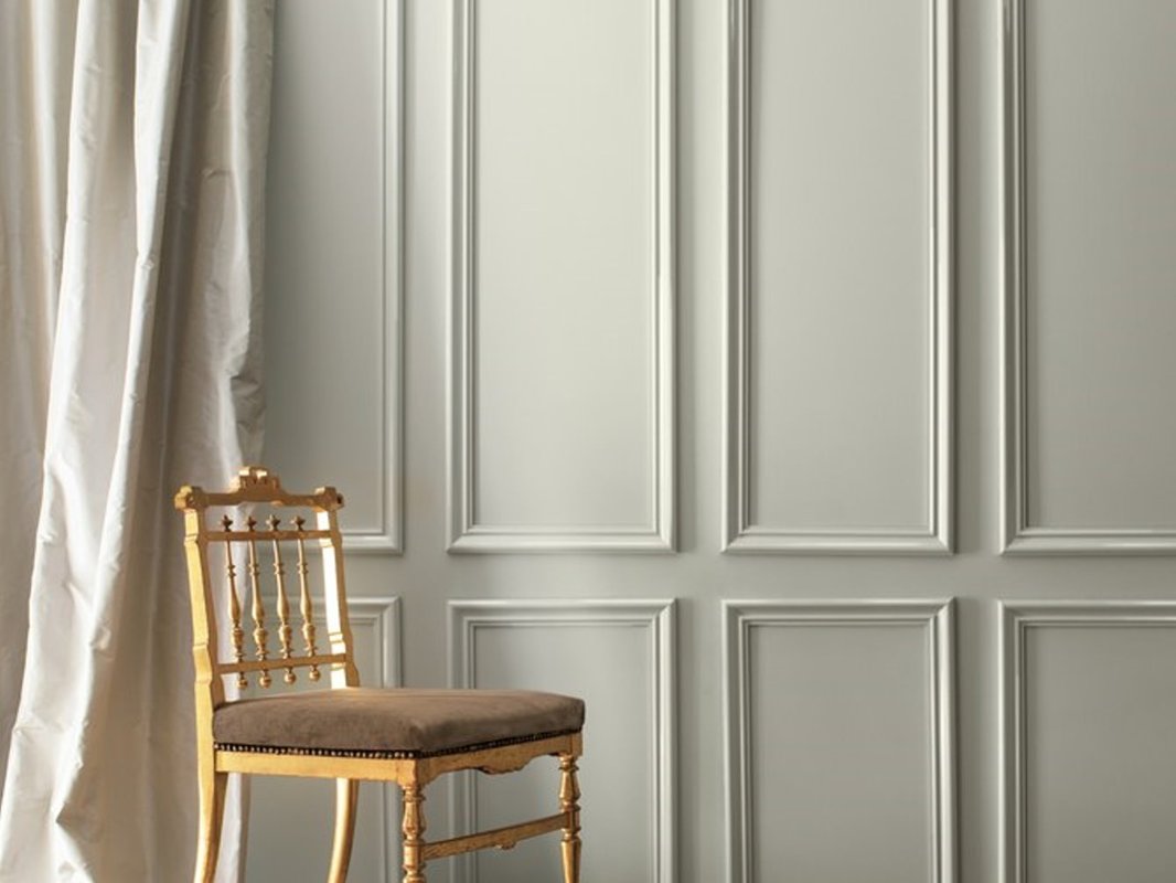 Now that the 2019 Color of the Year (COTY) has been revealed, everyone is discussing it in their design blogs this week (do a Google search on it), and you will see some beautiful room photos. I don’t have any myself, as I have never specified this color before, and it does seem a bit curious to me that Benjamin Moore selected a fairly obscure gray that no one has been using or talking about as its flagship color for the year. But it is similar to Coventry Gray HC-169, which is a popular color, so don’t think that Metropolitan is too far out there. In the press release, Benjamin Moore calls Metropolitan “effortless” and “not arresting or aggressive.” What do we think about those adjectives? In designing for my clients, the last thing I want my clients to conclude about our color selection is “effortless” or “not impactful.” But, having had two days to process the revelation of AF-690, and put it in context with the other color happenings and trends in the world of interior design, I guess it’s not that surprising a selection for this year. Especially since the 2018 Benjamin Moore COTY selection of Caliente, (a bold red) was interesting, but in reality, it probably prompted very few to head back into red territory for their décor. On the other hand, aren’t we already full-throttle about 5 years into the “Gray Era?” Color trends usually last about 8 years. My own take on Metropolitan is that it’s a neutral color with a cool undertone (bluish in north-facing rooms, a tad greenish in other exposures), a nice backdrop for either stunning architecture or to use with fresher and clearer happy hues like watermelon, lemon, periwinkle, or aqua. The Light Reflectance Value (LRV), which is a percentage that describes the quantity of light reflected from a surface compared to black (0%) and white (100%), for AF-690 Metropolitan is 50.5%. That is why I call it a medium gray, instead of a light gray. You might look at photographs on the internet of rooms in Metropolitan and be convinced it’s a light gray. But the LRV parameter will ALWAYS give you an objective measurement of how dark it is, and the LRV on every color is published right there in the fan deck in the index at the back or on the back of a swatch…check it out. Benjamin Moore describes its Color Trends 2019 as “a corresponding palette of 15 harmonious hues that further amplify the cultured grace of Metropolitan AF-690.” The Color Trends 2019 palette ranges “from ethereal neutrals to frothy pinks to rich blues and greens.” These are their words. It is interesting to me how the whole palette is fairly cool. 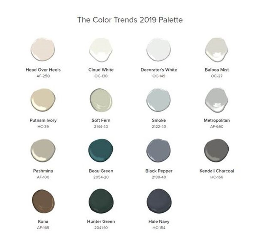 As for AF-690 Metropolitan, I can see this medium gray, with its LRV of 50.5%, pairing really well in a coastal setting with a clear and crisp cool palette, like those in the fabrics and paints of the Maine Cottage line: http://www.mainecottage.com/ 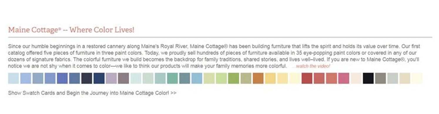 But this coastal connection is probably the opposite of what the Benjamin Moore folks had in mind about Metropolitan, as evidenced by their urban-inspired video for AF-690: So How Do You Use Light or Medium Gray in Your Décor The main thing to understand about neutral grays like Metropolitan is that they are indeed “supporting players” which absolutely require something else in the room to be the STAR, like:
So, that’s a wrap on the Benjamin Moore Color of the Year for 2019: AF-690 Metropolitan. If you are totally confused at this point, you can always hire me to perform a color consultation to explain the LRV, value, hue, and other Color-speak words. Or, you can hire me to choose a gorgeous color palette and new paint color(s) for your home. You have to look at any paint color in the context of the room you are decorating with its own light and surroundings, and all the recommendations from the internet and paint companies will not guarantee a success - so we can work together to personalize the process for wonderful, unique YOU.  Comments are closed.
|

Barbara PhillipsBarbara Phillips, interior designer and owner of Center Stage Interior Designs, has delivered impeccable window treatments and design services to both residential and commercial clients in Massachusetts since 2001. Categories
All
Archives
March 2021
|
 RSS Feed