Barbara Phillips
  • Home
  • Portfolio
  • Services
  • About
  • Client Journey
  • Vendors & Resources
  • Blog
  • Contact
  • Home
  • Portfolio
  • Services
  • About
  • Client Journey
  • Vendors & Resources
  • Blog
  • Contact
Search

Interior Design Terms:  Understanding the Lingo

7/30/2017

 
I’m a fairly plain spoken person, wishing to communicate and be understood by my clients on the first go-round, rather than using esoteric industry and design terms. But we all have our trade lingo, and I’m sure I’ve thrown out a few terms during client meetings that left my clients perplexed. Mutually understood reference terms are essential to effective communication so that the “message sent” equals the “message received.”  If you are the client, and you don’t understand an interior design term that someone uses, it’s useful, and entirely appropriate, to ask, “Can you give me a specific example or visual of that style?”

So what are all those interior designers, bloggers, and magazine article writers talking about?  With the goal of more effective communication, here are some interior design definitions that get used all the time:
​​
  • ​Bespoke:   Another name for custom.  The dictionary says bespoke means “of goods, especially clothing, made to order.”  The opposite of “off-the-rack.” 
​
  • Chinoiserie:  The imitation or evocation of Chinese motifs and techniques in Western art, furniture, and architecture, especially in the 18th century.  Chinoiserie is very popular today in traditional and transitional interiors. This mirror evokes a Chinese pagoda, for sale through Bellacor Designs.  
Picture
  • Clean:  A linear and uncluttered style with no frills (Jeff Andrews).
  • Collected: Describes a space that is filled with unique pieces acquired over time, creating depth (Jason Arnold).
  • Customer’s Own Material (COM):  Describes a situation where a furniture maker or drapery workroom will make a product using fabric supplied by the customer (designer or retail client).   For furniture, acceptance of COM is key because such manufacturers will make a custom product with any material, whether they stock it, or you provide it separately.
  • Curated:  Design that incorporates distinct style with a point of view, drawing from history (definition by Grant Gibson).
  • Custom:  A unique on-of-a-kind piece that is expressly made for a singular client to that client’s specifications.
  • Elevated:  Something that is kicked up a notch or taken to another level in style or design (Jeff Andrews). 
  • Edited:  Well thought-out and organized; minimal without feeling cold (Grant Gibson).
  • Layered: Building interest in a room through various levels of elements (Karen Vidal).
  • Open Concept:  When a home is designed or remodeled so that there are no walls between the kitchen, family room, and casual eating area.   This open concept plan is featured by Timberworx Homes in California.​
Picture

  • Overdone:  When a trend has been used too much and one feels the trend needs to be in the rear-view mirror.  Can also mean an interior that is overly fussy, whether chock full of too much furniture, accessories, or competing patterns.
  • Tailored:  Something with clean lines that holds up to the test of time, not fussy (Grant Gibson).  The Barcelona chair, designed by Mies Van Der Rohe in 1929 is an example of a tailored piece of furniture.  Just as good looking and relevant today as 88 years ago.​
Picture
  • Timeless:  Design style that stays away from trends that are too “now” to avoid quickly dating (Karen Vidal).
  • To-the-Trade:  A term that means products are sold through designers and businesses connected with the design industry, and are not sold directly to the general public.  
  • Well-Appointed:  Something of exceptional quality and craftsmanship (Grant Gibson).
  • Whimsical:  Elements of design that add a sense of humor, or make someone smile (Grant Gibson).
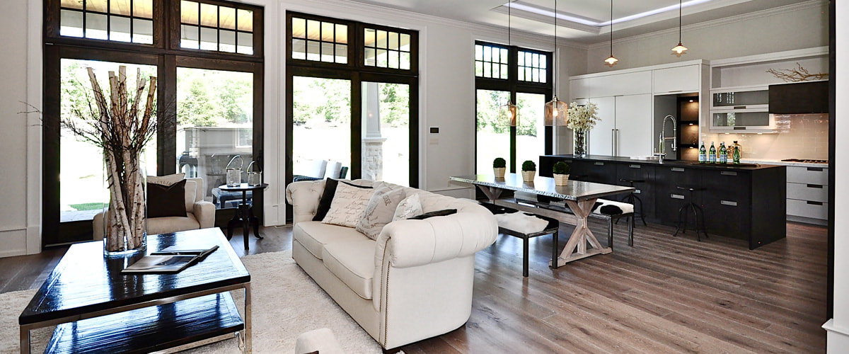
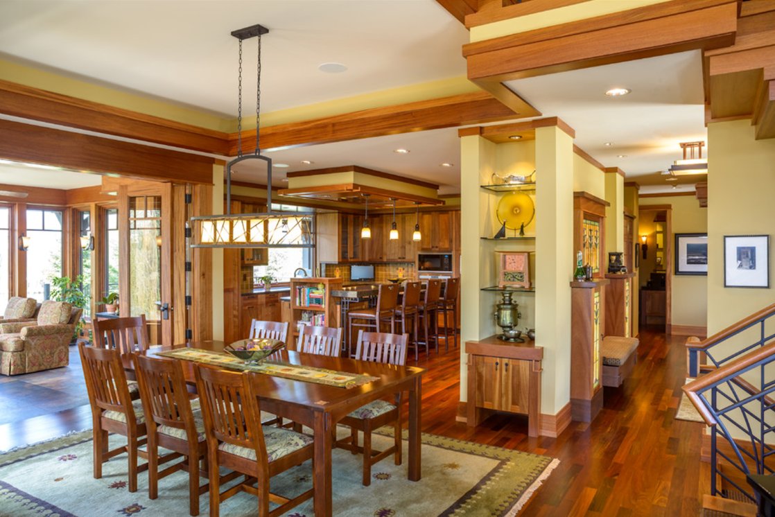
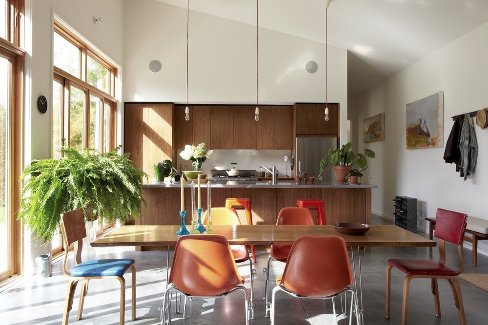
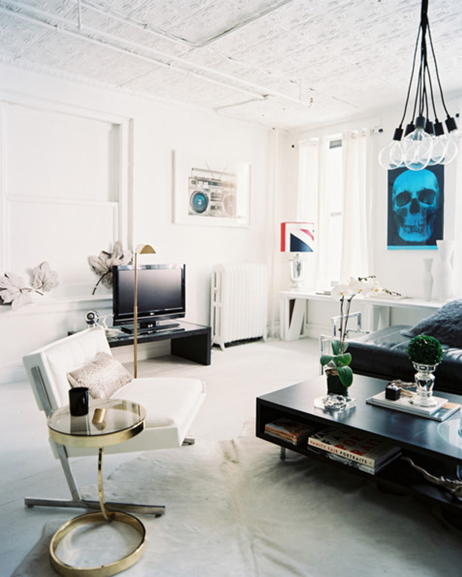
If you’re a client and you aren’t familiar with an interior design term someone uses when speaking with you don’t be afraid to ask for clarification. In today’s fast-paced world, who has time to get lines crossed? And remember – Photos speak volumes!
Picture

Defining Popular Interior Design Styles

7/30/2017

 
These days there are five very popular interior design styles in the interior design trade: Traditional, Arts and Crafts, Mid-Century Modern, Modern and Transitional. So that you know what each of them looks like I thought that I would give you a brief overview of the defining characteristic of each design style.
Traditional
Traditional interior design reflects classic European decor. Trademarks of this style generally include deep wood tones, architectural details, and elegant furnishings. This style is quite versatile and can be combined with other interior elements to create a unique look in a room. One of the most important facets of traditional interior design is the silhouettes, also called the lines, of the furnishings. Wing-backed chairs, claw footed tables, and curved furniture pieces that reflect the 18th and 19th centuries are examples of this. Common models for such traditional furniture are pieces attributed to the Queen Anne or Chippendale styles. Antiques are also often integrated into the Traditional design style, but many companies sell new pieces that mimic the lines of the old. (from Dwell Candy)  Photo of Traditional décor by designer Jack Fhillips in Traditional Home Magazine
Picture
Arts and Crafts
The Arts and Crafts movement took off around the turn of the 20th century. Like the Art Nouveau movement, it developed as a backlash against the overwrought style of the Victorian era. It rejected the factory-produced furnishings and decorative accents that prevailed at the time, embracing instead natural beauty and traditional craftsmanship. Artisans such as Gustav Stickley (who coined the term Craftsman, sometimes used for this style) and William Morris were seminal in establishing the Arts and Crafts code, and it characterizes much of architect Frank Lloyd Wright’s work.  (from Dwell Candy). The Arts and Crafts design style is consistent throughout this home in Wayzata, Minnesota designed by SKD Architects.
Picture
Mid-Century Modern
Mid-century modern design refers to a particular design style prevalent in the 40’s, 50’s and 60’s. The goal of mid-century modern style was to bring modernism to post-war suburbs, creating structures with windows and open floor plans, in order to bring the outdoors inside. A pioneering builder of mid-century modern homes was Joseph Eichler. Popular furniture designers include Eames, Noguchi, Saarinen and Nelson. The design elements of Mid-Century Modern include simplicity, avoidance of ornamental details, and materials such as wood, plastic, stainless steel, lucite and plywood.   Mid-century modern interiors are highly influenced by Danish design, which uses teak, oak, rosewood and walnut in furniture pieces. (from Dwell Candy)   Photo shows kitchen at the Confluence House in Harlemville, NY by INC Architecture and Design.
Picture
Modern
Modern interior design derives its influences from the modern art movement that preceded modern design. In painting, Modernism began with the Impressionists and others who used abstraction. Modern interior design grew out of the decorative arts, notably Art Deco, in the late 19th and early 20th centuries. It reached its peak in the 1950’s and 1960’s, which is why designers and decorators today may refer to modern design as being “mid-century.” (from Dwell Candy).   Sometimes modern has more graphic impact, drama, and use of metal and glass than mid-century modern.  Photo of modern living room done by Patrick Cline as shown in Lonny Magazine.
Picture
Transitional, also called Young Traditional or New Traditional
Transitional interior design is a combination of traditional and contemporary design. It’s a popular design choice for those who love traditional design but want an updated space with modern influences. The design elements of Transitional Interior Design uses warm neutrals to ground the space. Colors such as cream, taupe, tan, khaki and gray are often used as a unifying palette. Patterns are usually understated as well The neutral palette allows for interesting textures to be used in transitional interior design.  Natural fibers, such as jute and seagrass, are used 
Picture
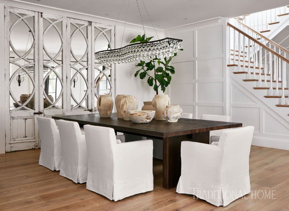
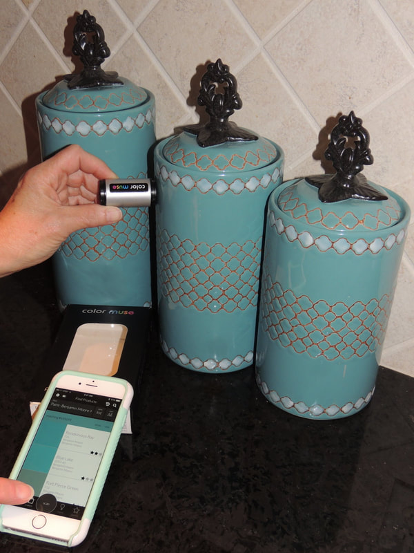
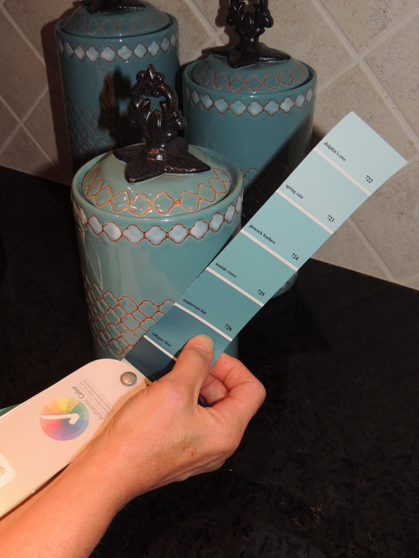
 to add dimension; a blend of shiny and matte finishes help layer a room; and leather, burlap, chenille and rattan add further interest. Transitional interior design blends masculine and feminine elements to create a comfortable space for everyone. Accessories are kept to a minimum and aren’t too fussy. Wood is used to balance softer carpets and drapes. The overall feeling of the room is comfortable. (Dwell Candy). This dining room from Lisa Peterson and Melanie Hayes in Traditional Home shows the traditional architecture in the mirrored wall cabinets, paired with the modern chandelier and industrial-like table base, all done in neutrals.
I hope this post helps you interpret the nuances of today's most popular interior design styles. If it does - great!!  If not - please don't hesitate to send me your questions. 
Picture

Color Muse Tool for Color Matching—You Just Have to See This!

7/23/2017

 
As I detailed in my last blog post on the “Top Ten Color Mistakes”, since colors are so vital to decorating I want to share my latest find—a digital tool for accurately “reading” colors:  the Color Muse.

Basically, the small Color Muse device has its own light source (charged by an internal battery that can be recharged with the included micro USB power cord), and you operate it through an app on your phone. The Color Muse works with an iPhone, iPad or Android phone.

To demonstrate the Color Muse, in the photos below I have used the app to tell me the corresponding Benjamin Moore paint color for the teal canister in a kitchen.  After a couple of seconds the Color Muse app chooses “Rendezvous Bay 726” as the closest paint color match.  I concur!
Picture
Picture
Picture
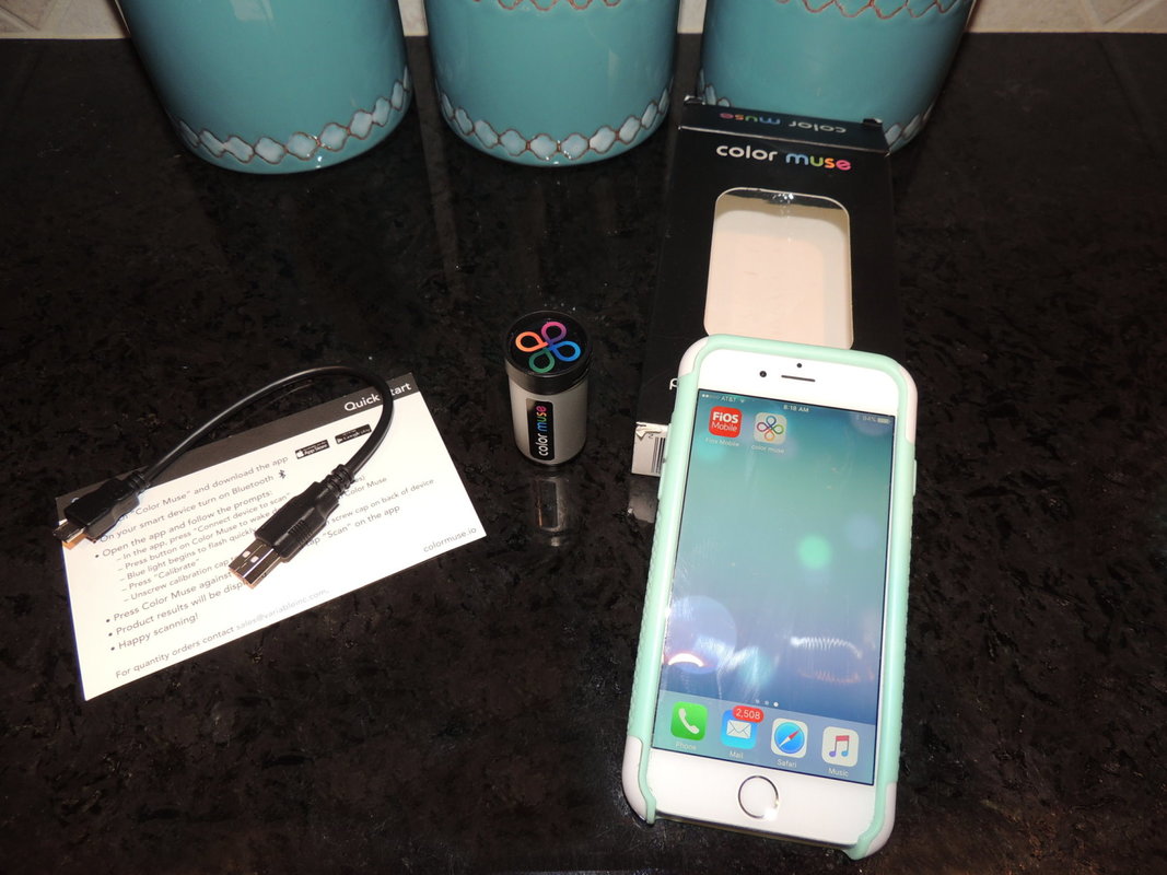
If you are interested in finding out more about the Color Muse, here is a link to more information on this fantastic product:  
                         Color Muse Website

If you need help matching colors in your home, I would love to demonstrate the Color Muse tool for you in your next interior home project!  I just used it yesterday with a client who purchased a lakefront home in New Hampshire, and she is in search of the existing wall paint color to do some small touch-ups.  In two minutes we identified the color…how cool is this techie product???
Picture

Top Ten Color Mistakes

7/23/2017

 
Picture
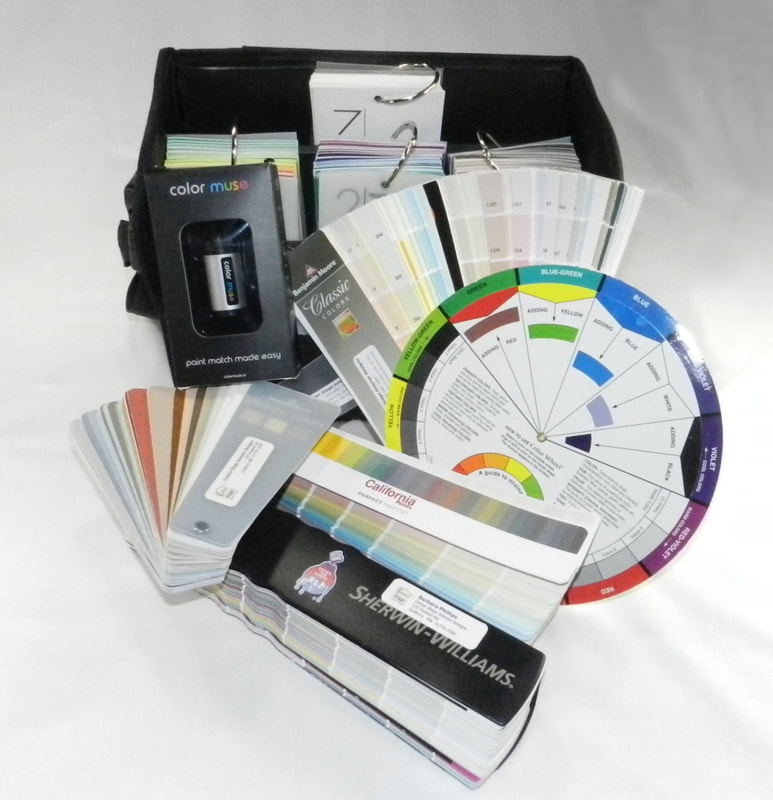
​Today I’ll relate the top ten mistakes I see clients make when choosing paint and color schemes for their homes, either when they don’t have a practiced interior color sense, or a designer who can help them with this critical area.  

​Don’t make these same mistakes, as repainting can be extremely frustrating, time-consuming, and expensive!

TOP TEN COLOR MISTAKES YOU WILL NOT MAKE:

​​1. When choosing a wall color, using the exact color taken from a rug, art piece, or fabric without regard to intensity of that color. 
  • Say you love the bright turquoise stripe on the trim adorning your crisp new white bedding, and you think painting the walls a turquoise will give you that tropical vacation feeling every day.  I like the inspiration!  But if you match that same color (that is in less than 1% of the bedding), and put it on your walls (which would represent about 60% of the surfaces of the room, WOW, it might be totally too intense for that restful feel.  Toning down the color, in value (the lightness or darkness) and saturation (the amount of pure color pigment) will give you the result you are looking for.  See our next blog post for information on the Color Muse tool which Barbara would use to identify the original turquoise color to make it a starting point for extrapolating and determining the best wall color.
2. Not testing color on the walls first with boards or swatches.
  • It is imperative to test your top 3 or 4 wall color choices on the walls themselves in different lighting, at different times of day, and on different walls in the space.  Colors will look vastly different at varying times of the day, and if you rely on selecting a color at the paint store (under extremely different lighting than in your own home), you may be sorely surprised!  How to avoid this mishap?  Test, test, test.  Barbara will order multiple swatches of paint colors from the paint companies for you (Benjamin Moore, Sherwin-Williams, and California Paints), and you can tack these up on your walls with blue tape, and the move them around.  Or, you can get the larger paper swatches from your local paint store, or purchase small cans for testing. But I highly suggest you don’t polka-dot your walls with painting 10 different colors right next to each other at the same time...a bit confusing, and more work for your painter on prep…but do what you must to test a color first.  
3. Accepting a “color match” of a paint color made from a different brand of paint.
  • This is one of my pet peeves, and I can’t stress this enough to my clients. It is essential that if you choose a “Benjamin Moore” color, you actually purchase it as a “Benjamin Moore” paint formulation.  Sure, Home Depot, Lowe’s and other stores will “computer color match” any color for you, including a Ben Moore swatch, but I guarantee you it won’t be exactly the same.  AND, more important, you will not be able to match the paint color down the line if you need more for touching up or an adjacent room.  And please buy quality paint to begin with, you (and your painter, be they a professional or your teenage daughter) will be much happier in the end.  By the way, my go-to paint formulation for Benjamin Moore is their Aura paint…goes on like a dream, doesn’t splatter, easy for no-show touch up of “paint holidays.”  An excellent product.   Sherwin-Williams and California Paints also have excellent paint formulations, just don’t select the ones based on cheapest price.  In paint, “you get what you pay for.”
4. Testing paint colors in rooms lit by incandescent bulbs that are no longer available for purchase.  
  • Excellent, I am so glad you are testing your paint colors on the walls before you decide on the perfect color…but…hello…the old bulbs in your lamps might steer you in the wrong direction!  New technology in bulbs and new federal regulations that phased out good old fashioned and energy inefficient incandescent bulbs really make this the perfect time to visit the hardware store and get some new bulbs to try out in your home in conjunction with trying out paint colors.      This should be the topic of another longer post, but suffice to say that bulb technology really does matter, and  you have lots of good choices now!  And one more thing…if you got an energy audit a few years ago and they replaced all your bulbs with the corkscrew ones that take forever to warm up, and emit cold bluish light, you might want to run to the store and check out the newer options….you  deserve good, pleasant light instantly!
5. Failing to consider the exposure of the room (North, South, East and West) when choosing paint colors.  
  • In New England, where I live, we tend have an aversion to “cold rooms” in the wintertime, and a color with a cool undertone will certainly contribute to making a room feel and look cold if it has a northern exposure.  So, that is when we consider a “warm gray” with warm, beige undertones as opposed to a “cool gray” with blue undertones in such a situation. So, you can still have a gray room with the popular gray trend, but maybe consider more of a griege (a new term for a warmer gray that mixes gray and beige, like my favorites Benjamin Moore Edgecomb Gray HC-173, or BM Alaskan Skies, 972). 
6. Choosing a paint color first and then trying to find a patterned rug or patterned fabrics to go with the color.
  • Occasionally, a client is able to totally redo a room and choose all new items, including carpet, furniture, artwork, paint color, and window treatments.   What fun!  Then we can plan the room perfectly and it all goes together.  In such cases, if you plan to use a patterned rug, I suggest you find the rug/carpet of your dreams first, and then work your color palette off of that rug (paying attention to #1 above, of course). Why?  There are way fewer carpets/rugs that might meet your design criteria and budget than paint colors!  We can always find a paint to go with a patterned carpet or fabric, but not so easy the other way.  Thinking of a solid, sisal, or seagrass rug for your décor?  Okay, you can pick a paint color earlier in the process when your options on the flooring are very broad. But expecting to find the perfect red/blue antique color washed Oriental in the size you want at the price you want that goes with your new paint color…well, you can always dream…
7. Cutting the formulation of a paint color by 10%, 25%, or 50% and expecting perfection (without testing).
  • I know the situation, having just experienced it myself with a new bluish-green color for my mudroom. You like two colors on the same paint strip, but one is too dark, the other too light…and you want a mix, somewhere in between.  So off you go to the paint store and have the color mixologist do his/her stuff to create your perfect color.    But, beware, if that color is green and you request “cutting” it by say 25%, you will invariably get a MINTY version of the green that you might not have anticipated. Generally, paint formulations can be cut like this, but beware of the “green monster” (special tip for all you Red Sox fans) out there.
8. Using the painter’s recommendation for color, sheen, brand of paint, and paint grade over the designer’s. 
  • Now, I’m not throwing all painters under the bus here (my painter Declan is a dream, and does a wonderful job with quality materials)...but I have had some issue with painters who confuse my clients at the start of the project by wanting to substitute different product formulations than what I recommend.  Now, I respect painters and their product knowledge, but I want you to be careful about painters who:
    • Want to paint all matte (it hides more imperfections so less wall preparation is needed, but some matte paints are not kid and hallway friendly at all)
    • Color match with a different, usually cheaper, brand of paint
9.  Not having something white in a room to register a color.
  • One of my favorite professors in Design School was adamant about this point, and she was right:  if you don’t have something white in a room, how can your eye really discern the subtleties of a paint color or other colors in fabrics, rugs, and accessories?  In Massachusetts, and in 80% of the cases, the millwork presents a great opportunity for fresh white paint (I like Benjamin Moore White Dove as my #1 trim paint for any color room).  A little white is a good thing, in my opinion, just like some black in a room is also a good thing…I particularly like some light/dark contrast and interplay in my interiors.  Anyway, you can put the white on the ceiling if nothing else!  
10. Liking the name of the paint, and taking it too literally for describing the color.
  • First of all, I want it to be known that I would love the opportunity to officially name a paint color!  All those evocative names out there in my paint fan decks, sparking imagination and stirring the creative juices.  But, what if you are choosing a paint color and didn’t realize that “Nantucket Gray” (BM HC-111) is really a nice, olive green?  Beware, the Benjamin Moore Historical Collection, a truly great set of colors, is just jam-packed with this naming subterfuge.   To wit, Newburg Green is blue, Hepplewhite Ivory is yellow, Bennington Gray is beige, Carrington Beige is green, Elmira White is griege, Montgomery White is golden, well, you get the idea.  So, just take some of the color names “in name only” and get the actual swatch.
Picture

Windsor Chairs and Benches Have Timeless Appeal

7/16/2017

 
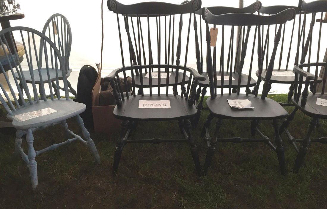
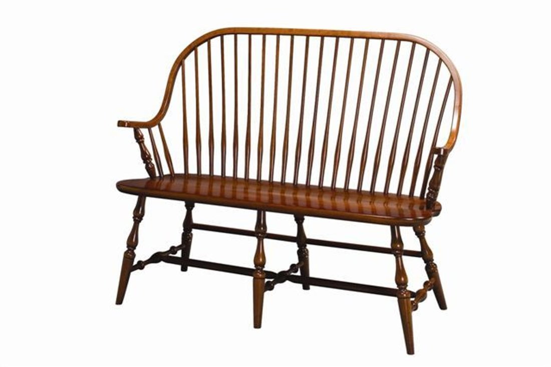
​I’ve always loved the styling and fine wood craftsmanship of Windsor chairs and benches; a classic staple of New England homes that are still very current in all sorts of locales be they coastal, mountain, country, urban or suburban.  When you think about the work involved in making such a chair/bench, and the subtle proportions involved, the Windsor style is truly a piece of art.
 
While my pursuit of a Windsor bench at the Brimfield Antiques Fair this past week was sadly unsuccessful, I did score a terrific resource to share with you.  First, let me point you to the furniture maker I have long admired, O & G Studio in Rhode Island (oandgstudio.com) that makes the gorgeous Atlantic Settee Bench you may have seen in New England Home, Elle Décor, the New York Times, Lonny, Vogue, and various other publications.  This is the bench I crave, and I have just the perfect striped fabric to make the crisp and tailored (but unstuffy) pieced cushion they feature here.  Striking, isn’t it?   And the black paint makes it look so modern and architectural.  
Picture
​At Brimfield, in the hunt for something similar to my dream bench (but narrower), I met a gentleman, Kevin Kille from “K Antiques Etc” in Lawrence, MA (at the Canal Street Antique Mall) who specializes in vintage Windsor chairs and benches; finding them and repainting them.  Here is his work on an antique set of chairs, shown at the Brimfield fair (which was very muddy the day I was there).

​During our discussion I learned that Kevin would take on projects such as repainting clients’ Windsor chair sets, and I have just such a project in the works with a new client.  So, score one for my client (a painter resource).
Picture
Picture
But what about my search for a Windsor bench? Since I didn’t find anything at Brimfield I continue to look elsewhere. Luckily, while recently researching benches, I’ve come across a few benches that are at a lower price point than the artisan quality of the O&G bench, but are still very viable stylistically. One of the pieces that I especially like was the Dexter bench from West Elm (shown in an outdoor setting). This Dexter bench is rather nice, and will certainly suit my mudroom, either in a natural finish, or in a painted out color.  The look that West Elm showcases is an example of how the Windsor style transfers over to more modern spaces. 
​Another option, from DutchCrafters (available online and in many finishes), comes with a higher back that would certainly suit an entry space.
Picture
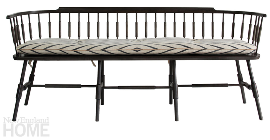
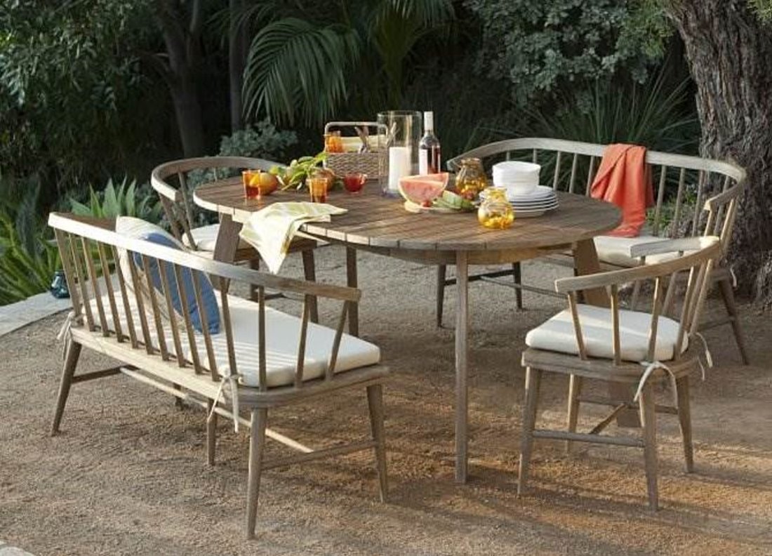
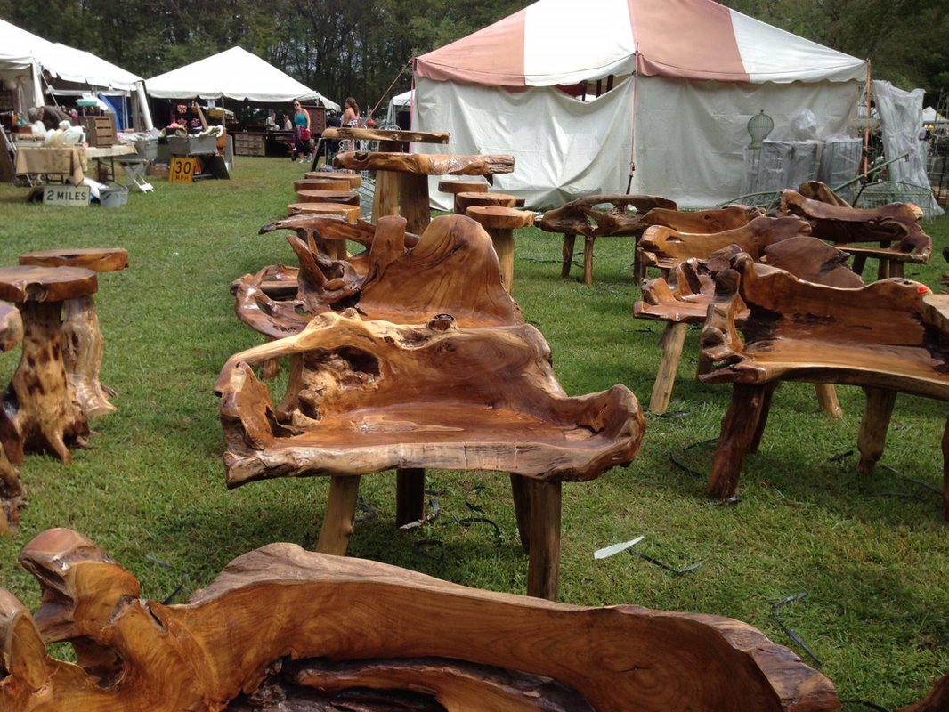
​For a dining area, Windsor chairs are very versatile and durable.   Here’s a photo of my client Monica’s eating area with such stylish flair…I can’t take credit for the overall design, it’s all her creation!  I was helping her with window treatments for the sliding door, and I couldn’t resist admiring the beautiful, kid-friendly, and fresh space that she had created.  Bravo, Monica!  I love it when my clients have a design point-of-view!
Picture
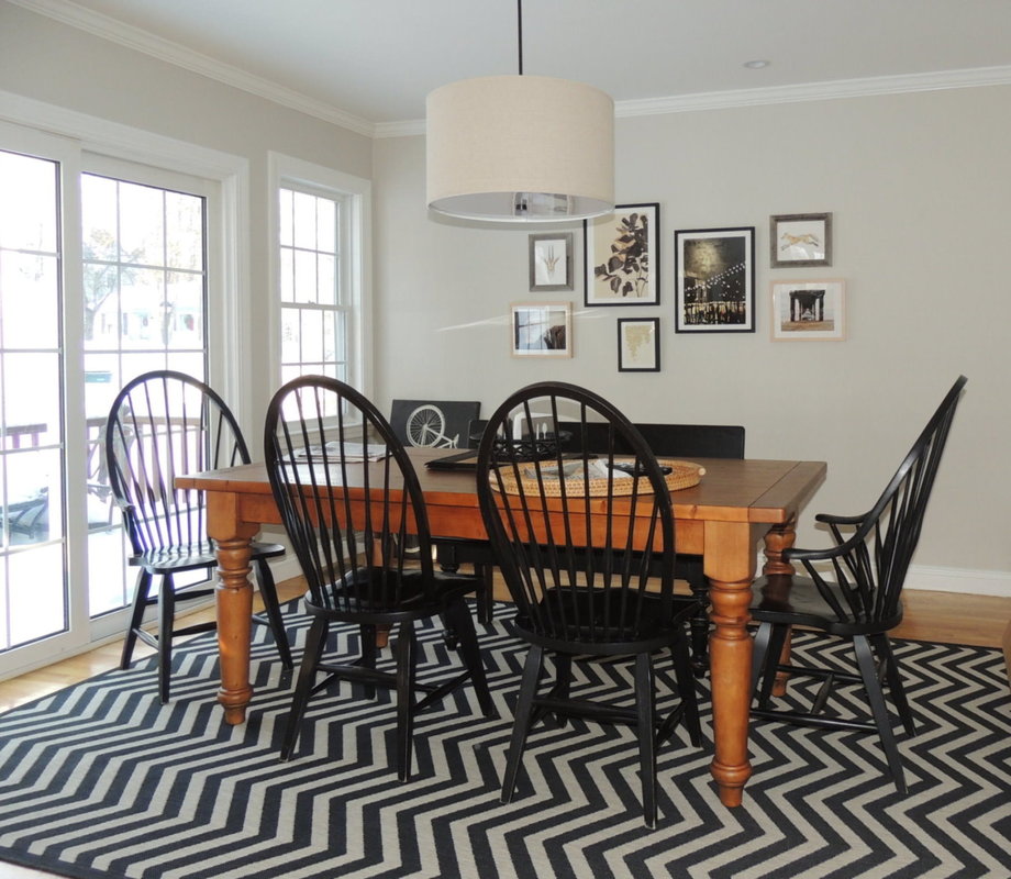
​Finally, let me share with you some of my design and decorating work in the upstairs Ballroom of the famous Wayside Inn in Sudbury, MA.  In the photo you can see the Birdcage Windsor chairs that the Inn favors in this small (50-person) function room ‘s space.  In 2011, I had the privilege of totally renovating this room (and many others at the Wayside Inn) with new window treatments, bench cushions, carpeting, lighting, stenciling, and other historically accurate decorative features.   I’m sure I’ll share more on those projects in future blog posts, but suffice to say it was a dream project for me; one that fueled my love of historic spaces and renovating with a period pieces and styles that are still very relevant today.  
Picture
Picture

A Great Outing - Brimfield Antique Fair, July 11-16, 2017

7/9/2017

 
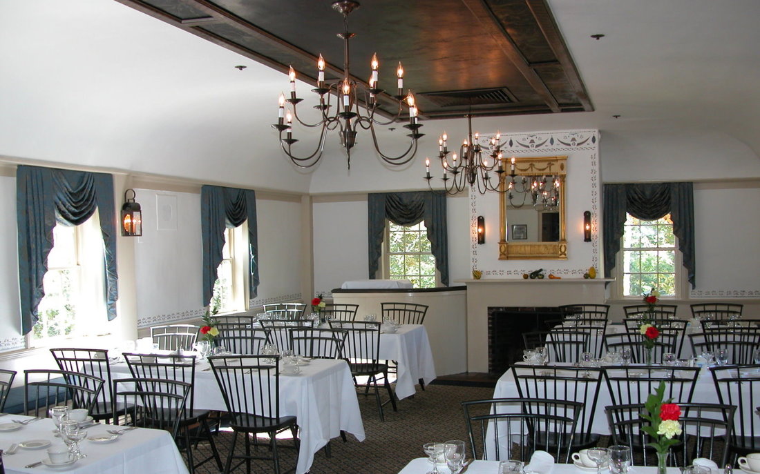
​The Brimfield Antiques Fair, a Massachusetts staple of summer, is coming up this week, 11-16 July 2017.
​
This fair is definitely worth a visit for a day’s outing, an hour’s drive from Boston in central MA not too far off I-90, the Mass Turnpike. The fair attracts dealers from all over the east coast, bringing their goods to the outdoor market, with most booths under tents.  While vintage items, antique furniture, and artisan handcrafted furniture are the main thrusts of the fair, there are lots of outdoor items (planters, furniture, garden sculptures), and what some might call “junk” but raw materials for aspiring artists and crafters.  
Picture
Picture
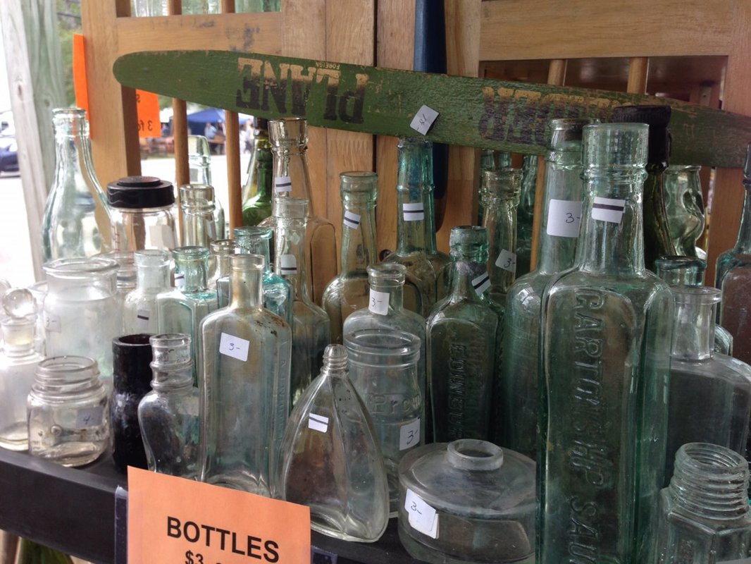
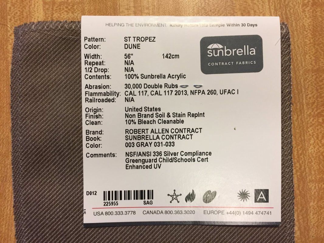
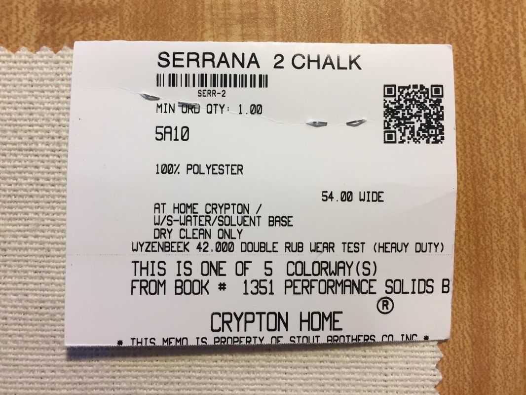
​My friend Deborah and I went to Brimfield last September, and I scored a whole box of antique clock parts for my teenage daughter who is into making Steampunk jewelry with gears, springs, and other metal mechanical parts.   She was thrilled!  And where else but Brimfield could you possibly ask “Do you have any old clocks that don’t have to work that I can take apart?”   The dealer came up with the box of old clocks within 1 minute of our arriving at the booth, and within 5 minutes my score of $30 made the whole trip worthwhile.  After loading the box in the car, it was a lovely morning of browsing and seeing the sights.   Here are some of my photos from last year, where I bought an eclectic mix of clock parts and vintage bottles at the request of a client.  
Picture
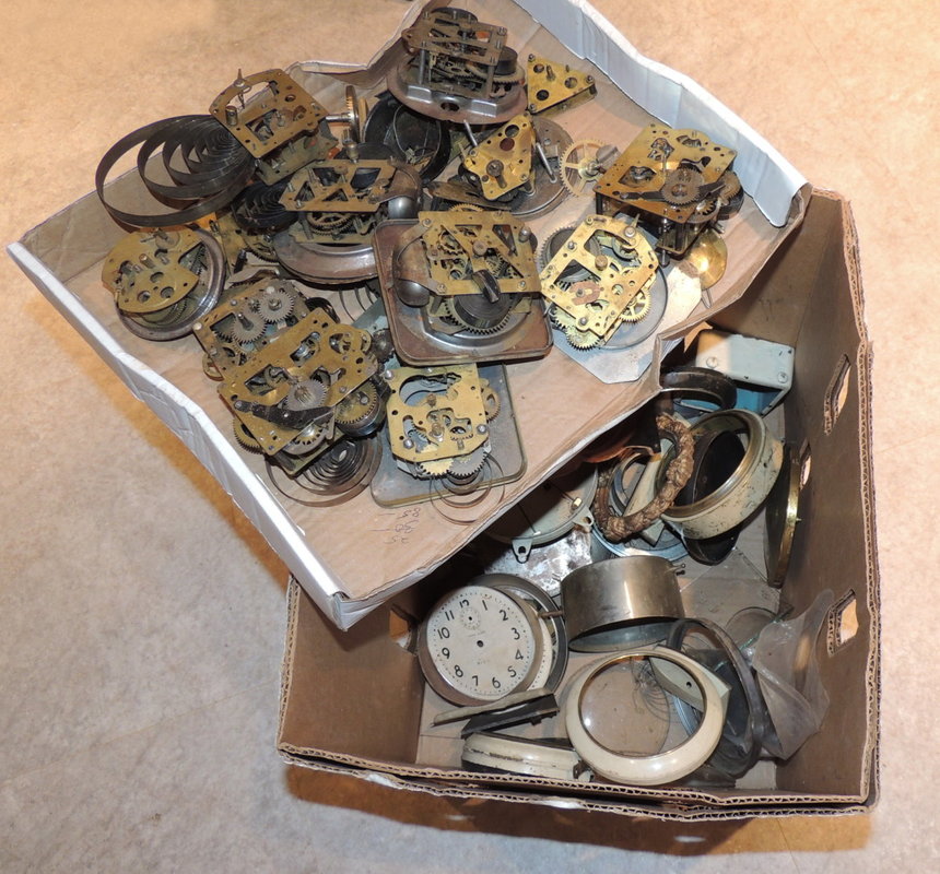
​Gameplan:  If you go, I suggest you have a definite shopping list of items you are looking for.  The show is huge, and if you spend 3-4 hours there, you will likely walk 2+ miles, and see hundreds of vendors.  Some find it overwhelming, but I find it good fun if I have 3 or 4 items that I am specifically looking for.  Wear good walking shoes, bring water (it can get hot and as a temporary fair, the amenities are sparse), sunscreen, and a car/van to cart things home if you think you will buy some furniture.  Truthfully, children under 10 are probably not going to be intrigued by anything at the show, and there are lots of breakables, so I wouldn’t bring small children.  However…an empty baby carriage might not be such a bad idea to bring along in the car if you have to cart things back to the car…I suggest you bring cash for transactions, but some dealers take credit cards.  
Logistics:  The Brimfield fair always runs 3 times per year, in May, July, and September.  There are lots of parking fields for a $5 all-day fee.  Most booths are open at daybreak (yeah, that’s really early in summer in MA), and I myself like to go early in the morning.   Set your GPS to 35 Palmer Rd, Brimfield MA and you can’t miss it.

Different fields are open on different days, and if you are a veteran of the fair, you may prefer to go when a certain vendor is there.  But if you are a newbie, I suggest you choose a weekday if possible (naturally the Saturday at the end of the show is always packed), check the weather report, and consult their website:  Brimfield Antique Flea Market 
​I’ll be going this week with a friend.  I’m looking for a new bench for my revamped mudroom…going a bit lighter and a touch coastal in there for a fresh look…and I need a Windsor bench…wish me luck!    

​And if you can’t catch the July Brimfield fair, no worries, it will run again September 5 -10, 2017.  Happy treasure hunting wherever you venture this summer.
Picture

Cleaning Home Décor Fabrics

7/2/2017

 
As a designer, one of my responsibilities is to recommend suitable fabrics that will stand up to the task at hand. For example, if you need a new custom cushion for your mudroom bench, I would probably recommend a Sunbrella®, Crypton, or other indoor/outdoor-rated and spot-washable fabric that could stand a little mud, snow, rain, and “backpack who-knows-what residue.” Think school bus floor…well, scratch that mental image for now!  So,what are these super durable fabrics that are now engineered for softness and a good “hand” for indoor use, and how do you clean them when spots and stains happen?
Picture
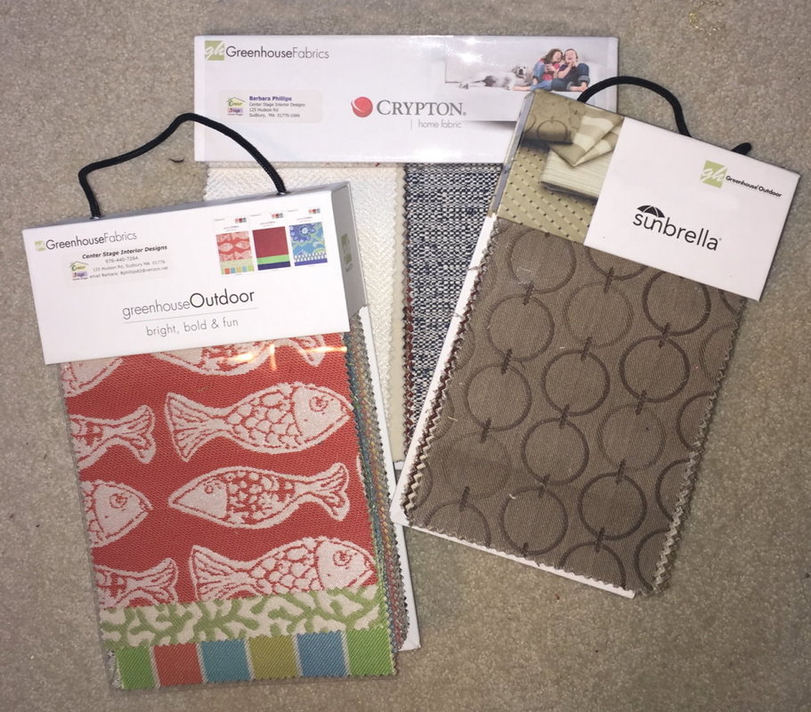
Sunbrella Fabric:
Most of you have already heard about the fabulous Sunbrella® fabric that originated for outdoor use, but has become popular for indoor use too.  This brand was developed by textile innovator Glen Raven in the 1960’s to create an awning canvas with a longer lifespan than traditional cotton. Their solution-dyed acrylic paired with high-style designs, caught on and today Sunbrella is considered one of the top marine-grade fabrics in the world.  It has many applications, for boat canvas, upholstery, awnings, sling chairs and more.  The fact that Sunbrella is acrylic and the color is in the actual fiber strands, not just printed on, makes it cleanable with bleach. In humid and wet areas, this means you can use bleach on Sunbrella to combat the dreaded mildew. 

​My favorite Sunbrella supplier has generously posted instructions for cleaning of this fabric (in downloadable PDF files):
​
             ​​Sunbrella Outdoor PDF                              Sunbrella Indoor PDF                              Sunbrella Stain Cleaning PDF

Crypton Fabric:
Several of my vendors offer Crypton fabric, which is great for seat cushions in kitchens, mudrooms, and dining rooms.   It started with hospitality use (commercial spaces like restaurants, offices, hospitals, etc), and has new hit the home décor market with great success, and many patterns.  Here is a blurb from the Crypton site:
  • “Crypton Fabric is a specially engineered fabric system that promises and delivers superior performance from stains and spills. As the benchmark for performance fabrics, each fiber of Crypton fabric is encapsulated with our patented technology through an immersion process, so it never breaks down its resistance to stains, moisture, mildew and odors. The impenetrable moisture barrier protects the fabric from spills, keeping stains from setting in the foam of the cushions. The fabric itself is also disinfectable when used in conjunction with our EPA-registered Crypton Disinfectant & Deodorizer. All of these features bundled together create an easy-to-clean upholstery solution that keeps your installation looking beautiful for years."
  • "All fabrics must pass our very stringent minimum performance tests before they can even enter our plant. This ensures that there will never be any surprises with Crypton technology. These minimum standards guarantee that when you specify Crypton, you can rely on its performance.”
  • "Superior Performance Features Of Crypton
    • Extreme stain repellency and soil release make cleaning easy, even on oil-based stains
    • Permanent, breathable protection built into every fiber
    • Integrated non-porous moisture barrier with 5 year warranty
    • Technology resists to the growth of odor-causing microbes
    • Technology resists deterioration and staining from mold and mildew
    • Disinfectable when used in conjunction with our EPA-registered Crypton Disinfectant & Deodorizer
    • Bleach cleanable on select fiber types (see Cleaning & Care for specific cleaning instructions)"
Cleaning Codes for Home Décor Fabrics
Just like the care tag sewn into apparel items, each home décor fabric comes with a cleaning code.  When you receive fabric samples from Center Stage’s fabric vendors, look for this information on the label—typically DC, S, W, WS, or X, as described below.
Picture
Picture
Picture
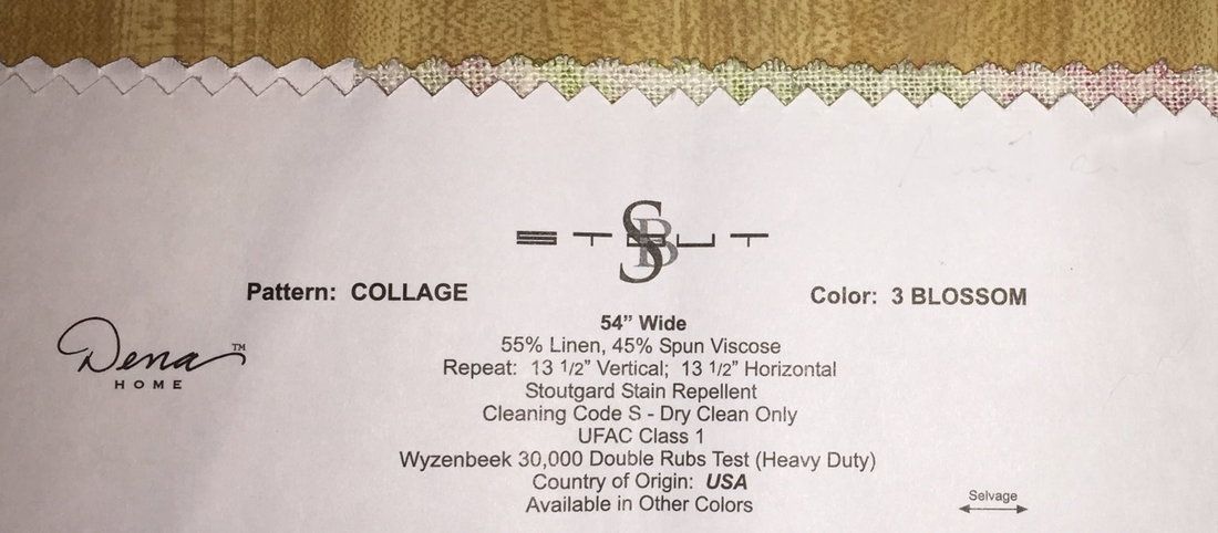
General Guidance on Cleaning:
Draperies, valances, and upholstered items should be lightly vacuumed every few months for longevity and dust control.  If you should get a stain on a home décor fabric, the following details on the cleaning codes (courtesy of Greenhouse Fabrics) will help.
  Cleaning Code: DC
  • Dry Clean ONLY
  Cleaning Code: S
  • Spot clean only with a water-free dry cleaning solvent.
  • Do not saturate or use water.
  • When cleaning a spill, blot immediately to remove spilled material.
  Cleaning Code: WS
  • Spot clean with upholstery shampoo, foam from a mild detergent, or mild dry cleaning solvent.
  • Do not saturate.
  Cleaning Code: W
  • Spot clean only with a water based shampoo or foam upholstery cleaner.
  • Do not oversaturate or use water, or use solvents to spot clean.
  • Blot immediately to remove any spilled material.
  Cleaning Code: X
  • Clean only by vacuuming or light brushing with a non-metallic, stiff bristle brush.
  • Do not use water or solvent based cleaner.
Before attempting to clean the actual fabric in your décor, we suggest you test the cleaning method (above) on the fabric swatch Barbara gave you when you ordered or received your draperies or upholstered item.  It’s always good to be cautious.

Clean spots or stains from the outside to the middle of the affected area, to prevent circling. Cushion covers should not be removed for laundering or dry cleaning. Hot water extraction or steam cleaning is not a recommended method of cleaning. Pile fabrics may require brushing with a nonmetallic, stiff bristle brush to restore appearance. To prevent overall soiling, frequent vacuuming or light brushing with a non-metallic, stiff brush to remove dust and grime is recommended. Overall cleaning by a professional furniture cleaning service only is recommended.
Picture
    Picture

    Barbara Phillips

    Barbara Phillips, interior designer and owner of Center Stage Interior Designs, has delivered impeccable window treatments and design services to both residential and commercial clients in Massachusetts since 2001.

    Categories

    All
    Aging In Place
    All About Fabric
    Before And After
    Color Confidential
    Decorating Cycles
    Design 101
    Family Friendly
    Finding Inspiration
    Furniture Workshop
    Inside The Drapery Workroom
    New England Style
    Seasonal Decorating
    Technology In Interior Design
    Window Design
    Worth Visiting
    Your Questions Answered

    Archives

    January 2021
    December 2020
    November 2020
    October 2020
    September 2020
    August 2020
    July 2020
    June 2020
    May 2020
    April 2020
    March 2020
    February 2020
    January 2020
    December 2019
    November 2019
    October 2019
    September 2019
    August 2019
    July 2019
    June 2019
    May 2019
    April 2019
    March 2019
    February 2019
    January 2019
    December 2018
    November 2018
    October 2018
    September 2018
    August 2018
    July 2018
    June 2018
    May 2018
    April 2018
    March 2018
    February 2018
    January 2018
    December 2017
    November 2017
    October 2017
    September 2017
    August 2017
    July 2017
    June 2017

    RSS Feed

Home
Portfolio
Services
About
Client Journey
Vendors & Resources
Blog
Contact
Center Stage Interior Designs 
(978) 440-7264
Sudbury,  MA   01776

www.centerstageinteriordesigns.com  
Center Stage Interior Designs Copyright © 2001 - 2021
Privacy Policy
  • Home
  • Portfolio
  • Services
  • About
  • Client Journey
  • Vendors & Resources
  • Blog
  • Contact