|
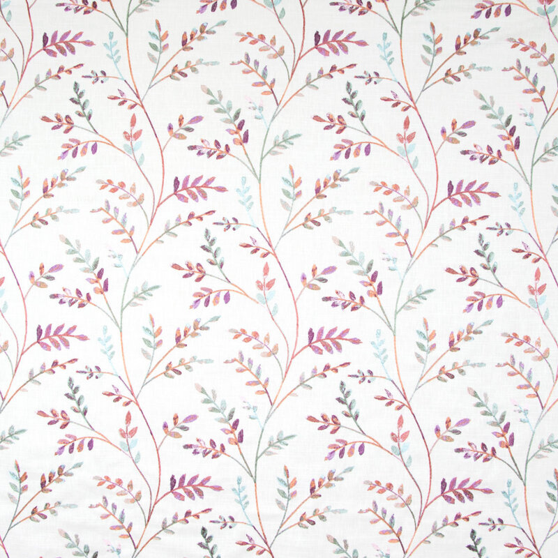
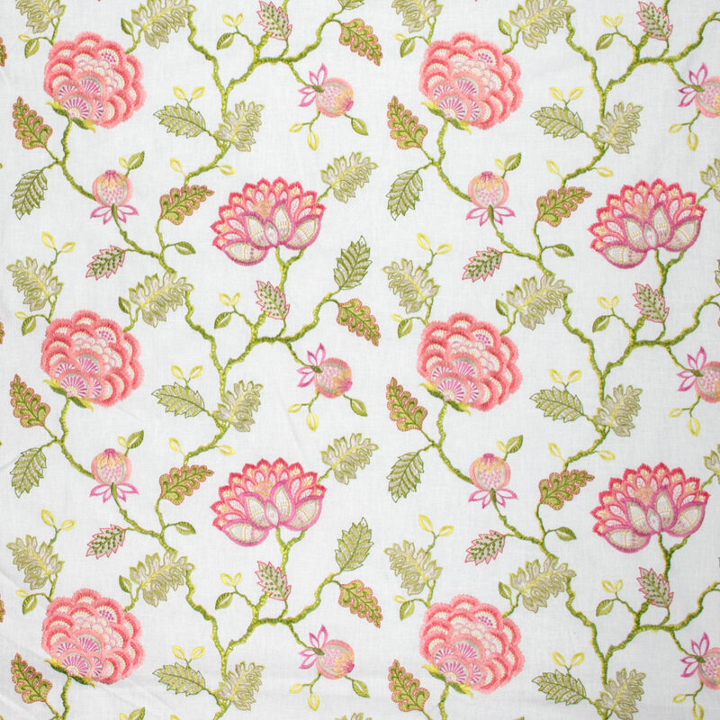
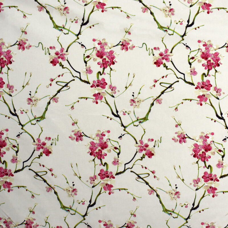
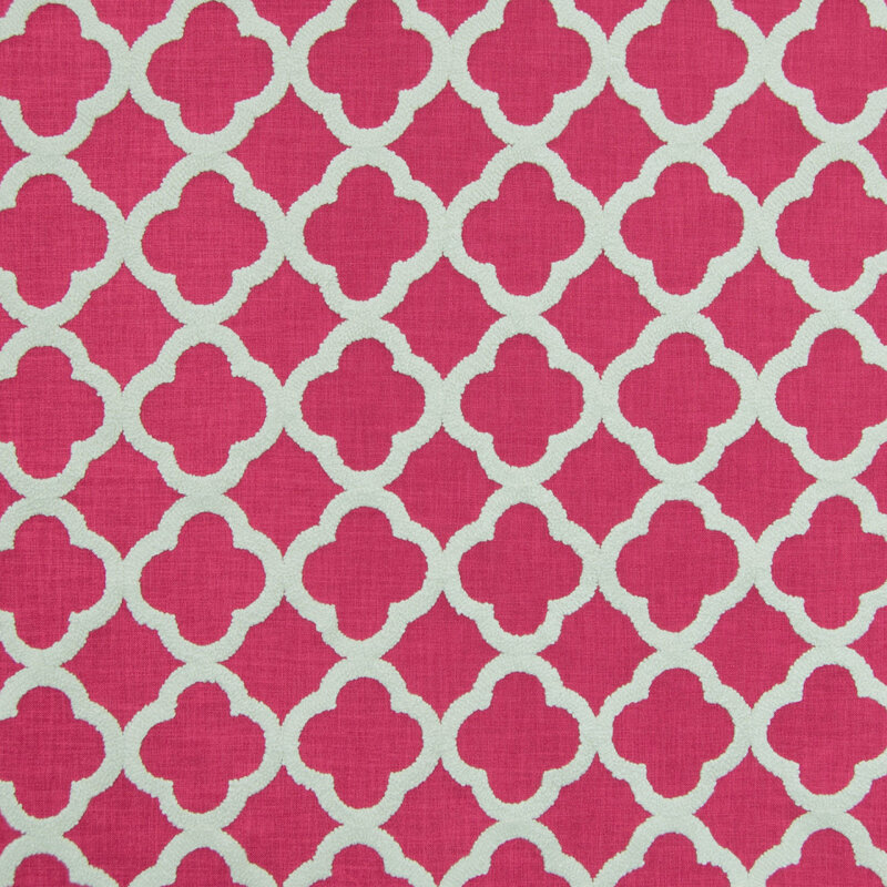
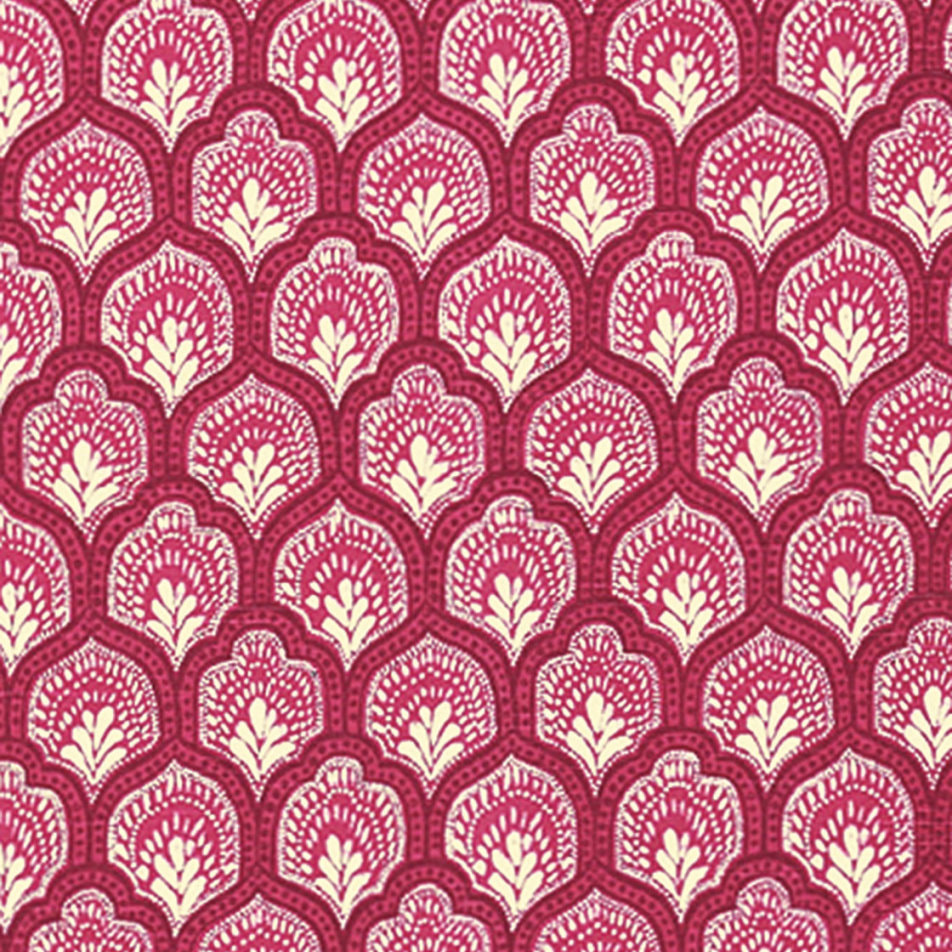
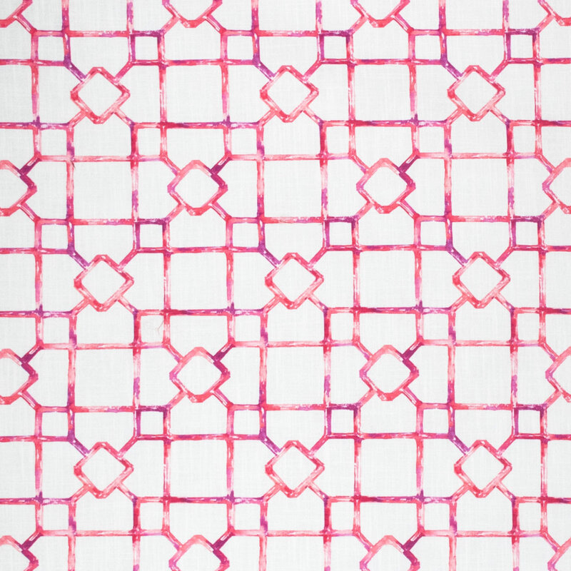
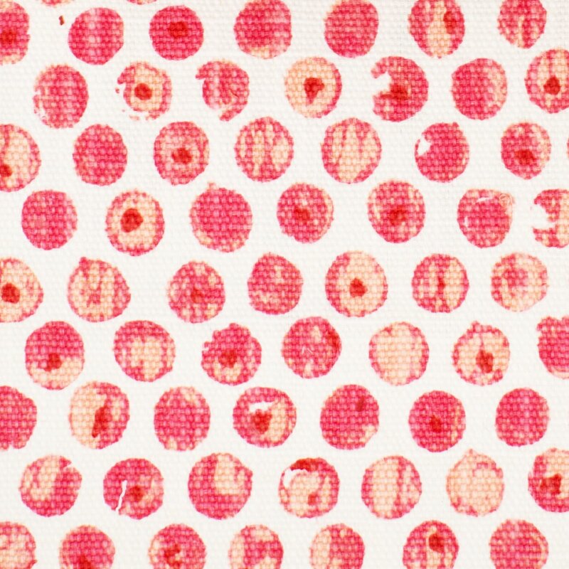
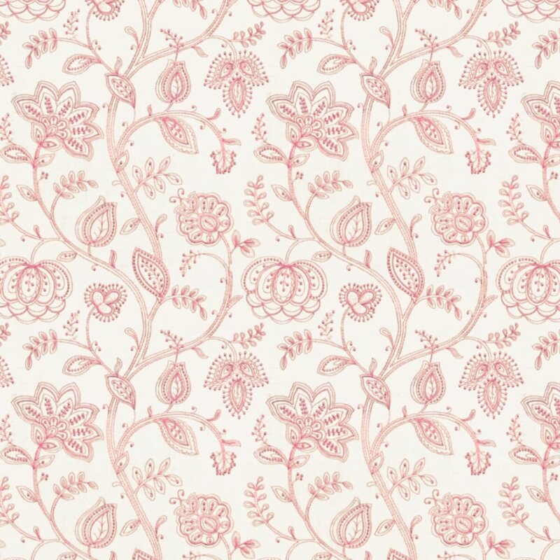
In my last post, I discussed decorating with the color Red, and I briefly touched upon the topic that decorating with Red is remarkably different from decorating with Pink. That’s curious, don’t you think? After all, decorating with all values of a color (from light to dark) works fairly well with blue, green, and neutrals of beige and gray. But definitely not with red and its lighter companion pink. What makes pink so special? Well, I’m not sure, but perhaps because pink is inherently perceived as soft, and red is inherently perceived as loud, they are just different. So, here are some general design guidelines for decorating with pink. I like pink. I have done numerous pink bedrooms (for little and not-so-little) girls, and it’s always a happy endeavor. And the joy of the young clients in choosing their paint color (with only a few options presented, naturally) and their fabrics is also just delightful. I’ve also done other rooms (family and adult spaces) with pink as the accent color, and they have been refreshing and happy, like in this Lexington, MA living room below: 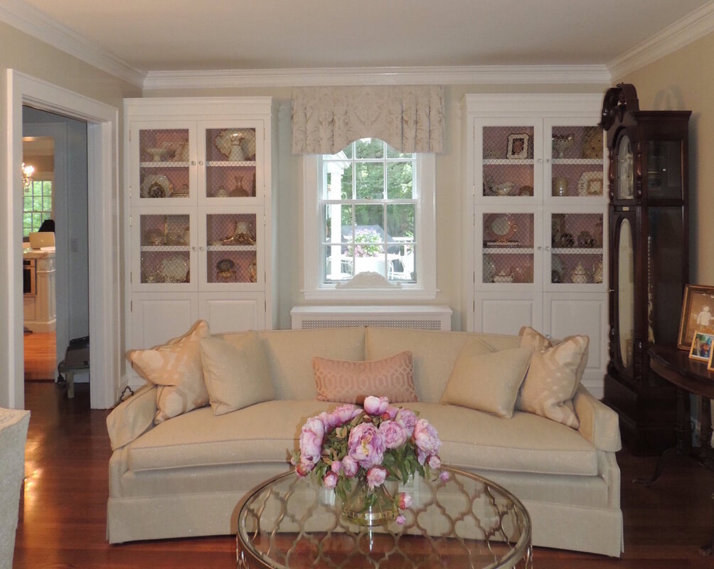 When decorating with pink, I have always found it best to find an inspiration fabric to start the fun. Sometimes it is the motif (floral is pretty predominant, but geometrics are strong lately, and there are lots in pink to choose from), sometimes the intensity of the pink is the draw, and sometimes a fabric just starts the spark. Here are some great current pink fabrics that are available from my vendor, Greenhouse Fabrics.
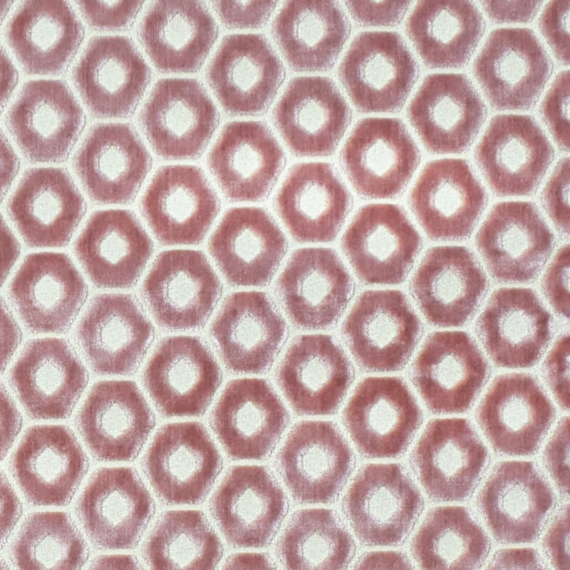
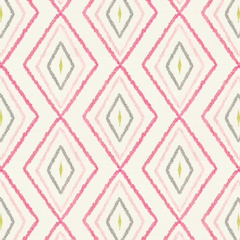
Additionally, here are some excellent pinks from another one of my vendors, Stout Fabrics.
One thing you’ll notice about these designer pink fabrics is that they are generally monochromatic: pink and white or pink and ivory. If there is an accent or second color, it is usually green. From a color specialist perspective, I find that so curious because in the interior design field, we generally don’t embrace too many “complimentary color” parings like red and green. But pink and green are certainly compatible as the fabric swatches shown above attest. Pale pink goes well with green, and bright pink (hot pink or fuchsia) goes very well with blue, as they are very close on the color wheel. Rules of Thumb When Decorating with Pink:
 Well, that’s a wrap on the color pink. Let me help you navigate the intricacies of pink! As subtle as the color is, it demands a careful eye to make it sing with the rest of the décor.  Comments are closed.
|

Barbara PhillipsBarbara Phillips, interior designer and owner of Center Stage Interior Designs, has delivered impeccable window treatments and design services to both residential and commercial clients in Massachusetts since 2001. Categories
All
Archives
March 2021
|
 RSS Feed