|
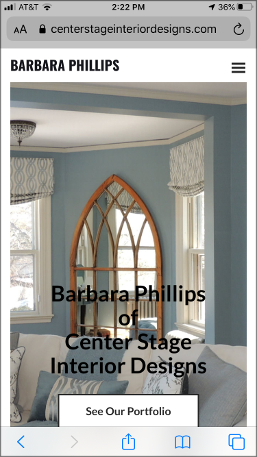
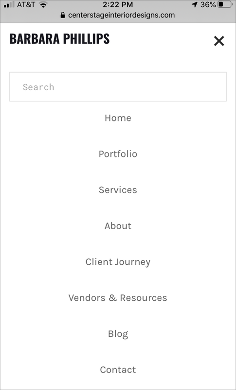
Back in April I wrote a blog post about “Making COVID-19 Masks for My Family and Friends”. Well, quite a bit of time has passed since then and I thought that I would give everyone a quick update on my latest mask activity since I know that some of you used my information to make masks of your own. The good news is that the final version of the masks that I settled on back in April (version 2.0) worked out really well for all my family, friends and clients. In fact, this design held up so well that the only significant change that I’ve made over the past two months was to remove the internal pocket for adding an additional filter. Everyone thought that they would use a pocket like this to insert additional filtering layers inside the mask if needed – but in practice people found that they did not actually add any additional filters. Based on that input I’ve continued to make bunches and bunches of masks over the past two months for family, friends, acquaintances from church and for clients that requested them. The version 2.0 mask design has held up really well, and the wearers really like the tight custom fit and the piece of floral wire I added at the nose (top of the mask) so the mask could fit tighter on the face and not fog the wearer’s glasses. So, for my Version 3.0 masks I’ve removed the internal pocket and focused on refining my pattern and process to make masks that come in a variety of sizes so that they can more tightly fit a wide range of face sizes. I’ve also increased my mask fabric inventory so that I can make masks to fit all sorts of different styles. Here’s a picture of some of the version 3.0 masks that I most recently made. 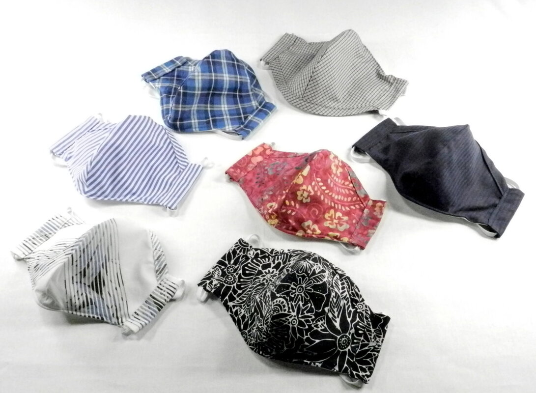 Like I’ve previously mentioned, I’m not selling these masks, just providing them locally to my family and friends (and clients that request them) as a small token of community service. Hopefully you are all in good health and good spirits as Summer gets into full swing and we get the COVID-19 mess behind us.  It’s Summer – Hooray!! At my house that comes with having morning coffee on my back deck and listening to all the sounds of Nature; woodpeckers, cicadas, scampering chipmunks, and last week, even a deer, bunny, snake and woodchuck roaming through our wooded backyard. A veritable “Wild Kingdom” in the suburbs. One thing that I like to do while I’m drinking my coffee is catch-up on all of the latest blog posts from other designers. I always enjoy, and benefit from, my colleagues techniques, insights, advice and wisdom. Since I’m on my back porch I read their postings from my iPhone – probably like most of you these days. This morning while browsing I looked at my own website and noticed that on the iPhone it’s not readily apparent that I’ve published 97 posts over the past 3 years. So I thought that I would use today’s post to highlight that and to show you how to search all of my blog posts from your phone. Once you are on the Center Stage Interior Designs website, if you click on the menu in the upper right hand corner (commonly referred to as a “hamburger menu” because of the three parallel lines) and select “Blog” you will be taken to a page with my 10 latest blog posts. If you want to see a blog post that was published before these last 10 posts, simply click on the “<<Previous” icon (located underneath the last post on the left-hand side). This will take you to a page with the previous 10 posts. You can then navigate backward or forward in time by clicking on either the “<<Previous” icon or the “Forward>>” icon.
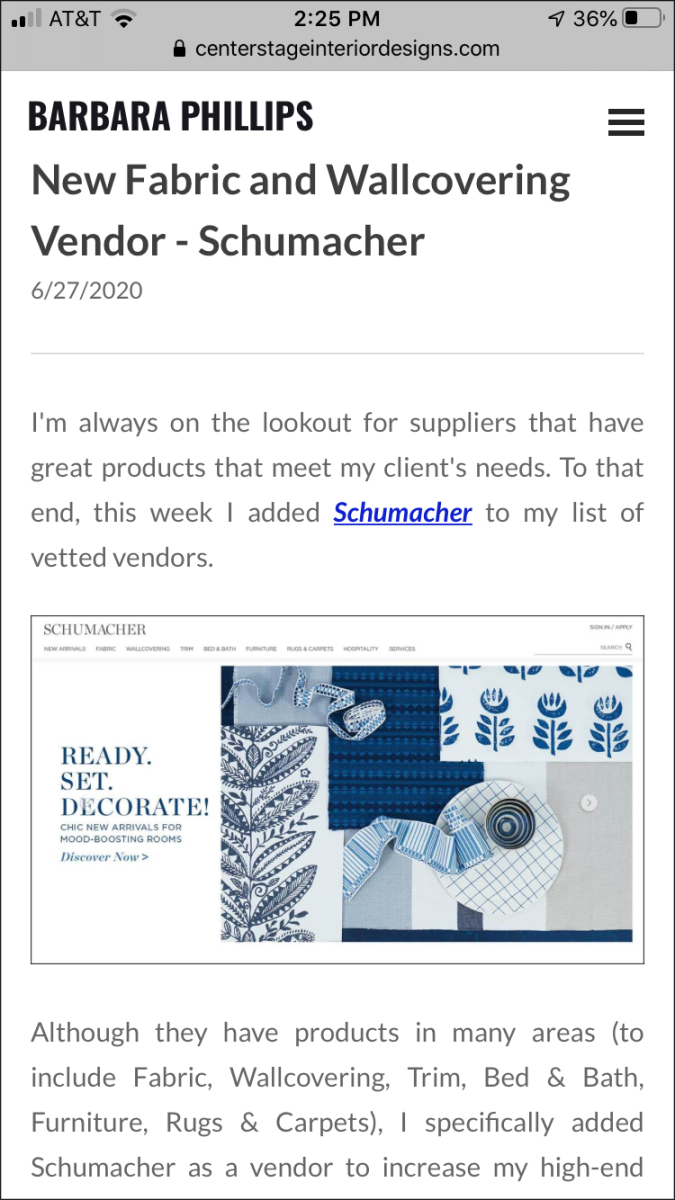
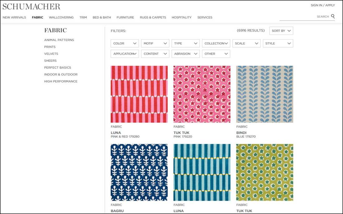
Hopefully these hints will make it easier for you to find what you’re looking for on my website – since with 97 posts there’s a lot of to look at. The Category, Archive and Search functions all exist on the desktop version of my website too – but since the screen is so much larger these functions are pretty obvious – so I won’t discuss them here. As always, it you have any questions or comments, please feel free to drop me a line through my “Contact Us” page or by calling me at 978-440-7264. Until next time, I hope that your Summer is off to a great start. I'm always on the lookout for suppliers that have great products that meet my client's needs. To that end, this week I added Schumacher to my list of vetted vendors. 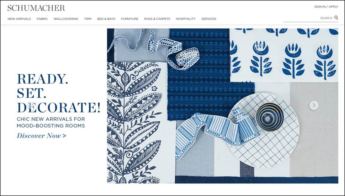 Although they have products in many areas (to include Fabric, Wallcovering, Trim, Bed & Bath, Furniture, Rugs & Carpets), I specifically added Schumacher as a vendor to increase my high-end fabric and wallcovering offerings.
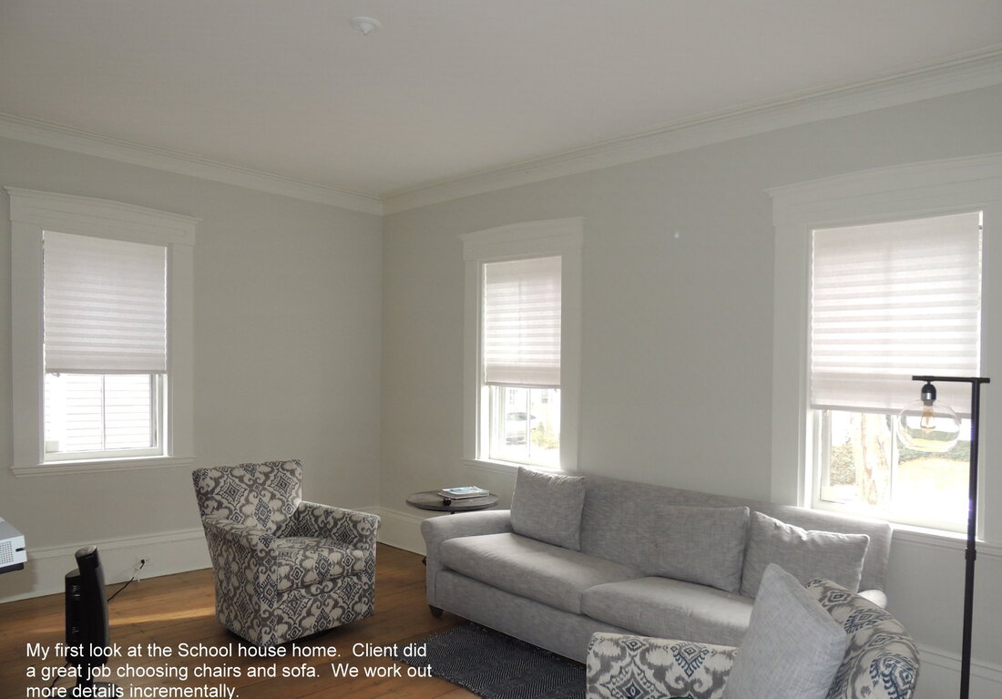
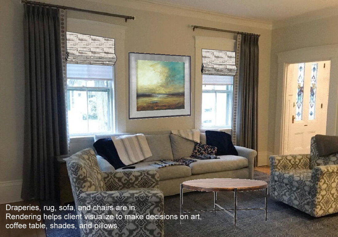
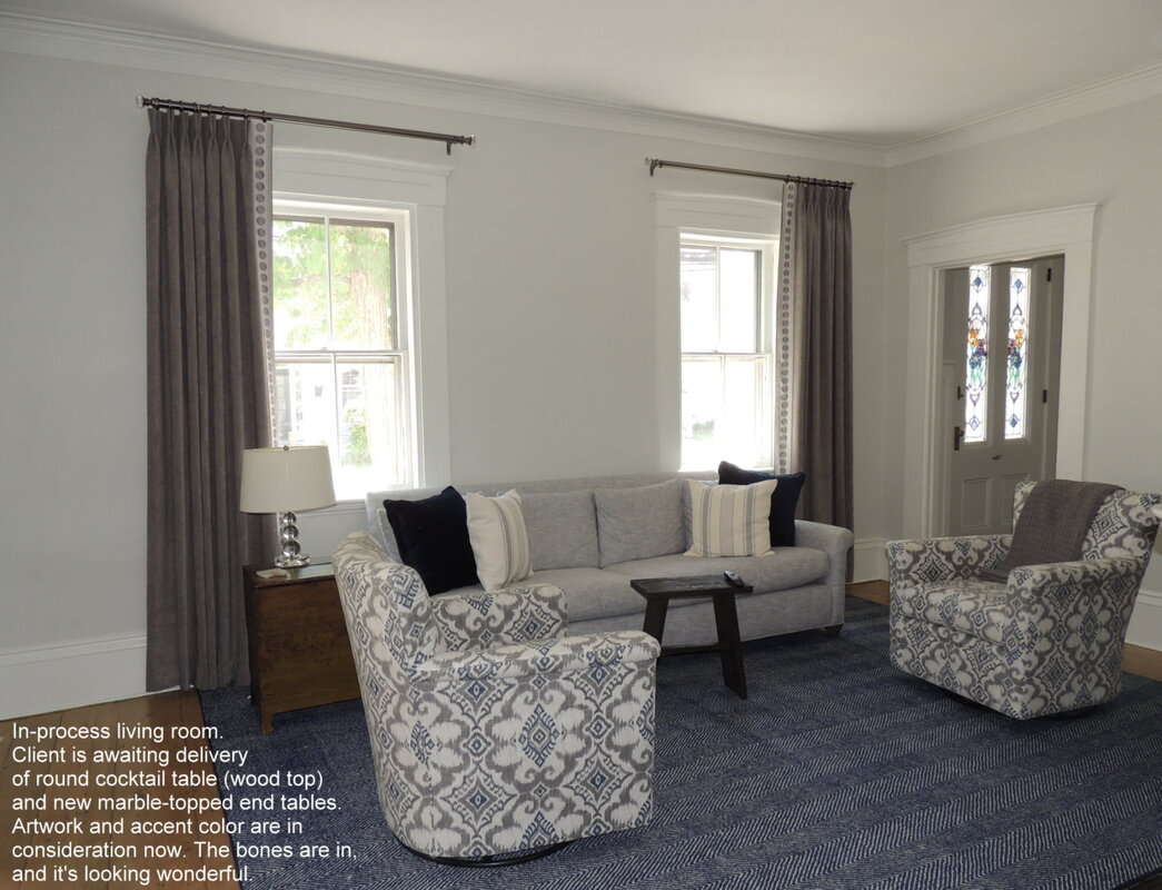
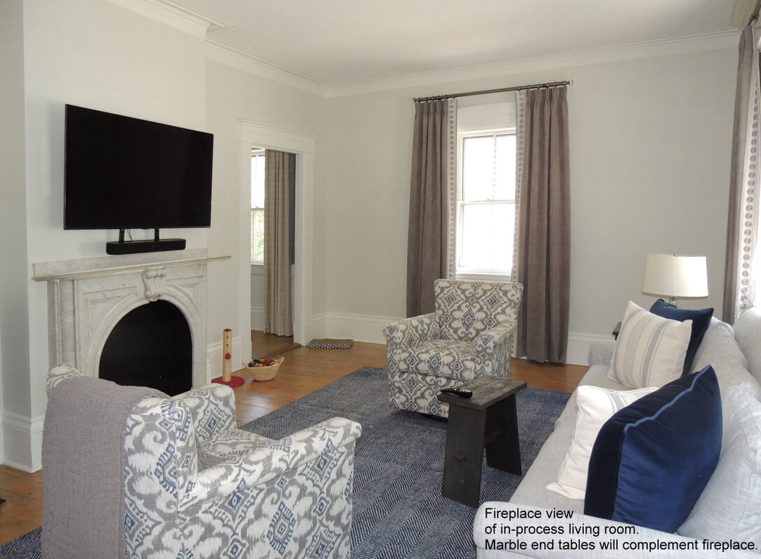
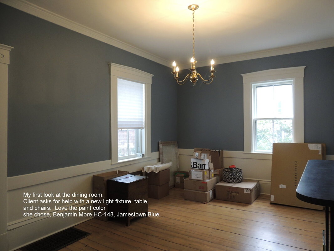
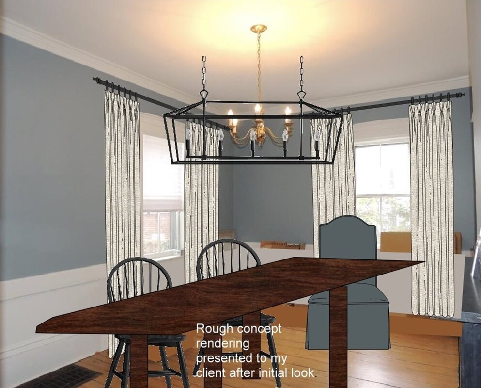
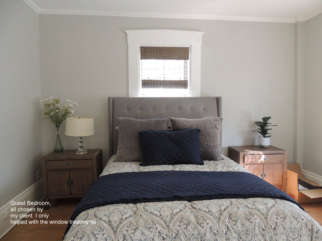
For those of you not familiar with them, F. Schumacher & Company started in the design business in New York City in 1889. Schumacher is currently a fifth generation business that is still privately owned and managed by the direct descendants of its founder; Frederic Schumacher. The company sells fabrics, wallcoverings, trimmings, furnishings, and floor coverings under two brands (Schumacher & Patterson, and Flynn & Martin). Schumacher designs and manufactures decorative fabrics for residences and other interiors. They specialize in historic reproductions, oriental rugs, exclusive designs by Wilton, custom designed handmade rugs, and rugs which are tufted by hand. They sell exclusively to Interior Designers via their network of sales people and showrooms located throughout the world. Schumacher currently maintains 18 showrooms in several countries (to include a local showroom at the Boston Design Center). Over the years Schumacher wallcoverings and fabrics have been used in numerous Hollywood movies - from "Gone With the Wind" in 1939 to more recently "The Age of Innocence" (1993), "Washington Square" (1996), and "Atonement" (2007). Schumacher has also supplied textiles to the White House, the Chambers of the United States Supreme Court, the Smithsonian Institution and the New York City Metropolitan Opera. Here are the links to Schumacher’s online Fabric and Wallcovering catalogs just in case you have some free time to browse and want to take a peek. https://www.fschumacher.com/catalog/fabric https://www.fschumacher.com/catalog/wallcovering As always, if you have any questions, want to see samples from Schumacher, or want to tour their Boston Design Center showroom just drop me a line or give me a call. I recently read that the COVID-19 shutdown has spurred a significant boost in home improvement projects. I guess that there’s always a silver lining if you look hard enough. Thankfully the home improvement giants like Home Depot and Lowe’s, and other smaller hardware stores, have been open to support the demand. Nothing better than fixing up your home when you’re seeing lots more of your “four walls” than you ever imagined. I’ve also noticed an amazing uptick in my website’s traffic directly related to my blog posts that discuss choosing paint colors and give general color advice. Thanks for checking out my prior blog posts in this area – it’s much appreciated. Paint colors are a fundamental decorating issue, and one of the biggest decisions most of my clients make when they purchase a home is choosing their exterior paint color. It's a huge decision - and one that you want to get right. Along those lines, here’s a story I came across on how a family from Portland, Oregon decided on a paint color for their exterior – they let their neighbors, and then the whole internet, decide. Wow, that is way more than “second opinion!” 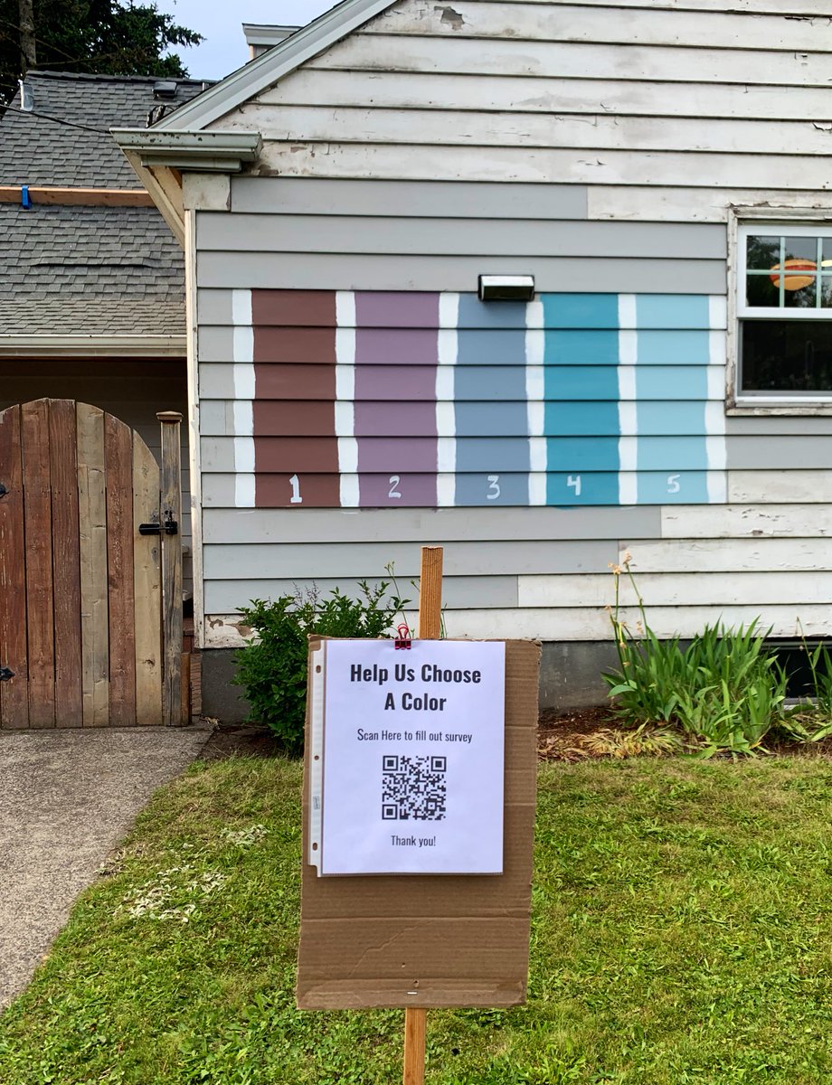 I’ve included a link to the original article below, but here’s a summary just in case the link disappears at some future point in time: Oregon Family's Public Vote for New House Color Goes Viral (by reporter Janiane Puhak of Fox News; 26 May 2020): “There’s no place like home, so it all should be just right. One Oregon family is dazed that a public vote for the new paint color of their house went viral on social media, with more than 2,000 entries from over 20 countries pouring in overnight. The Landreth family of Portland recently combined a home improvement project with a learning moment for middle schooler Grace, who was tasked with completing a school project about documenting data, KOIN reports. To bring the lesson to life, the family painted five colors on the side of their house and created a QR code for passersby to scan with their smartphones, leading to a Google Doc to vote for a favorite choice for the fresh paint. The poll exploded in popularity when neighbor Michal Naka tweeted out a photo of the project on Monday, which has since gone viral with nearly 13,000 likes and 6,300 shares. “We went to bed last night and had about 60 people walking by, and we’re like, ’60, that’s crazy!'” Brian Landreth, Grace’s father, told KOIN on May 25. “Currently, there’s more than 2,000 entries.” Now, through the magic of the Internet, the dad and daughter say they’ve received responses from over 20 countries around the world. Participants can rank five shades: a muted “Rocky Mountain” brown, “Wild Orchid” purple,” an “In Good Taste” slate blue,” the turquoise “Blessed Blue,” and “It’s Well” sky blue. “Please help us decide by ranking the following colors for our house,” the survey says of the numeric grading scale. “1 being amazing and 5 being ‘I seriously can't look at that color every day.’” Twitter commenters seem partial to the turquoise blue hue.” https://www.foxnews.com/real-estate/washington-family-public-vote-new-house-color-viral My Take on the Color Options Hmmmm….how to say this diplomatically….I’m afraid I wouldn’t choose any of the colors presented. My initial take was that the colors are all way too vivid, too “saturated” to be pleasing on the exterior of a home. Even the brown is too vivid. But I wouldn’t necessarily suggest a dark brown exterior in the suburban setting that I can discern from the photo. I must admit I’m influenced by the fact that I grew up in dark brown home in the suburbs, and I never really liked the color. When my parents changed to a pleasing white siding (when I was a teenager), it was a happy day! For the Langreth family, if I had to choose 1 of the 5 colors that they considered, I would choose #3, the gray-blue color, but I wouldn’t have chosen that particular shade. It’s ironic that the color (from Miller Paints) is called “In Good Taste Slate Blue.” So what’s wrong with the colors options that the Langreth family presented? In my opinion, this is a perfect example of when you look at a small color chip, and admire a color like #4 - the turquoise “Blessed Blue,” and then you mentally extrapolate that it would be just as pleasing on the 2,000 square feet of siding on your home. Unfortunately when it covers that much surface area the color might end up being a tad too much in the end. Now, turquoise and teal are my favorite colors, so I’m a fan of this hue. But…you can see from the small patch of the exterior, that it’s too bright. Such a color needs to be very grayed down. Actually, I rarely recommend green, teal, or turquoise for the exterior of a home, but it depends on the landscape. Wooded, green grass, beach, desert, modern, urban? Too many variables for a “one size fits all” analysis of green here. Suffice to say, I would strike #4 and #5 from my list. I remember when my husband and I were living in Colorado Springs (our first home years ago), our backyard neighbors painted their home a vivid blue. They weren’t home the day the new color went up, and of course we didn’t say anything to them. Then, about a week later, we noticed the painter came back and repainted the entire house with a more “grayed down” version. Sigh of relief…thank you, good neighbors. What Color Did the Langreth Family Pick? What color did the Langreth family finally choose? A week later an article from KPTV reported that “more than 150K votes from around the world” chose #4 - Blessed Blue. Yes, the bright turquoise. Oh my! The family seems happy, and after all, they turned it into a democratic vote, very gracious. 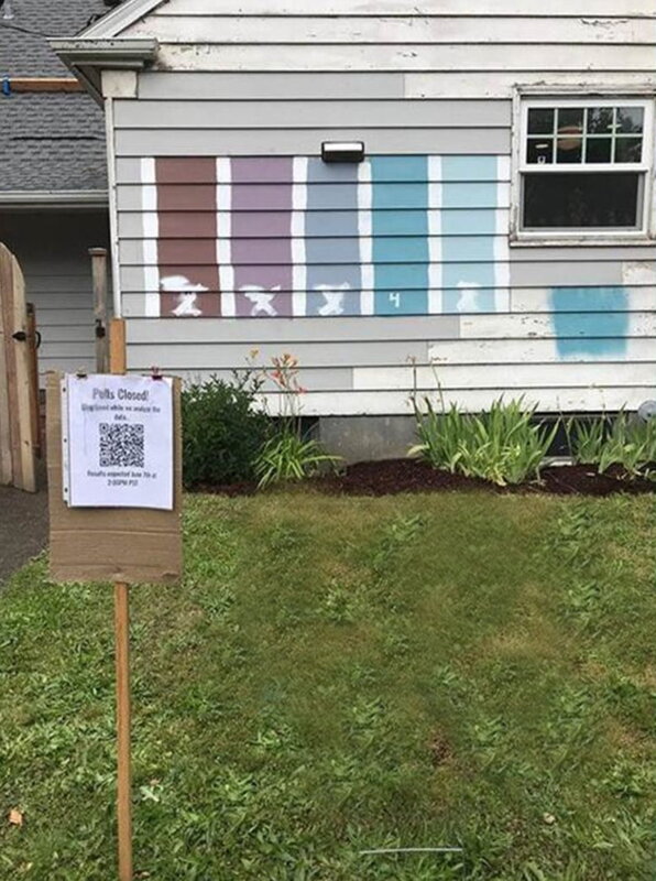 You can get the updated story from Miller Paint's Facebook page: https://www.facebook.com/pg/MillerPaint/posts As one of my on-going projects I am quite fortunate to have a client who asked for my help furnishing and decorating her historic home; located about 10 miles west of Boston. My client’s project is super unique in that her home used to be the town’s school house. Years ago the building had been divided into a duplex configuration, with her home being the right side of the old “school house.” I just love old houses with their attendant millwork, charm, and even their very “non-square” and “non-level” idiosyncrasies. In fact, ten years ago I did quite a bit of historical decorating work at the famed Longfellow’s Wayside Inn in Sudbury, and I still enjoy unique opportunities such as this current project to saunter down the historical path, so to speak. To give you a feel of the progress that my client and I have made using an “incremental” design and decorating process, here are some “in progress” photos of the charming school house renovation showing our gradual addition of lighting, window treatments, and furniture. We're still working on the finishing touches. I must say that, prior to my introduction to this project, my client did a wonderful job directing the renovation of her house in a manner that preserves the very best of the features of the home, while infusing it with a current warmth and comfort factor for her family – which includes teenage sons. (click on any photo to start the slideshow): I love what I do – and I routinely give thanks to all of my wonderful clients who allow me to explore and celebrate your homes with you. So where were we . . . . . . . . . prior to the mask making interruption. . . . . . . . . oh yes, “composing a gallery wall and installing it easily and perfectly by yourself”. Gallery walls are very popular these days, and for good reason. It’s fun and stylish to display your favorite art and photos rather than have them sadly tucked away awaiting “the plan” and “the time.” If you have children, you more than likely have an ever growing selection of artwork that would be delightful to display (….before your children leave for college). Additionally, with open concept house plans, we tend to have large expanses of uninterrupted walls that are virtually impossible to treat with just one or two pieces of artwork. So, let’s assume you have lots of artwork to hang, but you haven’t tackled that project yet for a variety of reasons. If you’re concerned that your current collection of art poses too much of a commitment (fearing that “once the gallery wall is up, it can never change”), you might want to check out a terrific hanging system called the Walker Display System: https://walkerdisplay.com/gallery/ I’ve posted about the Walker system before (“How to Display Your Children’s Artwork”) and especially like that it allows for the easy reconfiguration and the addition of new art. Galleries, libraries, and shops use the Walker Display System, or other similar systems, to showcase their ever-changing displays. As shown in the photo below, it imparts a bit of a modern vibe, so consider whether that will work with your décor. But once you have that top rail installed, everything is reconfigurable, so it’s a great option for most people. 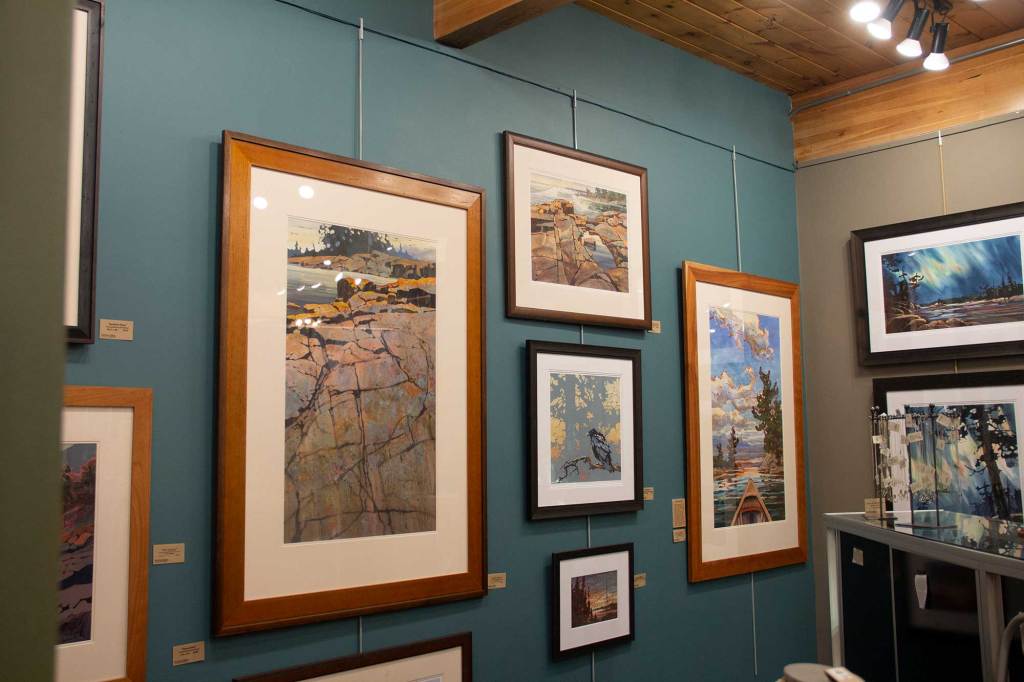 If you want to go the old-fashioned route of hanging your artwork with hooks and nails (and no connecting rods), then you have a bit more of an opportunity for placement creativity. But the issues then become (1) how to arrange your artwork for an interesting effect and (2) how to actually hang the pictures without it taking forever. For advice on arranging your artwork, let me point you to the All Modern website which gives some terrific tips in their article titled “How to Create a Gallery Wall”. Here’s some of their advice on gathering the art for your gallery wall: “Grab pieces from around your home, ones hidden away in the attic, or art you've collected for this purpose. Take stock of what you have and consider these factors:
What I’ll help you with today is a fast (!) and super simple way for determining exactly where to put the nails and picture hooks in the wall to achieve the overall look that you desire. Miraculously, there’s very little measuring involved. The materials that you will need are:
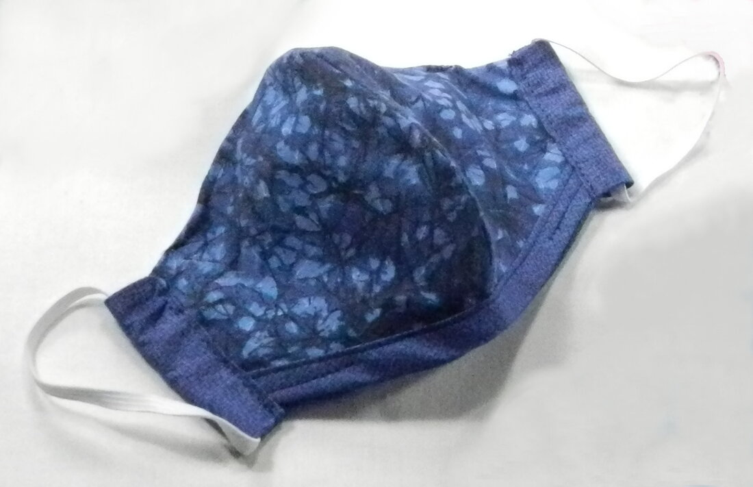
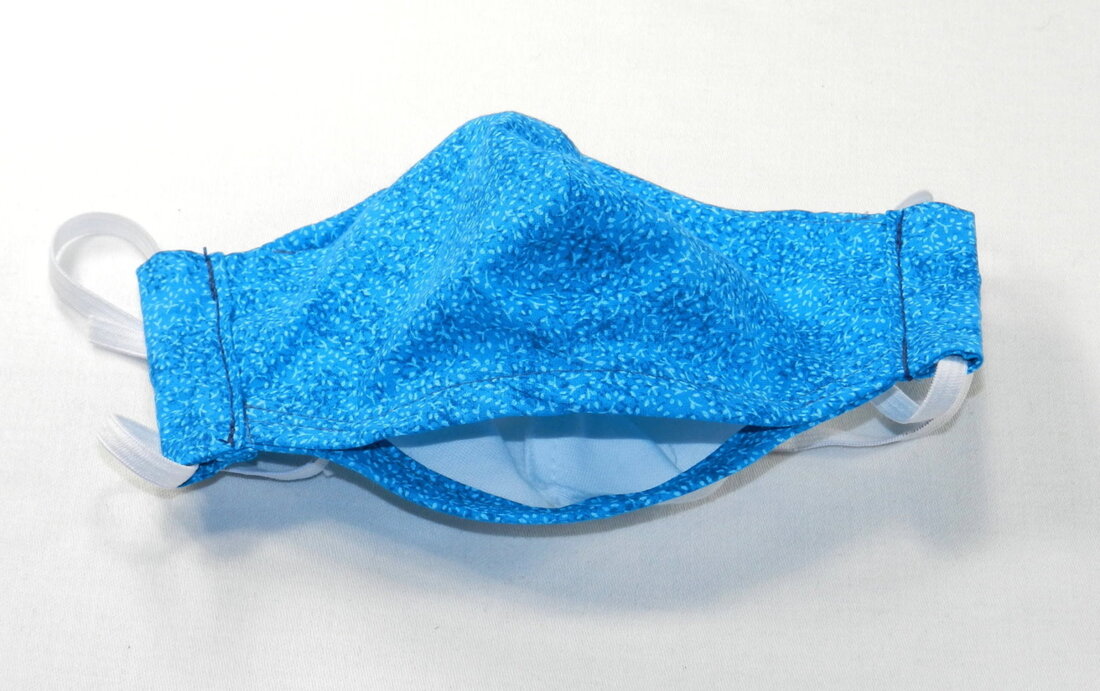
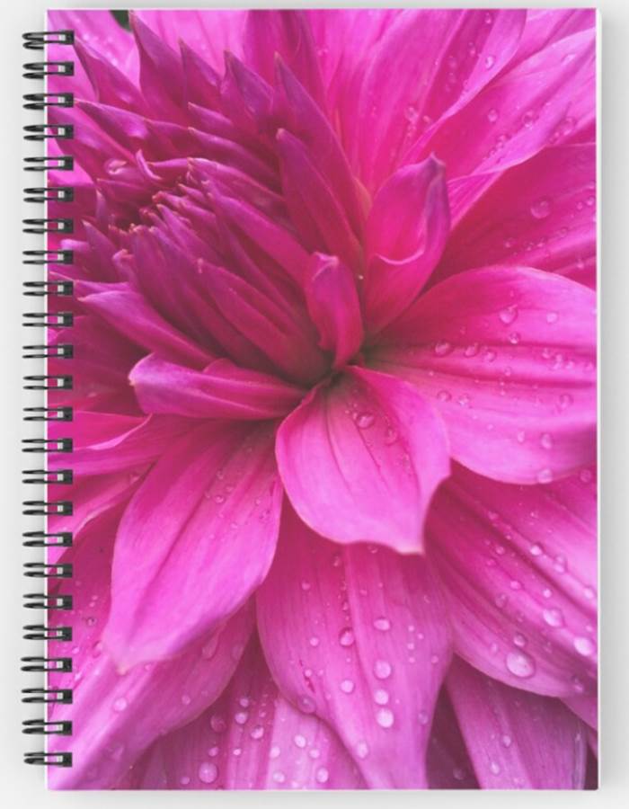
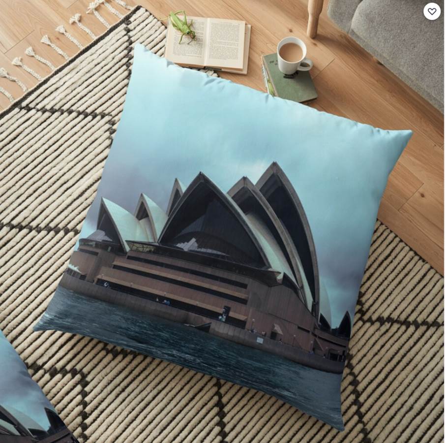
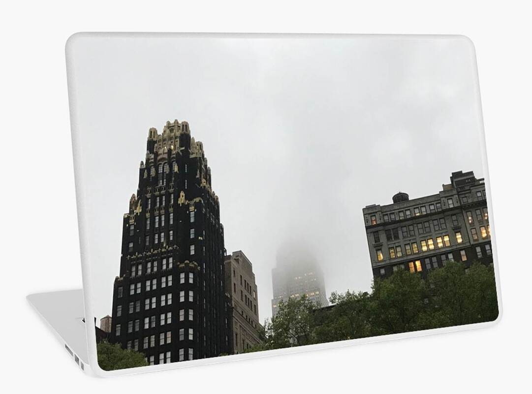
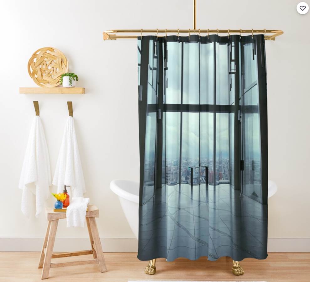
Step 1: Create paper templates of your artwork. Rollout the gridded wrapping paper and randomly lay out your artwork on the gridded side of the wrapping paper. Trace around the frame of each picture on the wrapping paper. To make rearranging the art easier I‘ve laid everything out on the carpet, which enables me to get a good view of all the artwork and the overall montage. Note: In this step-by-step process, I’m using some of my daughter’s artwork. She is prolific and it’s all beautiful. 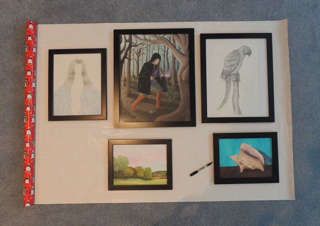 Step 2: Flip the artwork over and label both the artwork and templates. Labeling the pictures at this stage will help enormously. In addition, label both the front and back of the template with the number of the appropriate piece of art. I suggest you also label the number on both the front and back of the picture. Next, look at the hanging device (for example, a triangular hook, sawtooth hook, or wire that will need a few nails) for each picture. On each template, mark where the nail(s) should be placed. You will eventually transfer this point to the wall, so measure and transfer it accurately. 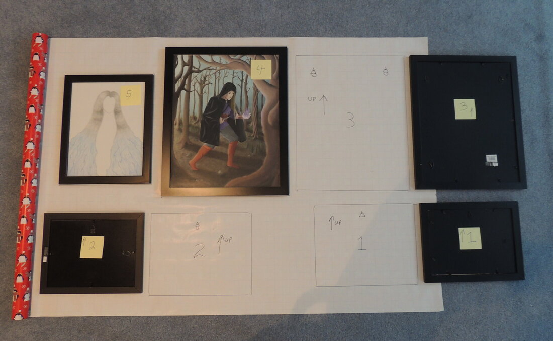 Step 3: Cut out all the templates that you’ve drawn. 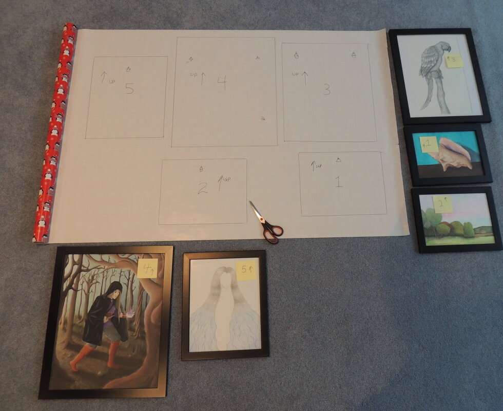 Step 4: We now have our templates. Don’t skip this template stage. It’s very important since the templates show the positions of the nails that will eventually go into the wall. Having these templates also allows you to easily try out alternate arrangements - either on the wrapping paper on the floor - or actually on the wall using blue painter’s tape to temporarily hang the templates. 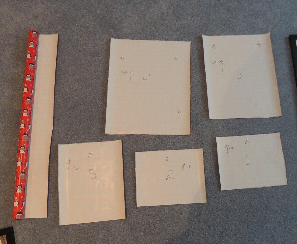 Step 5: Roll out more wrapping paper - wide enough for the gallery wall - and try out different arrangements with the artwork. Based on the test arrangements that you made using the templates on the wall, place your artwork on the rolled out paper as it pleases you. If you haven’t tried out different arrangements on the wall, then play with different arrangements on the rolled out paper using either the artwork or the templates. For this example I’ve shown a very symmetric arrangement, but asymmetric arrangements work very well and are probably preferred if you have a great deal of artwork, perhaps more than 6 pieces. Once you’ve decided on your final configuration, trace around the picture frames so that you’ve captured the final layout on the rolled out paper. If your gallery wall height (the vertical distance of the pictures) is large, you might need to connect two strips of paper together. If you are doing a configuration up the stairs, you will definitely need to connect papers together. If you would like to use computer technology to play with different layouts (instead of paper), you can take a photo of the arrangement and Photoshop or PowerPoint it onto a picture of your wall. I have rendering software that will easily do this. So, if you want some help send me a photo of your wall, the size (width) of the wall, and a photo of the wrapping paper with the pictures placed upon it. Give me the dimensions of the wrapping paper, and I will scale your photo montage accordingly and give you a rendering of your proposed configuration. 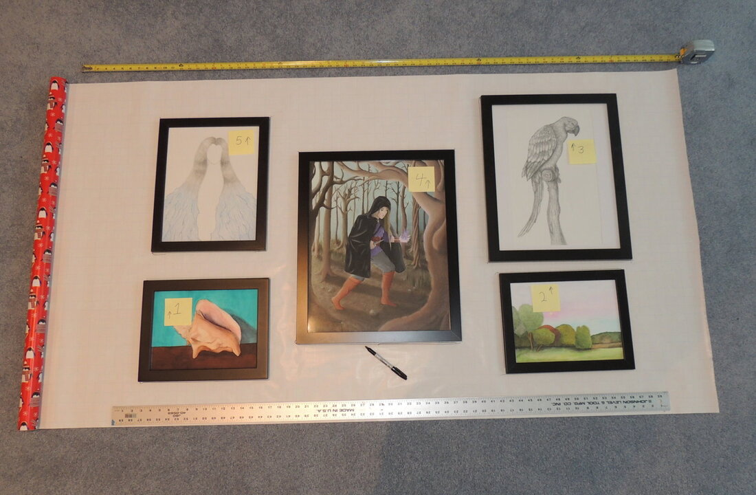 Step 6: Remove the pictures from the rolled out paper. Remove the artwork and place the appropriate template onto that picture’s space. In the example below, I place Template 2 on top of the final desired location for picture 2. Next, use an awl (or other pointy object) to push through both pieces of paper to mark where the nail should go. 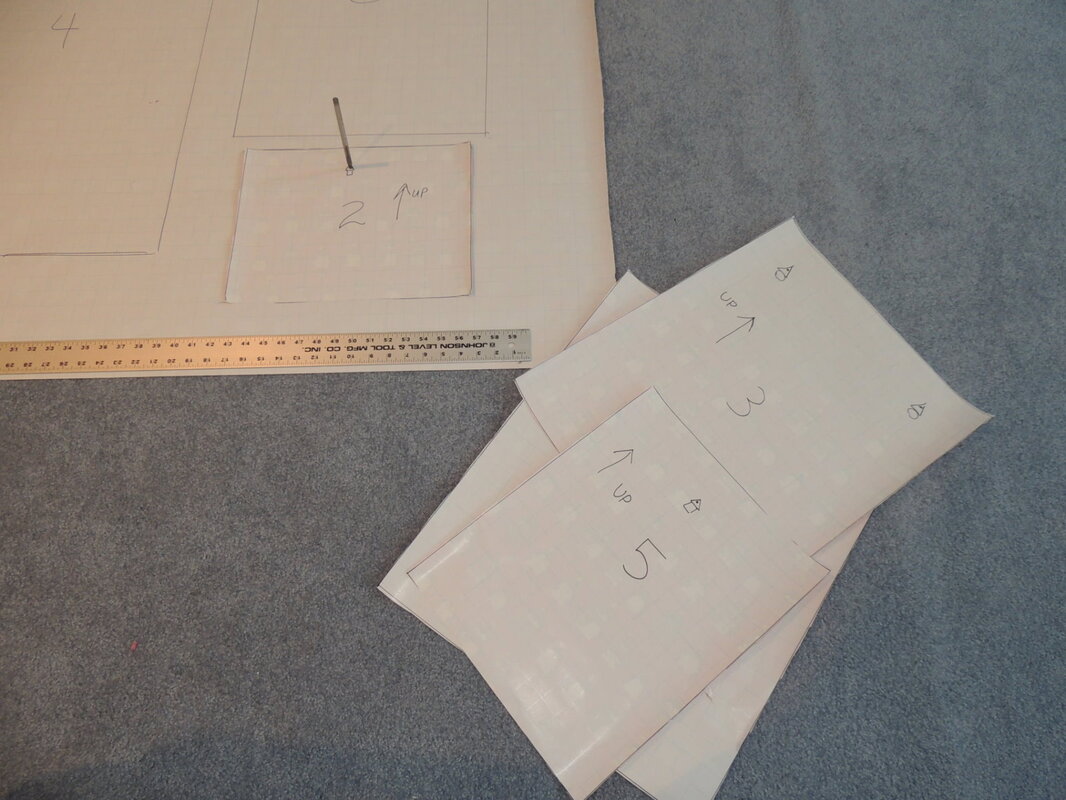 Step 7: Place all templates on the rolled out paper and mark all nail spots. Having the paper on carpet makes this an easy exercise. If you are working on a table, you can use carbon paper between the template and the rolled out paper to record the nail marks - but please, do it gently so that you don’t damage your table. 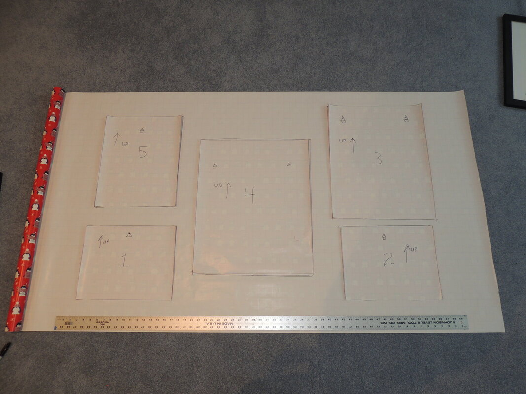 Step 8. Now you should have all of the outlines of the pictures drawn on the rolled out paper with all of the nail spots marked. 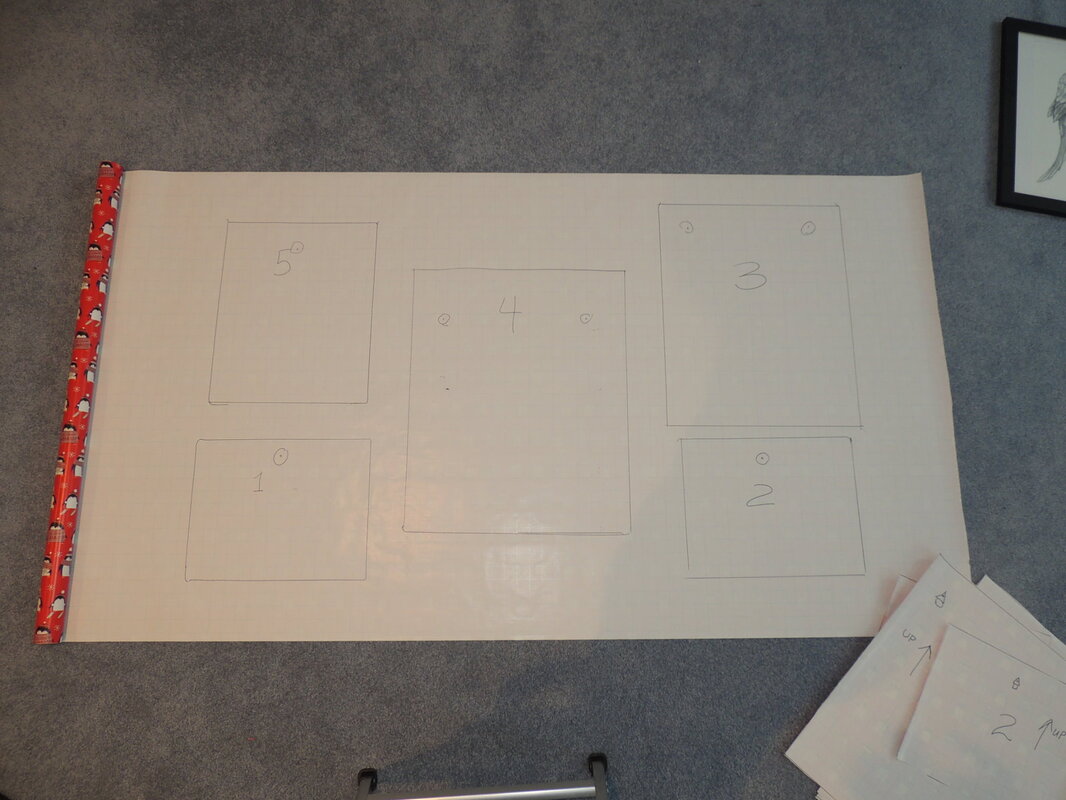 Step 9: Hang the roll of paper on the wall with blue painter’s tape, making sure the horizontal grid lines are perfectly level. 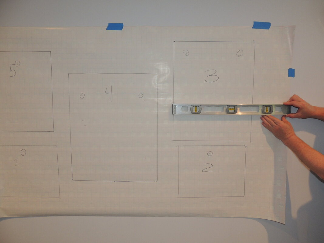 Step 10: Now you know where to hammer the nails. Make slight indentations with a nail, remove the paper, and finish the process. Hang the pictures and you’re done. Viola! Featured Artwork was made by My Daughter I hope you’ve enjoyed seeing a fraction of my daughter’s artwork that I used for demonstration purposes in the photos for this gallery wall tutorial. We have several gallery walls in our home with her beautiful artwork in oils, pencil, watercolor and acrylic mediums. If you’d like to see more of her art and photographs, you can see it online by going to her Redbubble shop - which I previously mentioned in my “Finding Inspiration in Your Travel Photos” blog post. On the Redbubble site you can purchase over 75+ different types of items with artwork from over 500,000 artists printed on them (e.g. mugs, stickers, phone cases, wall art prints, T-shirts, pillows, acrylic blocks, coasters, postcards, greeting cards, tote bags, drawstring bags, water bottles, shower curtains, spiral notebooks, etc.,). We’ve enjoyed seeing where my daughter’s customers are coming from around the globe. Amusingly, with COVID-19 currently raging, people have started buying one of her photos from the “Lord of the Rings” and “The Hobbit” movie set located in Hobbiton, New Zealand for facial masks. The photo’s of Bag End with the “No admittance except on party business” sign. Now that’s just perfect for a mask! 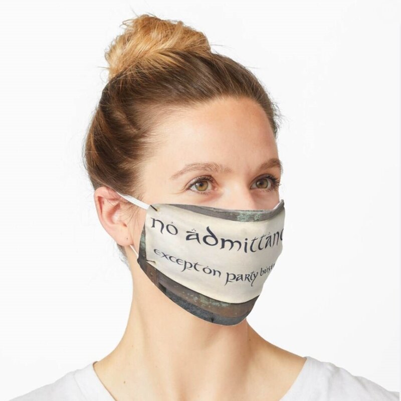 Who would have thought?? In any event, you might want to check out her Redbubble shop and browse around. You will of course recognize some of the originals that I used in this demonstration. Stay healthy and productive. Drop me a note, or give me a call, if you get stuck during your efforts to create a gallery wall. I’ll be happy to help you out with a rendering if you ask.  In my previous blog, I promised this post would be about “composing a gallery wall and installing it easily and perfectly by yourself”. Well, as all of you know, these days plans change fast! Since I wrote my previous blog, I’ve set aside my decorating efforts for a couple of days each week to make face masks for my family and friends to protect them from the COVID-19 virus when they are out and about. 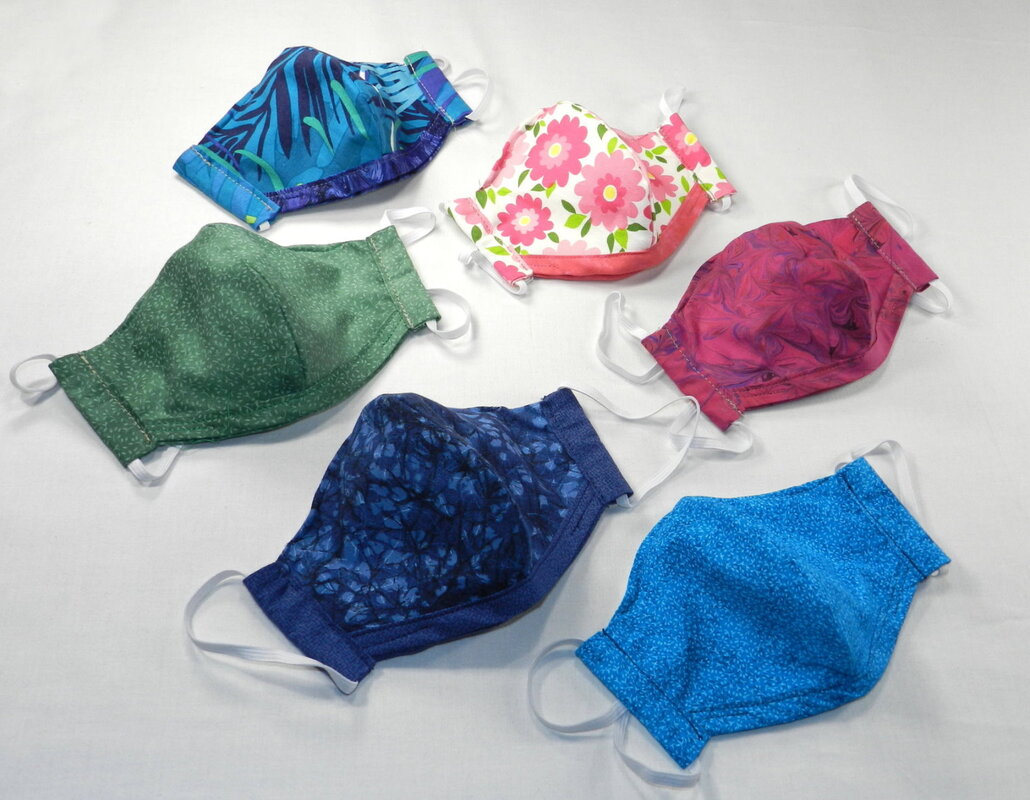 I’m not selling these masks, or making them for the general public, so why am I blogging about them? Well, in short, to offer what I found out about making masks to any other people who want to make masks themselves, so that they don’t have to go through the same learning curve that I did. The US sewing community (professionals and home-sewers) have really rallied to all the calls from hospitals, nursing homes, the Surgeon General, and the whole population of the US for fabric masks to help protect individuals (regular folks like me and maybe you) with an effective face covering. We’ve been advised that because of the current shortage of Personal Protective Equipment (PPE) the “official” N-95 medical masks should be reserved for medical workers and essential personnel on the front lines fighting the COVID-19 virus. The disposable blue masks seem to be available at the present time, but they’re really only for one-time use – not a great option. So what’s the alternative? The best alternative appears to be handmade 100% cotton fabric masks that are washable. Let me be the first to acknowledge that there are numerous patterns out there on the internet (for free, of course) for these fabric masks. If you go to YouTube and search “fabric masks” you’ll find an amazing amount of helpful advice, videos, and patterns to hand-sew or machine-sew fabric masks. All of this advice and these patterns are probably better than nothing – but there are significant differences in the protective quality and fit of the patterns. I know, since at the start of my mask making journey, I surveyed many articles and videos, and downloaded many of the patterns. After I found what looked like the best pattern, I started producing masks. That’s when I found out that some of the patterns look fine – until a person tried to put it on only to find out that it’s too bulky, too loose, has ties that won’t stay tightly tied, has elastic that’s too tight, or has some other problem that limits its wearability or breathability, adaptability to various face/head sizes proportions, or effectiveness. Here are some photos of the masks that I’ve made to date – from my initial pleated version (which was the initial home-sewer “design of choice” because of the ease of cutting a rectangle and sewing, but had some fit and bulkiness problems) to the more fitted version that I’m sending out now to my family and friends. Mask #1 (version 1.0): This initial design was the best of the rectangular pleated designs that debuted on the internet in early March. It looked good and seemed to have the proper attributes. To start with, I preshrunk all of the 100% cotton fabric by washing it in hot water before starting fabrication. I then made about 30 masks to send out for the “something is better than nothing stage” and to request for feedback. On this initial version, my friends and family commented that the fit wasn’t snug enough and the ties were hard to keep tightly tied. They did appreciate the fact that the outside was clearly a different fabric pattern than the inside, which made the “contaminated” side easily discernable from the side worn next to the face. They also liked that there was a way to insert additional filtering layers inside the mask if needed and that I had added a piece of floral wire at the nose (top of the mask) so the mask could fit tighter on the face and not fog the wearer’s glasses. 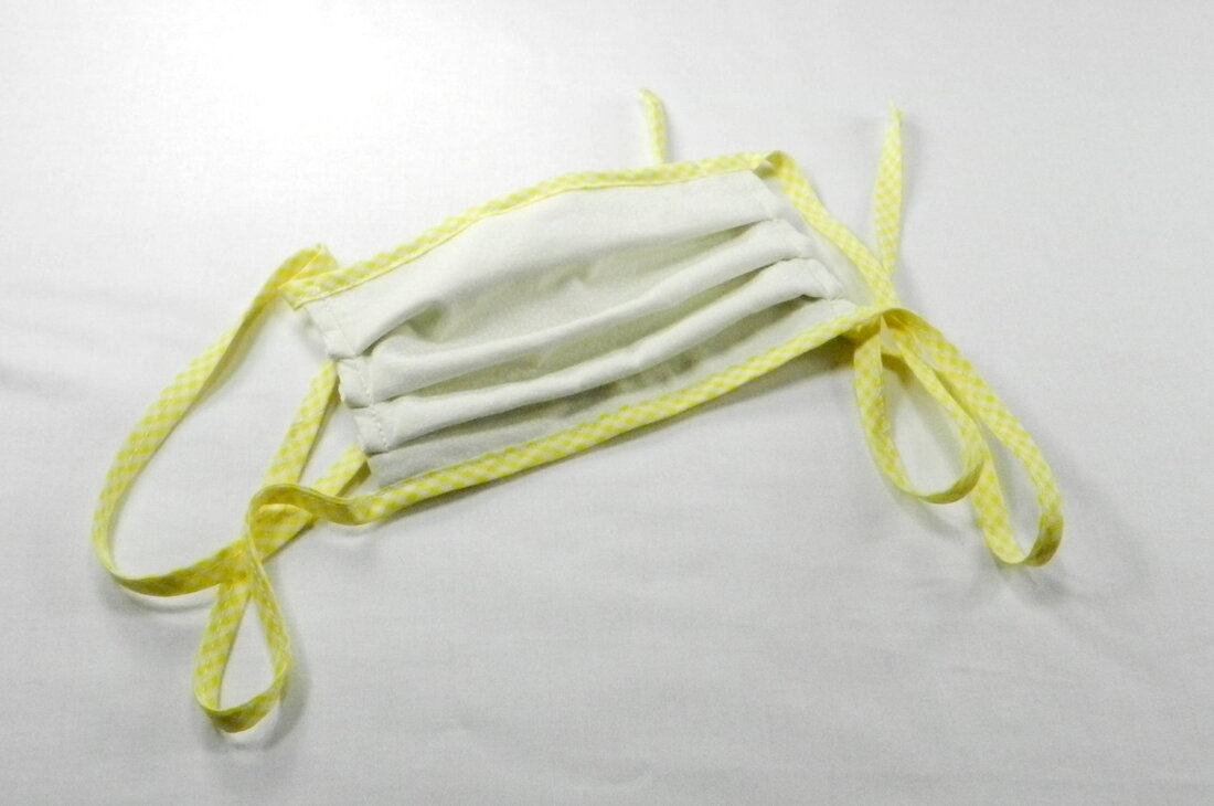 Mask #2 (version 1.1): This had a much more refined mask. Instead of a pleated rectangle this mask was actually more contoured and placed the pocket for adding an additional filter on the front so that the opening didn’t rub against the wearer’s face. The biggest downside was that the twill ties were still ungainly and didn’t work well for some people based on their head shape. 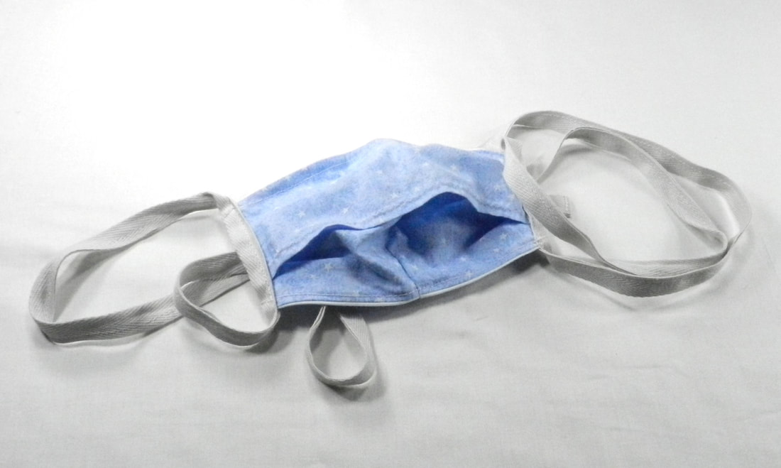 Mask #3 (version 1.2): This version was essentially the same mask as v1.1, but with elastic instead of twill ties. The feedback that I received on this mask was that the fit was better and the mask stayed on better. Unfortunately, since the elastic was a preset length, some people had problems wearing the masks for long periods of time because the elastic pulled on their ears. 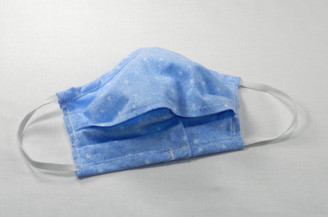 Mask #4 (version 1.3): This version refined v1.2 by contouring the mask even more for a tighter fit and refining the filter pocket to be more streamlined. 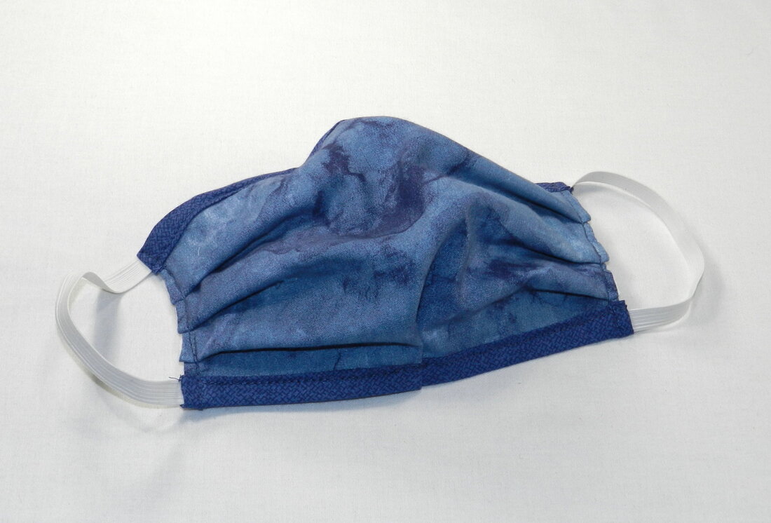 Mask #5 (version 2.0): As I refined my mask pattern I continued to innovate and go back to the design space based on the feedback I received from my family and friends. While I was doing this a breakthrough occurred when one of my vendors, Sailrite, sent me an email detailing their mask research efforts and their discovery of what they believed to be the “best mask pattern” (https://www.sailrite.com/how-to-sew-diy-face-mask). I discussed the merits of this new pattern with my interior design and drapery workroom colleagues, as well my 92-year-old mother who had tried out my v1.0 design. In addition to lots of great comments from my colleagues, my mom provided a brilliant suggestion to make a casing (or channel) at the sides of the mask so that the elastic could be inserted through, and tied to the best length by the actual wearer, rather than cutting the elastic to length and hoping that it wasn’t too tight or too loose for the specific wearer. Once adjusted. the knot can then be moved so that it is hidden in the fabric channel. Mom’s so clever, and is the one that taught me to sew when I was 6 years old. Thanks Mom for the great suggestion! The photos below show my current (and probably final) mask design with a close-up of the internal pocket where you can insert any type of filter (e.g. paper towel, piece of a hepa vacuum bag, piece of air filter, etc.,). This design fits snugly over the mouth and nose, but still allows for good breathability, and has adjustable elastic.
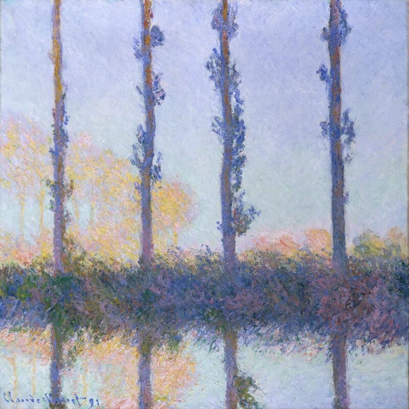
If you’re interested in what the attributes of a medical quality N95 mask are, here’s a good article to read through: Making An N95 Mask For COVID-19 Coronavirus? What You Need To Know https://www.forbes.com/sites/brucelee/2020/03/29/making-an-n95-mask-for-covid-19-coronavirus-what-you-need-to-know/#5706a0b84989 So that’s it for today. Like I mentioned earlier, I’m not selling these masks, just providing them locally to my family and friends as a small effort of community service. Frankly, it has been fun to resurrect my quilt fabric stash and use up all those small bits (for good). Today I just wanted to share what I’ve learned so that others can learn from my trial-and-error process. I’ll get to that blog post about composing a gallery wall as originally planned in the near future. Until then, stay safe and sane. We have a bright future ahead, I am sure of it, and I wish you all good health. (And wear your mask when you go to the grocery store!). Finding design inspiration can be difficult, and the challenge is different for everyone – but luckily inspiration sources are actually everywhere. Might it be lurking in all those travel photos and mementos that you have stashed away waiting for a rainy day? Right now we could all use some inspiration, and many of the clients that I’ve reached out to recently say that they’re using this “pause” to look at old photographs and finally organize them. What a wonderful endeavor - one that often gets sidelined after a trip or special occasion. It’s remarkable that even organizing today’s digital photographs can get set aside, even though our devices and computers make the task as streamlined as possible. Perhaps it’s that we take too many photographs with the magic of digital photography, and the sheer enormity of just deciding which of the 1000+ vacation photos to print becomes a chore for the “do it later” pile. As you know, I love to travel with my family – to far-off exotic places, cities, national parks, grand vistas, historic sites all over the globe, you name it. Over the years, one of the things that I’ve found is that after we return home, our photographs become a marvelous source of inspiration for new design projects, both in our home and on my client engagements. For example, after we returned from a trip to Japan (you can see that blog post here – “Design Impressions from Japan”), my daughter and I embarked on a project to redesign our Massachusetts backyard into more of a Japanese garden. Ironically we happened upon more Japanese garden inspiration later that year on a trip to Acadia National Park in Maine where we found the beautiful Asticou Azalea Garden, a Japanese stroll garden built in 1956/57. I marvel at the peace and calm of the photo every time I see it. The ducks in the photo apparently appreciated the wonderful setting too.  Another inspirational trip for us was our journey to Paris, Giverny (Claude Monet’s home), Bordeaux, and Lisbon. In a previous blogpost (“A New Fabric Line That Is Perfect for Summer”) I shared some photographs from that trip where we marveled at the beautiful architecture of the churches, monuments, and all the gorgeous detail. However, that’s not so say that you have to travel half way around the world to find inspiring sights. For example, here’s a photo taken inside a lighthouse in Maine that echoes the beauty of the architectural form I love so much, albeit in a much more rustic fashion. 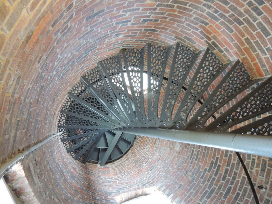 In the Boston area, architectural splendor and design are all around, and in sometimes seemingly unlikely places like the Waterworks Museum in Boston, which I featured in a previous post (“Waterworks Museum: Worth Visiting for Industrial Design Inspiration”) and in trips to local area parks and preserves which have also produced an abundance of design inspiration for me. Who can dispute the beauty of the natural form in budding branches that are so welcome outside our windows right now? Here’s a photo of the Kanzan Cherry tree in my front yard from last year:  I can’t wait to see what this Spring’s display will be this year. Blossoming branches are a terrific way to refresh your interior, as shown below in a Pottery Barn photo of their Faux Sakura Cherry Blossom branch in a kitchen setting. Are your forsythias in bloom right now? Are your local pussy willows peeking out their fuzzy buds? Is your lilac bush blooming? To brighten things up you might take some of these budding branches, put them in vase with water and celebrate the resilience of Springtime inside your home right now. 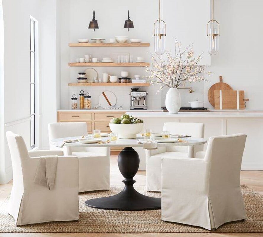 Of course I’m also fortunate to be surrounded by numerous nature preserves. During a trip with my daughter to a local park in Marlborough last Fall we saw a line of trees that struck a design note with me since it reminded me of Monet’s painting “The Four Trees”.
So my message to you today is clear – if you’re looking for design inspiration you already have inspiration at your fingertips in the photos of the people and places that you hold most dear. If you see a pattern in the things you photograph (like seaside scenes, or branches, or interesting doorways) you can use these images as design inspiration to make wholesale changes in your home (e.g. paint, wallpaper, furniture, light fixtures, window treatments, etc.,) or, on a much smaller scale, you might consider developing a photo montage for a gallery grouping in your home. But that’s a topic for my next blog where I’ll give you my advice on composing a gallery wall and installing it easily and perfectly by yourself; a great project that you can easily accomplish while you’re stuck at home. Needless to say, with all the on-line resources for printing your photos to any imaginable size and medium these days (like Shutterfly), it’s an easy DIY task to move your inspiration from your computer screen to your walls so that you can be surrounded by the images you love.  In fact, the online systems have grown so sophisticated that I’m happy to say that my very artistic daughter has been putting her own artwork and designs on-line via Redbubble.com so that other people can also enjoy her paintings, drawings, doodles, colorful "word art" and photographs by having them made into products. What kind of products - well almost anything to include: coffee mugs, stickers, phone cases, wall art prints, T-shirts, pillows, acrylic blocks, coasters, postcards, greeting cards, tote bags, drawstring bags, water bottles, shower curtains, and spiral notebooks. She even edited her photographs in Photoshop and uploaded them to as large format photos (~25 MB each) so that they can made into large products such as throw blankets, shower curtains, pillows, laptop cases and skins, scarves, notebooks, etc. The Redbubble website is really nice since it shows exactly what the product will look like with the selected artwork. So check it out! She is an amazing artist and entrepreneur. As you might guess I’m so proud of her. Here’s the link to my daughters Redbubble Shop and a few of her photos as they would look transferred to various products: https://www.redbubble.com/people/magic-24/shop In closing, here’s a little design inspiration for you – a photo of my daughter’s latest oil painting: “Old Keys and Flowers” 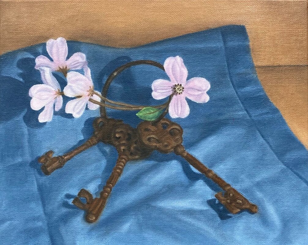 One thing’s for sure - we could all use some inspiration, encouragement, fortitude and togetherness-in-spirit right now. Hang in there and God bless all of you. Since many of you are currently either "working from home", or housebound from all the Government dictates, now might be a good time for you to address some of those home decorating projects that you have been pondering for a while. After all, Spring is arriving and that's a great time to refresh your nest - especially since you and your family are undoubtedly spending more time inside than usual. An important note: I hope that you and your loved ones are all doing okay in this uncertain and scary time of medical crisis. I also hope that you are okay with me putting out a business blog post that deals with a very non-emergency thing like interior decorating at this time. In my business, there is no such thing as a decorating emergency, and we all know (and appreciate) that. However, like you, I’m trying to get my family through the day in a productive way, abide by all the social distancing and health rules, and support my community and neighbors during this mess. So I think this blog post is reasonable – I hope that you do too. Thanks for understanding. Now here’s how we can work together - at a distance – over the next few weeks.  Shop-At-Home Service My interior design business has always supported “shop-at-home,” and my design studio is located in my home, so I am already very well postured to help you with interior design activities “from a distance.” This means that we don’t have to interact face-to-face to get things that have been on your list for a long time accomplished! Because of how I’ve always operated, I have all my tools and resources at my fingertips right now, including fabrics, paint swatches, samples, sewing machines, woodshop, and my digital rendering software. So I’m ready if you are. Meet and Home Walk-through via Electronic Means Normally, I would come to your home in the Boston area, meet you, and discuss the scope of your interior design needs in person. Well, with Facetime and Zoom, we can still accomplish that task exceptionally well, just from a remote stance. After these discussions, to let you know how the proposed design would look, you can email me photos of your home, and I can email you back digital design renderings so that you can envision your home in a new way.
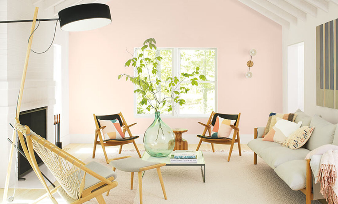
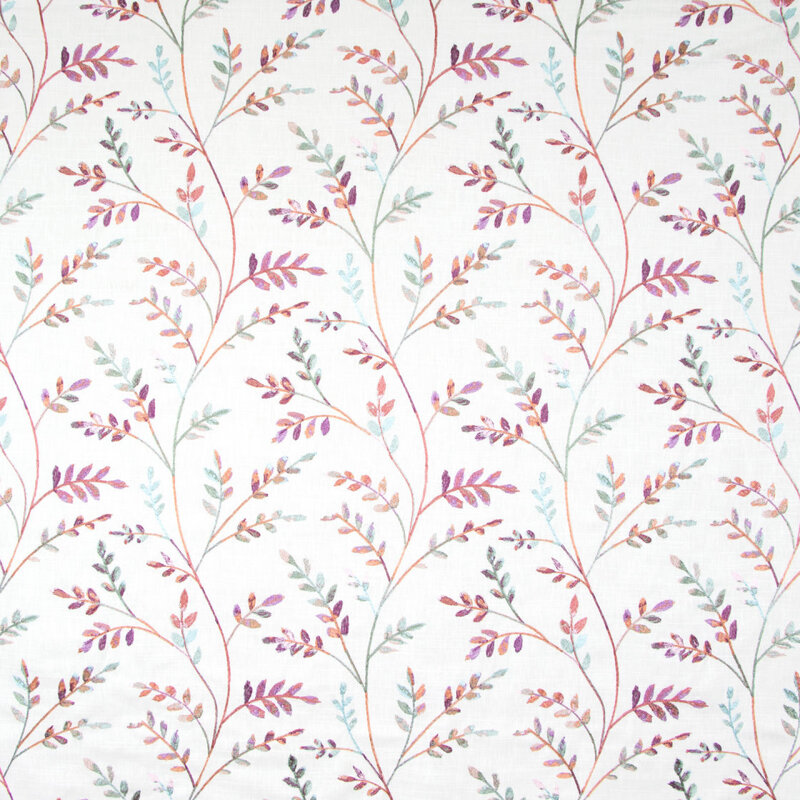
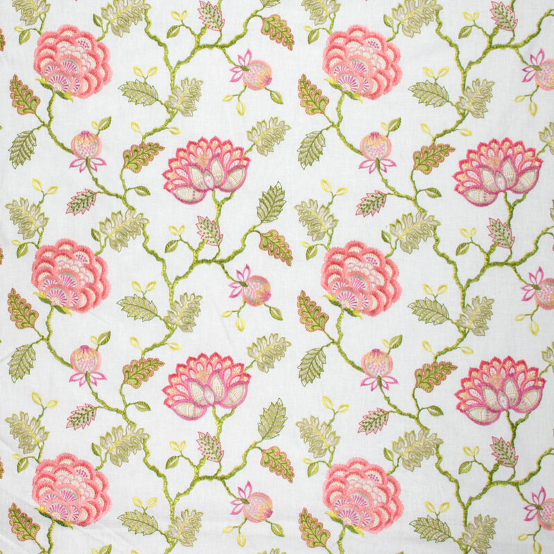
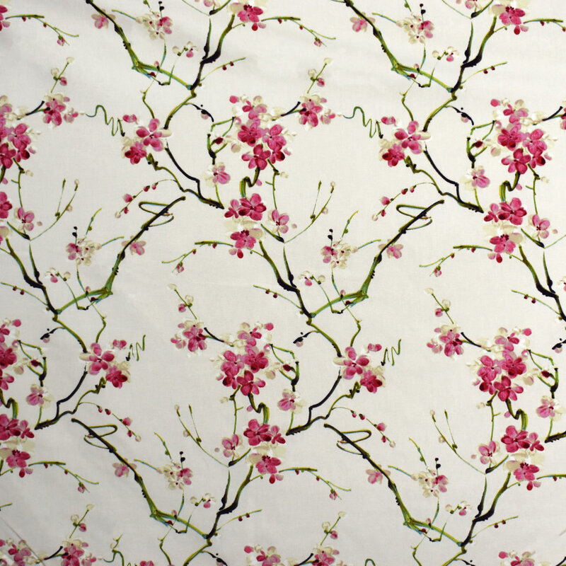
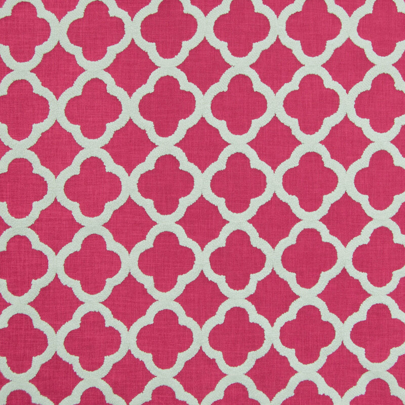
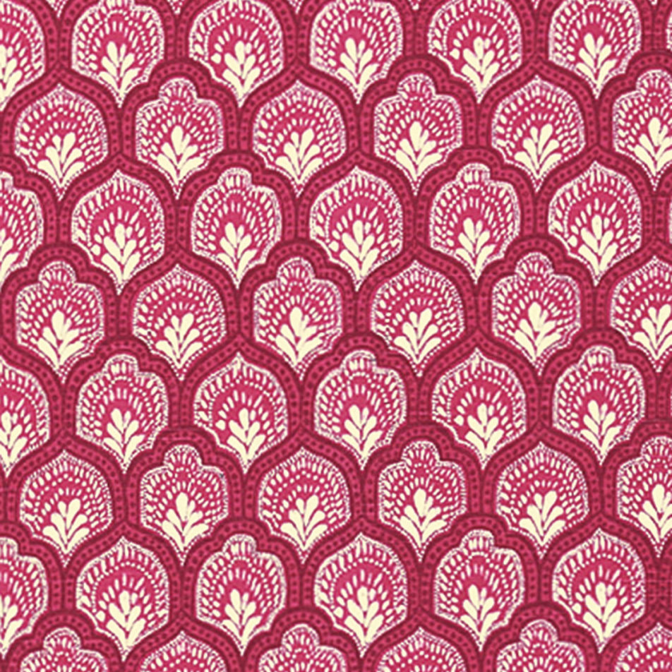
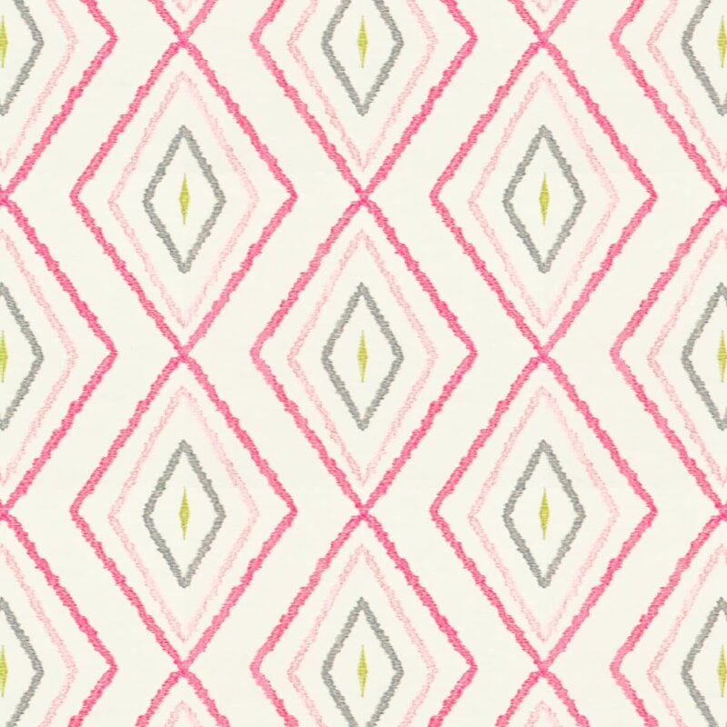
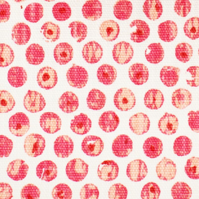
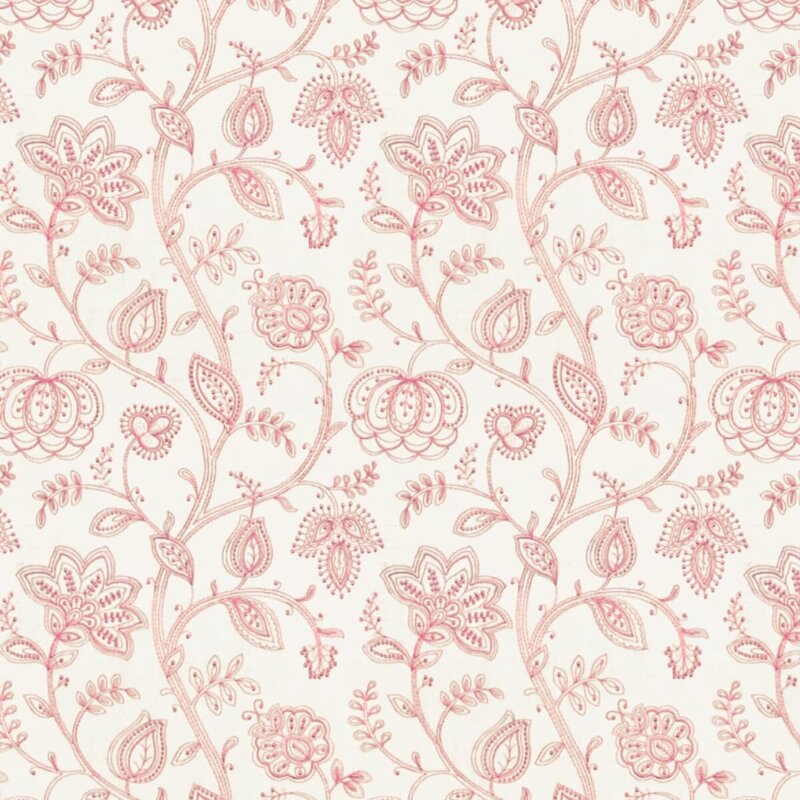
Ordering Products I'm a firm believer in American manufacturing, and my 3 main fabricators of blinds and shades (Lafayette, Horizons, and Comfortex) are all located in the US. Two of these manufacturers, and 95% of my fabric vendors remain open, operating and sending out products as of 27 March 2020; so that part of the interior design pipeline is very much viable and strong. Because they are great, I would very much like these companies to stay in business (and employ their fabulous workforce who always “speak with a smile” on the other end of the phone) during this time of uncertainty. In addition, my furniture vendors are all working remotely, and I have been in contact with my representatives to keep the ball moving on designs for my client’s current projects. For more information on my support to American manufacturing, you can check out my previous blog post. Working out the Details Once we have sorted out a design and plan, we can move on to implementing your design vision by taking the next actions remotely: Samples My fabric vendors are still sending out samples, so I can order samples that can be directly delivered to you. That way you can see, touch and feel whatever fabrics we determine together are contenders for your project. Taking Measurements Well, that might be a tad more difficult to do remotely, but we can work this out via Facetime and/or Zoom. I know that we can be creative! Fabrication I am getting lots of sewing/fabrication done while at home! You would not believe the amount of “inventory” of fabrics I have that are just waiting to be made into projects (e.g. valances, pillows, cushions, etc.,). Dropoff and Installation I am happy to deliver items to your doorstep like the UPS or FedEx driver. I can even install your items in your home (with appropriate social distancing and sanitization protocols) – or we can get everything made and install it after the crisis wanes. Alternatively I can guide you to install them yourself – by providing you with online installation instructions and by walking you through the installation via Facetime and/or Zoom. So, if you want to make good use of this break from “normal” life, give me a call at 978-440-7264. As always, I offer a free initial consultation, and that can be via electronic means. During our call we can chat about your needs and set up an electronic walk-through. It’ll be nice to talk to you, whether about decorating, or how fortunate we are to be in Massachusetts in the springtime, or our families, or that “elephant in the room.” As a note of encouragement, this morning my Lafayette representative, Jackie Ibarguen, sent me a quote that I liked: A bend in the road is not the end of the road... unless you fail to make the turn."-- Helen Keller Stay healthy! Personally I’m looking forward to our country and the world making the turn to safer times together with compassion, spirit, and dedication. In my last post, I discussed decorating with the color Red, and I briefly touched upon the topic that decorating with Red is remarkably different from decorating with Pink. That’s curious, don’t you think? After all, decorating with all values of a color (from light to dark) works fairly well with blue, green, and neutrals of beige and gray. But definitely not with red and its lighter companion pink. What makes pink so special? Well, I’m not sure, but perhaps because pink is inherently perceived as soft, and red is inherently perceived as loud, they are just different. So, here are some general design guidelines for decorating with pink. I like pink. I have done numerous pink bedrooms (for little and not-so-little) girls, and it’s always a happy endeavor. And the joy of the young clients in choosing their paint color (with only a few options presented, naturally) and their fabrics is also just delightful. I’ve also done other rooms (family and adult spaces) with pink as the accent color, and they have been refreshing and happy, like in this Lexington, MA living room below: 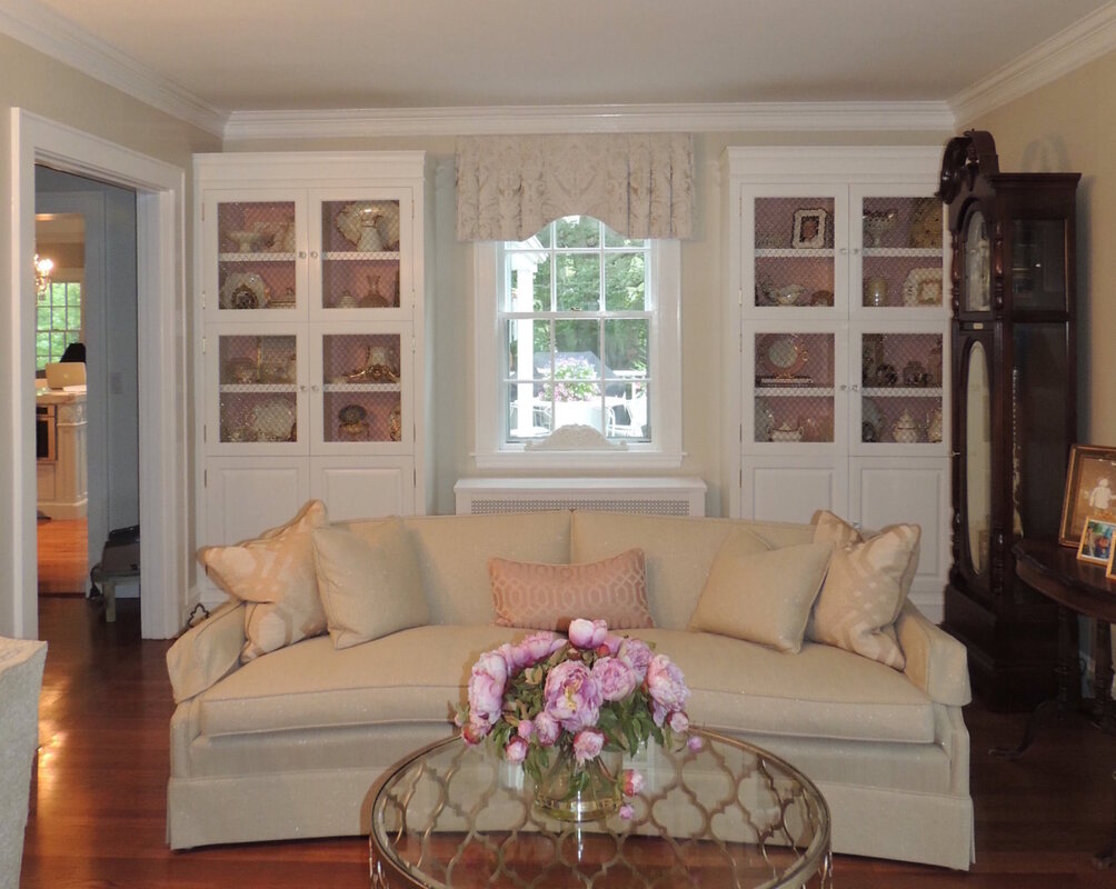 When decorating with pink, I have always found it best to find an inspiration fabric to start the fun. Sometimes it is the motif (floral is pretty predominant, but geometrics are strong lately, and there are lots in pink to choose from), sometimes the intensity of the pink is the draw, and sometimes a fabric just starts the spark. Here are some great current pink fabrics that are available from my vendor, Greenhouse Fabrics.
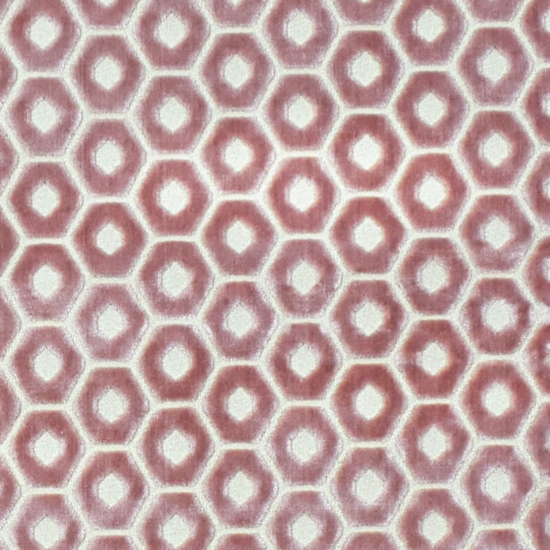
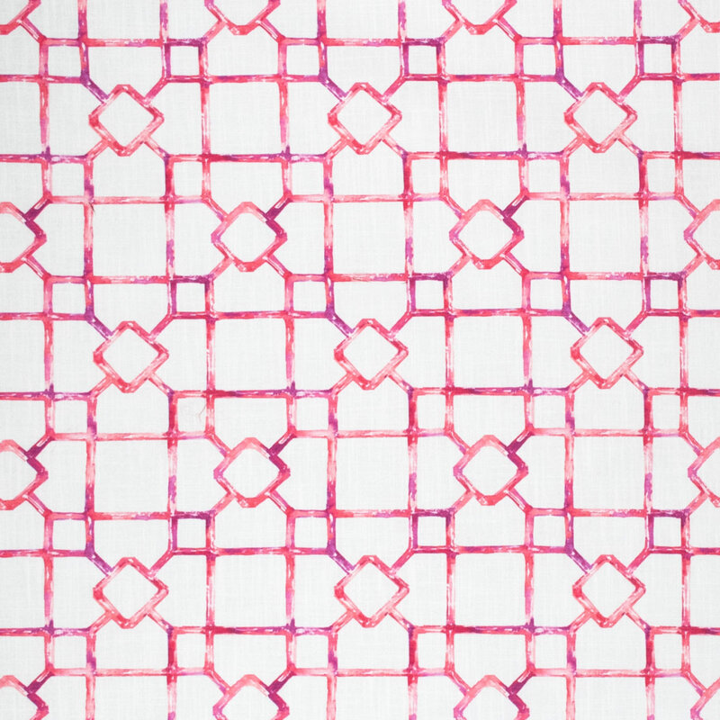
Additionally, here are some excellent pinks from another one of my vendors, Stout Fabrics.
One thing you’ll notice about these designer pink fabrics is that they are generally monochromatic: pink and white or pink and ivory. If there is an accent or second color, it is usually green. From a color specialist perspective, I find that so curious because in the interior design field, we generally don’t embrace too many “complimentary color” parings like red and green. But pink and green are certainly compatible as the fabric swatches shown above attest. Pale pink goes well with green, and bright pink (hot pink or fuchsia) goes very well with blue, as they are very close on the color wheel. Rules of Thumb When Decorating with Pink:
 Well, that’s a wrap on the color pink. Let me help you navigate the intricacies of pink! As subtle as the color is, it demands a careful eye to make it sing with the rest of the décor. |

Barbara PhillipsBarbara Phillips, interior designer and owner of Center Stage Interior Designs, has delivered impeccable window treatments and design services to both residential and commercial clients in Massachusetts since 2001. Categories
All
Archives
March 2021
|


 RSS Feed