|
In today’s Interior Design landscape, there’s a great deal of free advice out there. My blog (and hundreds of other blogs) is free. Pinterest is free. Houzz is free. Asking questions of Houzz designers is free. Major furniture chains (like Ethan Allen) have designer services that are free. All free and available at your fingertips on your computer with a few simple search terms - ready to help you redesign your home’s interior. So you need to ask yourself three critical questions:
 Century Furniture showroom at Boston Design Center, one of the many trade resources clients can access through me Well, it’s a bit of a consumer nightmare out there, sorting out the free wheat from the free chaff….and the sorting requires lots of time and energy spent by you! Which brings me to the following list about design fees: Why paying a design fee for a specific project is good for you:
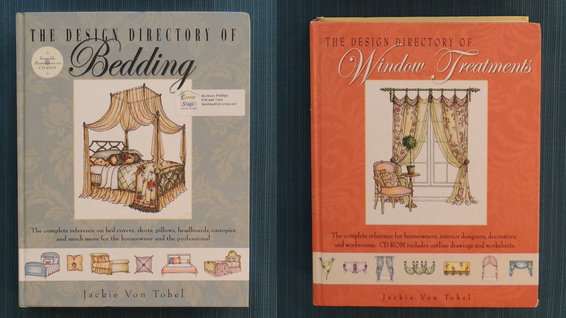
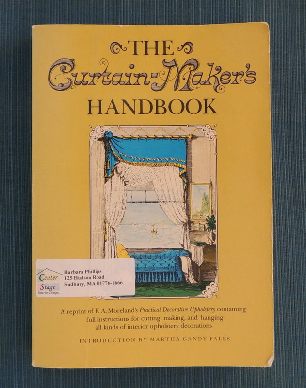
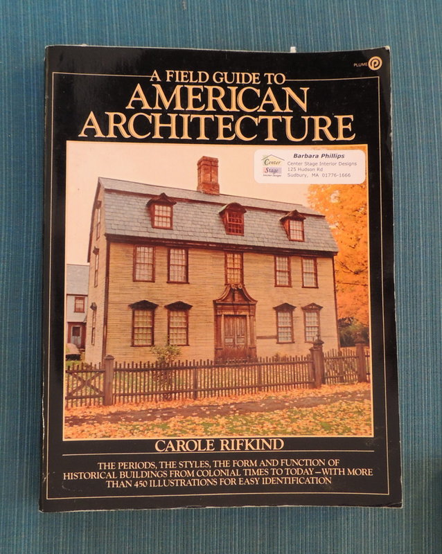
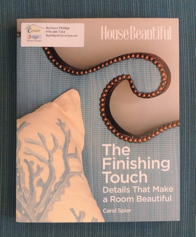
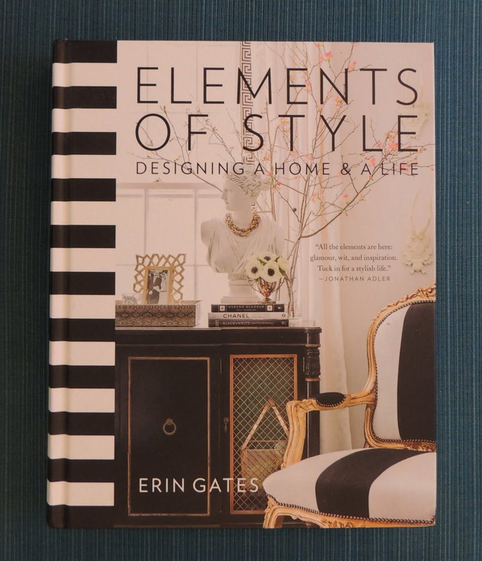
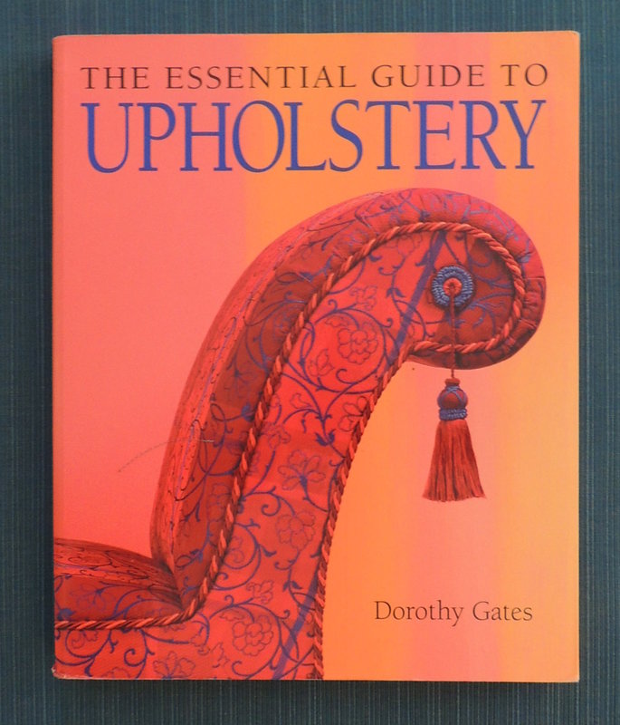
For all these reasons, I have developed a design process that has served my clients extremely well over the past 17 years (see the “Client Journey: How We Work Together” page). And that process includes having my clients pay a design fee up front based on a clear understanding between the client (you) and the designer (me) on the scope of the project and what the client will get for that design fee (e.g. photographic renderings, fabric swatches, wallcovering samples, paint selections, pricing, time estimates, etc.,). As a client of any service, don’t you want to know what you are going to get, how it’s going to look and what it’s going to cost? Of course you do! I can think of many instances in my own personal life where I’ve paid an up-front “design fee” to start a project out on the right footing. For example, when we were first married we moved to Colorado, purchased a new home and paid a landscape architect to draw up a detailed landscaping design. Frankly, we had no clue on the trees and shrubs that grew in Colorado’s climate, and it would have been way too laborious and inefficient for us to research it ourselves. That’s what you hire any professional for, right? With the landscaping plans we paid for we could make informed decisions on what we were going to do and when. We ended up using that architect’s landscaping company for the major initial work and did many of the smaller jobs ourselves on a time phased approach. We were happy that we had the structure of the architect’s design plan to guide us on the overall project, the costs and the time phasing. Similarly, years ago we paid an investment advisor to perform a comprehensive financial review and design a retirement plan, with no risk of him selling us specific investment products that were more financially rewarding for him than they were for us. We were seeking a high-quality, objective and informed professional opinion. To get that we paid a design fee to the investment advisor, and therefore spent time specifying our needs and paid attention to, and placed value on the plan that he developed. And it’s no different with a professional Interior Designer (except Interior Design projects are way more fun!) So now I’m going to make a statement that will probably make you wince: “Nobody values decorating advice they don’t pay for.” Yes, it’s true. Free decorating advice from the internet is valued as much as asking your mother-in-law, sister, best friend, or pet. Harsh words, but it’s true! We value what we pay for…….maybe it’s because we have to invest our time in doing the research to find the right person to pay for advice. Think about it! When was the last time you took professional advice that came for free from a Doctor, Lawyer or Plumber? In my opinion, if you have a significant decorating project you need interior design help and advice, and you probably know it. The good news is that this help can be extremely beneficial in terms of money and time spent, and in the happiness that comes from getting it right the first time! As a designer who charges a design fee I can assure you that doing this aligns us and makes sure that I have your unique goals and interests at heart. I can help, and you will be amazed at what we can accomplish together! Call me at 978-440-7264 so that we can get started on the project that you keep putting off.  This week I thought that I would share with you my Top 11, all-time favorite, Interior Design books from my own personal library. I am a huge fan of the printed word, and when I say printed, I mean actually printed out on paper. Cyberspace is indeed incredible for communicating the written word and gorgeous photos, but I just adore books in book form, especially ones I can curl up with. So, here are the interior design books that I reference all the time, from inspirational design to fabrication methods to architectural classification. I’ll review each book, clockwise, starting in the lower left corner. These are presented in no particular order in terms of how much I adore the books…it’s just too hard to choose anyway. It was hard enough for me to pare it down to only 11! 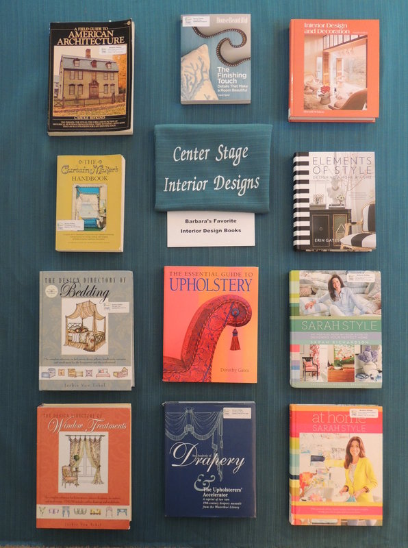
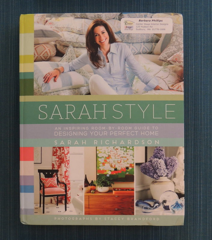
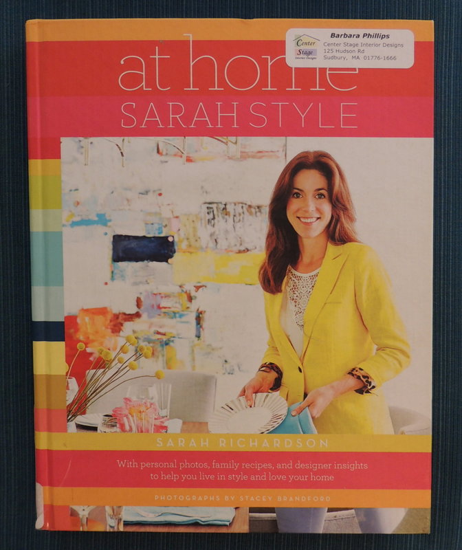
8 and 9) Sarah Style (2014) and At Home Sarah Style (2015) by Sarah Richardson My all-time favorite designer, Sarah Richardson, has written two books that I recommend to anyone redecorating a residence. She’s Canadian, and you have undoubtedly seen her on HGTV. I love the fabrics she has designed and her overall sense of vitality, freshness, and use of textural materials in her residential interiors. The looks she favors are particularly relevant in New England with our millwork, architecture and size and layout of rooms.
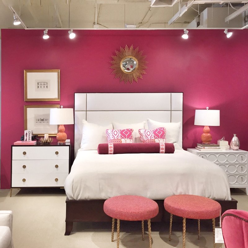
So, that’s it for my Top 11 Interior Design books. If you are in the Sudbury MA area, you are more than welcome to borrow any of these books…just call. Happy reading to you, whatever the format!   In today’s hectic world it’s not uncommon that getting around to decorating sometimes falls to the bottom of the “to do” list. Decorating takes time and energy. Sometimes it feels like just too much work to take on. Help might be the answer. So, if you’re struggling with defining and executing your interior design vision, here are 9 indicators that it may be time for you to ask an Interior Designer to assist you. 1. When you moved in, you accepted the previous owner’s paint colors that don’t quite go with your things, yet you’re reluctant to make a decision on new paint colors.
2. The rooms in your home don’t flow…the living room is red and Tuscan. The library is 1920’s Craftsman in navy and green. The kitchen all white and slick modern. The family room is mid-century modern with teak wood. Oh my! It’s like you’re at a museum and each room is from a different decorating era.
3. There is no artwork on your walls because….you just don’t own any!
4. You’re 35 and you don’t have a proper bed and headboard. Your mattresses are on the floor, and frankly, it’s getting harder and harder on your knees to get out of bed.
5. You have totally bare windows in every room of your house…and/or your neighbors are making snarky remarks at the neighborhood holiday party about the “wink, wink” need for shades.
6. The pillows on your sofa all came with the sofa…years ago.
7. You have a few “costly mistakes” around your house, probably ordered from a catalog company, and they are likely too big, too small, or too tall for your space.
8. You and your partner can’t agree on anything, decorating-wise.
9. You need a wider reach than the same old stores and catalogs like Pottery Barn, Frontgate, West Elm, Serena and Lily, Crate and Barrel, Wisteria, Ballard, CB2, Rejuvenation, and Restoration Hardware.
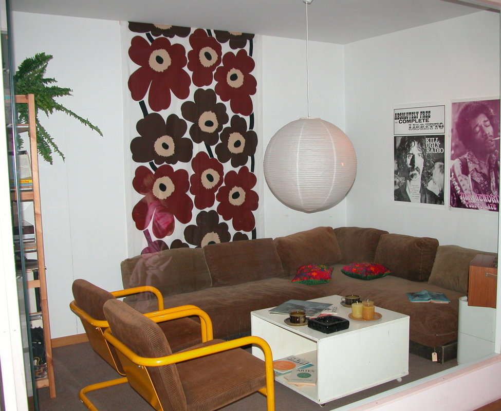
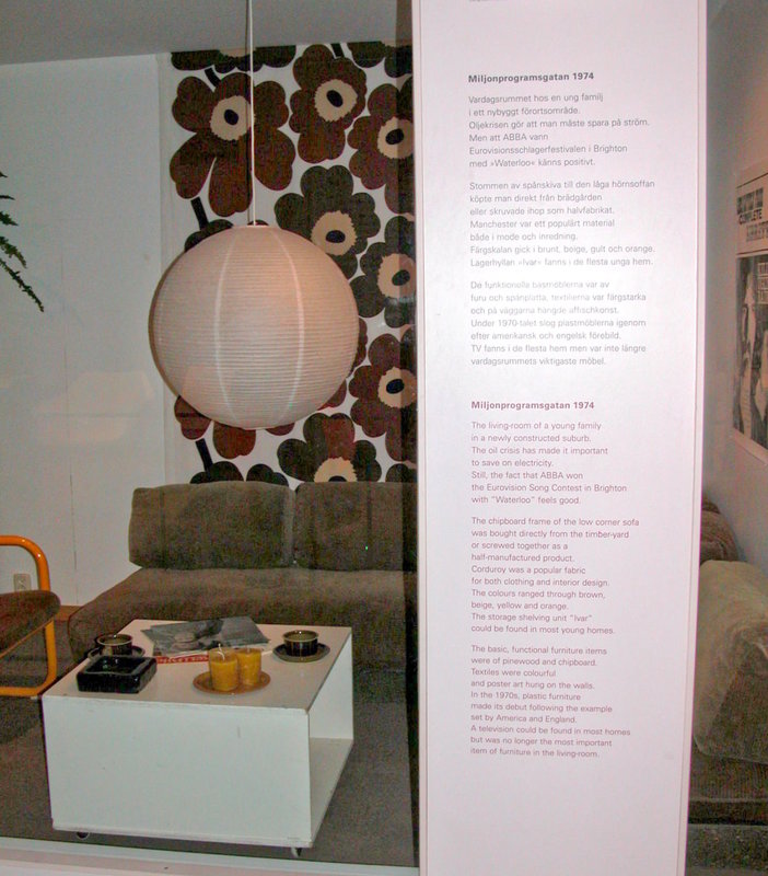
It all sounds pretty bleak and time consuming – doesn’t it? Rest assured, in the larger scheme of things, the time that you spend decorating will pale in comparison to the time that your decorating results will last and the enjoyment that you will receive from them. So, all is not lost. To inspire you to reach for a beautiful coherent design for your home, here are some photos of period rooms from museums we have visited during our travels. They illustrate how some elements of design are timeless, no matter the era or style. First, two photos I took at the Nordic Museum in Stockholm, Sweden…land of Ikea and mid-century modern. The photos show a 1974 living room in Sweden. (Gee, some of these design elements are still pretty popular.) The second photo has a caption detailing the design elements for this 1970’s interior (thankfully in English on the bottom).
Next, some Art Deco rooms at the Musee D’Orsay in Paris France:
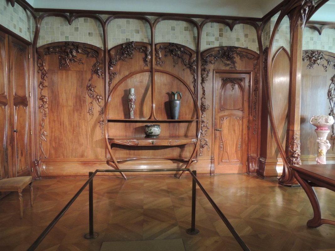
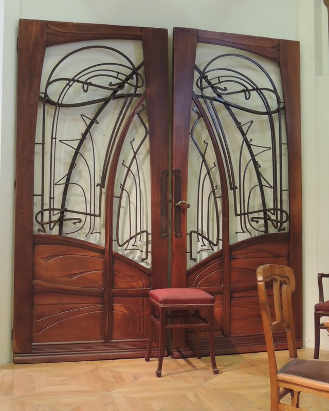
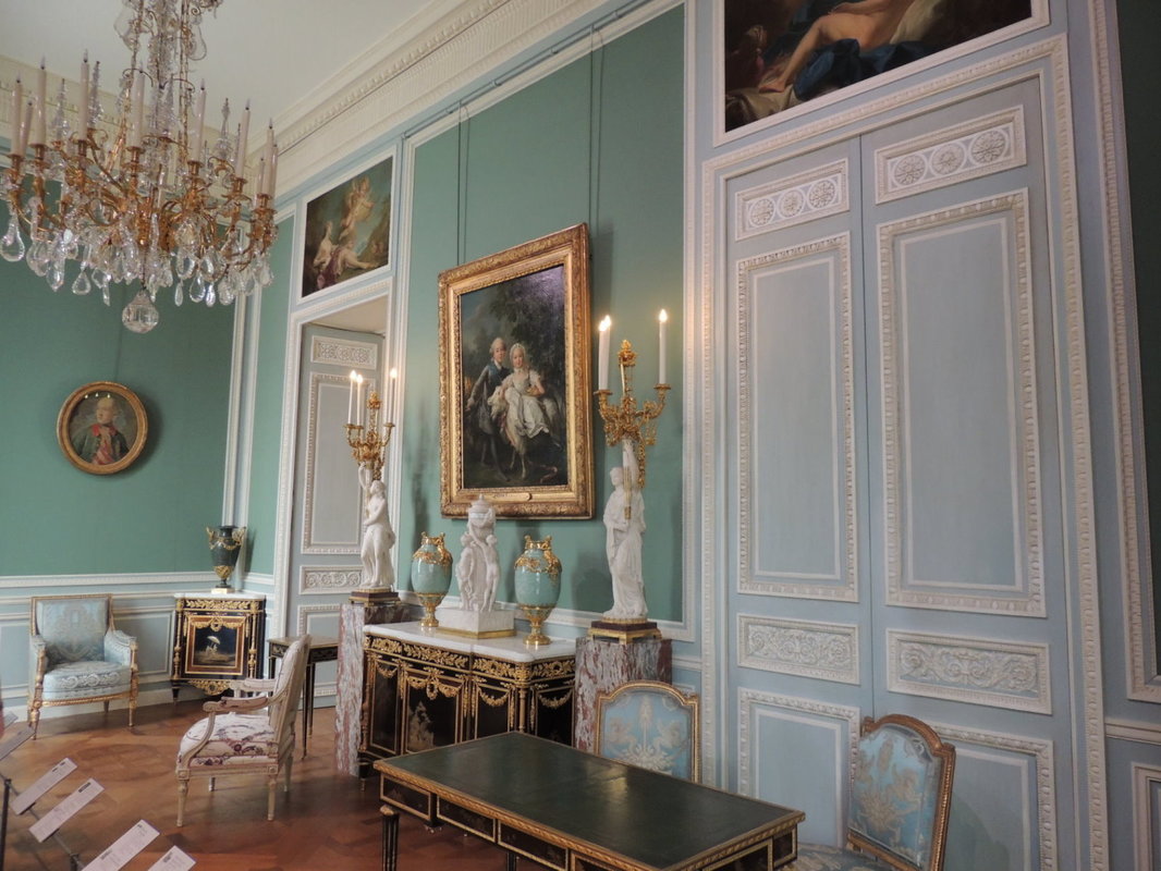
And some period French interiors (from the Louis XVI period) at the Louvre in Paris, France:
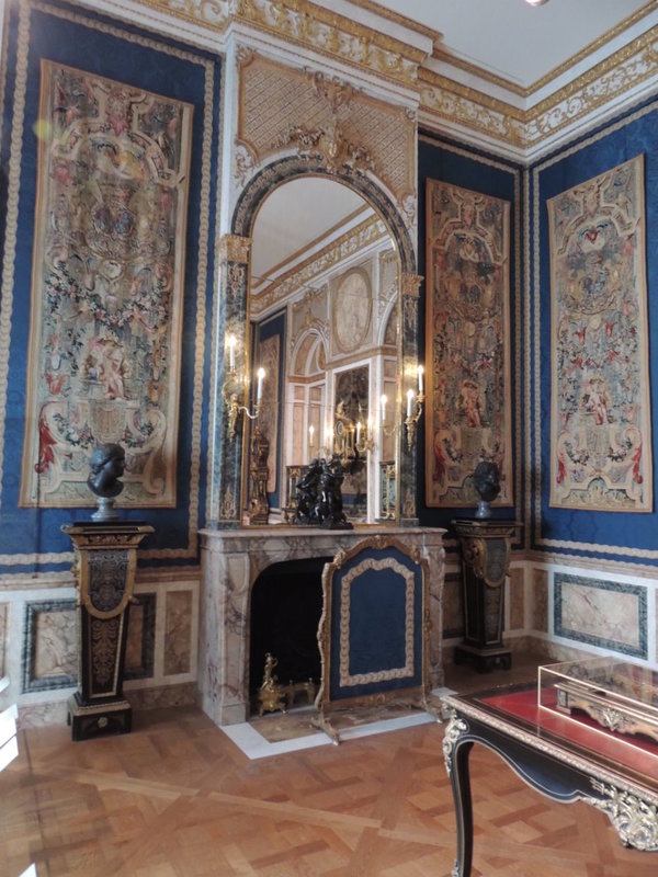
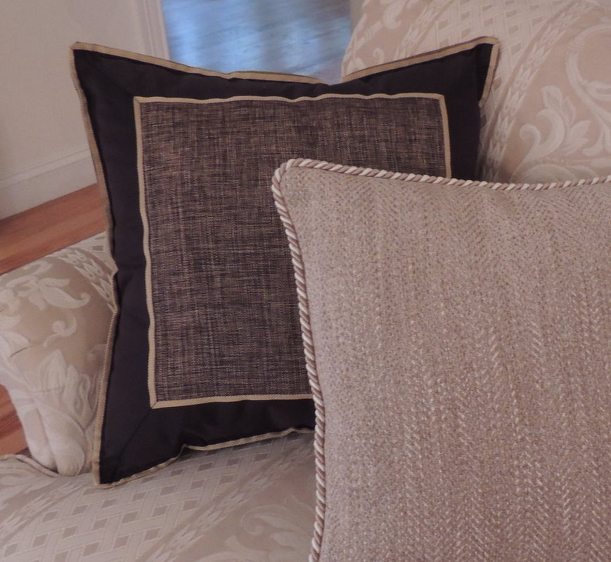
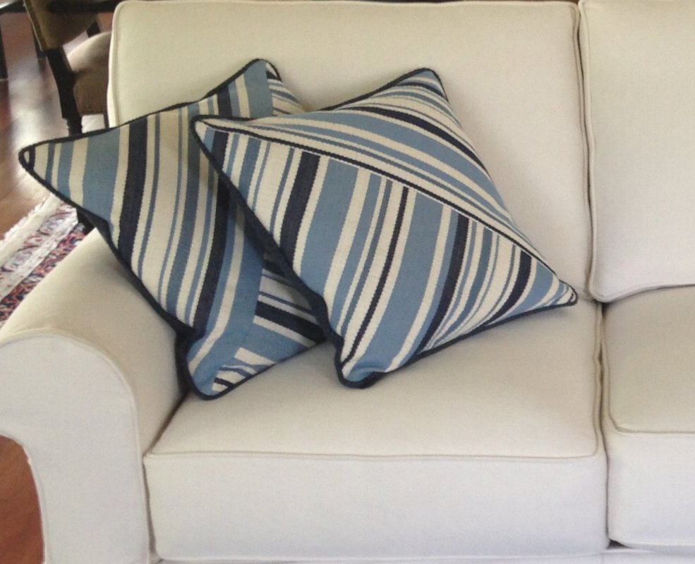
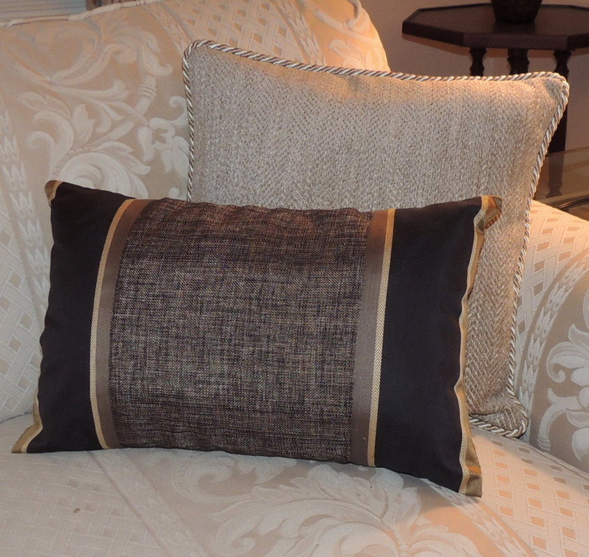
And finally, a dining room from the summer palace of Catherine the Great outside Saint Petersburg, Russia. 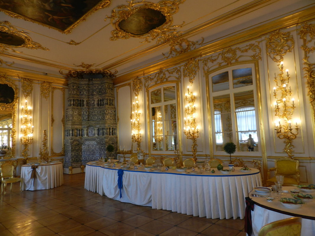 We’ve completed our quick review of the 9 telltale signs that it’s time for you think about calling an Interior Designer and put your decorating project onto the front burner (with a little inspiration thrown in to keep you motivated). So let me ask you, isn’t it time for you to get that decorating project that’s been on your list for a while done and get it done right? If you are struggling with any of these issues, give me a call. I can help!  Today let’s discuss using the often overlooked stripe fabric for upholstered pieces. Why don’t stripes get more attention in the fabric selection process? Well, one reason is that it is exceedingly hard for most people to envision a stripe on a piece of furniture when just looking at the swatch or a bolt of fabric. All that verticality...you start to get a bit wonky thinking the stripe will dominate and close in…jail cell mental image perhaps? But in smaller furniture pieces, like ottomans, stools, occasional chairs (not skirted), and pillows (especially!), stripes really add zip and tailored crispness. Especially paired with a bold wallpaper, like in this Thibaut photo I just received in my email. These striped stools really finish this beautiful entry space! 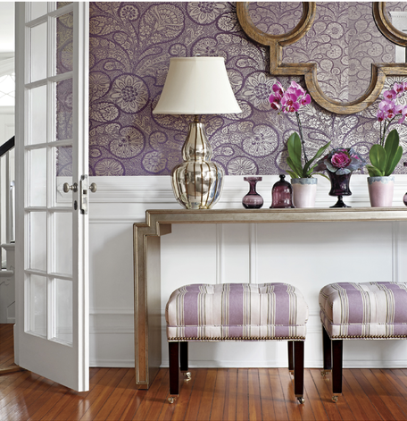 As another example, below is a fresh and inviting family room sporting several stripes, created by designer Garrison Hullinger in Portland, Oregon. 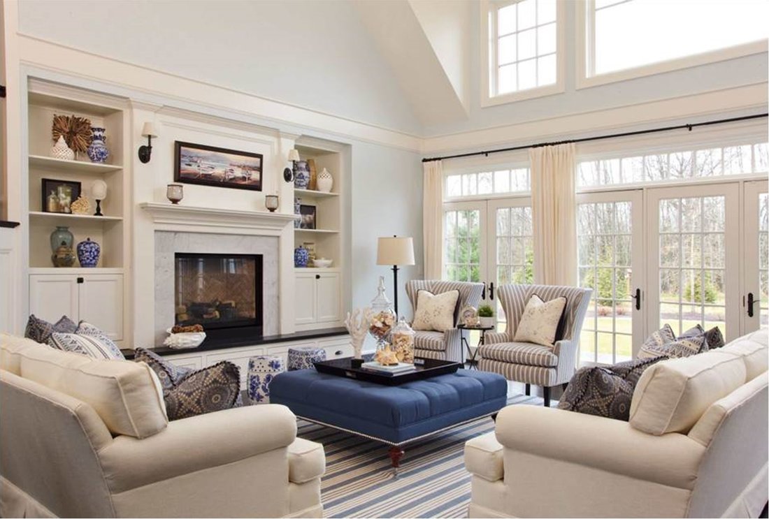 Stripes in a coastal décor is a classic look, but note how pretty and interesting the slender stripe looks on the wing chair…I love the way your eye goes to the mitered effect on the curve of the back of the chair (which has to be perfectly matched, naturally). The rug is a subtle and interesting stripe, with a different scale than the chair. This is such a calming interior that really could be anywhere, mountain cabin, coastal, suburban family room. For more inspiring interiors and stripes, here is a link to Garrison Hullinger’s Houzz site: https://www.houzz.com/pro/ghid/garrison-hullinger-interior-design-inc Below is a fan-back chair from Chairish (https://www.chairish.com/) that demonstrates a very effective way of finding the exact two colors for a striped fabric in the exact dimension you seek…make it with two different fabrics. By the way, Chairish is a cool site that pairs sellers and buyers of vintage furniture and décor. This center-stripe technique is perfect for updating a cherished family chair to harmonize with a casual or transitional décor. I would caution you, though, about making the center stripe too narrow, less than 6”. I personally am not a fan of the look where at first glance, you think it’s an actual narrow ribbon running down the chair similar to at a museum that indicates “don’t you dare sit here!” Just saying…make the width of that center stripe scream “Yes, please do sit yourself down right here and stay awhile!” This chair from Chairish looks super inviting, like a big hug; and note that it is paired with a red and white Oriental carpet…nice! 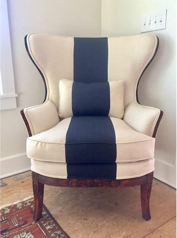 As a designer and fabricator, I love to use stripes in creative ways on pillows. This summer I fashioned lots of pillows from remnants, experimenting with stripes on the diagonal and mitered effects.
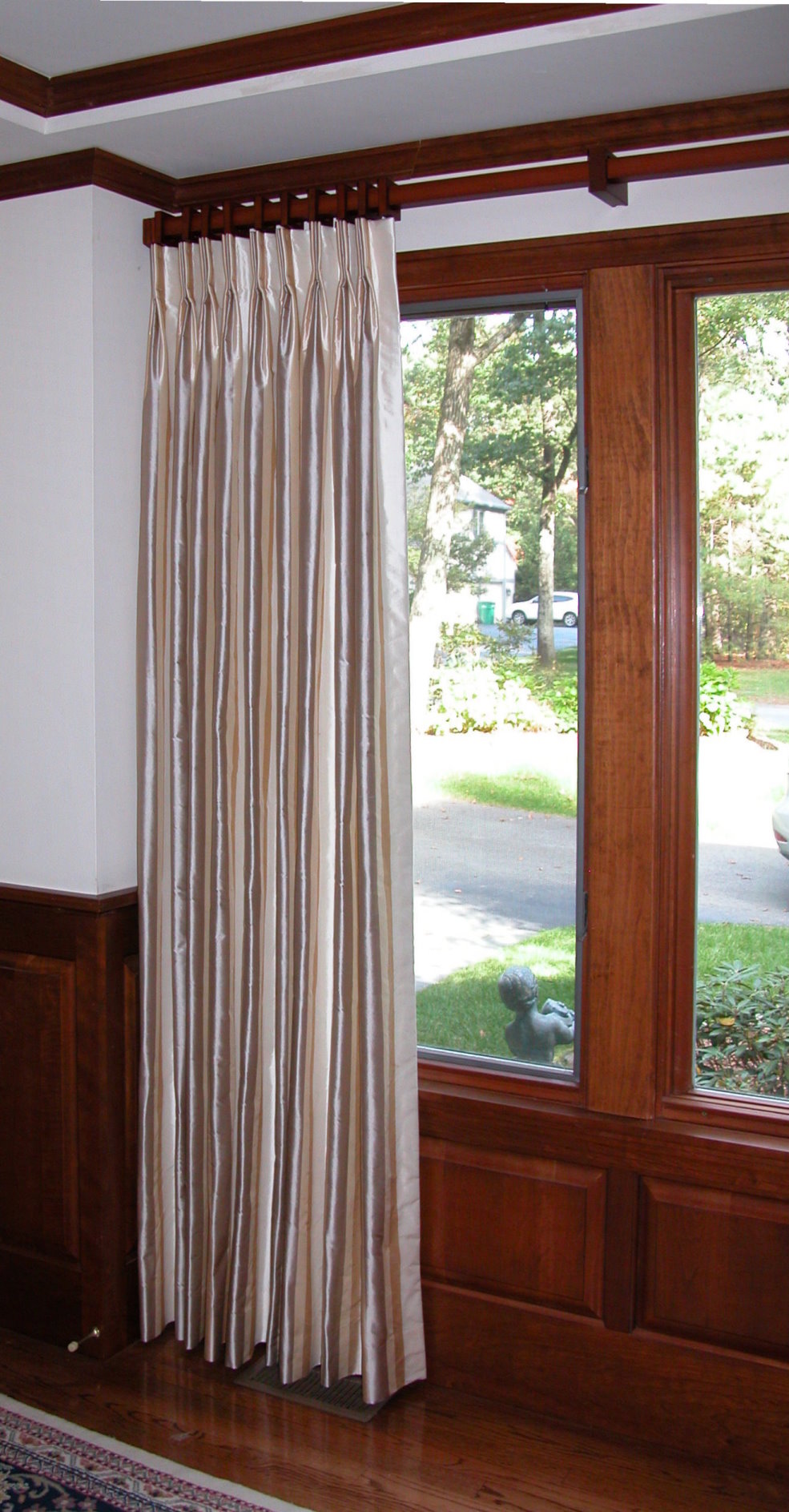
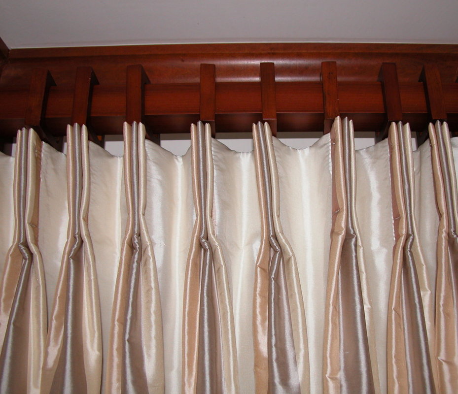
Stripes on window treatments are a natural…whether in children’s rooms, coastal settings, or more formal spaces. Below is a drapery panel treatment I did in a home office, with the subtle striped silk “pleated to pattern” (see Blog post “Pleating to Pattern”, 6/25/2017). Below that photo is a closeup of the pleat which I stitched down to further emphasize the stripe colors.
So, when you decorate your home I encourage you to consider using the “simple stripe” in your next décor project. Used creatively and thoughtfully, a simple stripe becomes sublime. (Note to my readers…I don’t actually think I have ever used the term sublime in a blog before…more coffee on this cold fall morning, please!) Happy day to you all as you prepare for Thanksgiving next week.  While we typically think of there being four seasons weather-wise and activity-wise, there are really only two grand seasons in Interior Design: Fall Market and Spring Market in High Point, North Carolina. The High Point Market is the largest home furnishings industry trade show in the world, meeting for a week in April and a week in October every year. What a feast for the eyes and inspiration for your decorating soul! At Market, manufacturers, artisans, and purveyors of the perfect bring their very latest designs and products to showcase to designers, retailers, and the world…fabrics, furniture, lighting, rugs, accessories, you name it, if it goes in a home, it’s all there. Well, maybe not sheetrock…that’s what the International Builder’s Show is all about. But you get the idea – the High Point Market is THE place to be to see what’s new in residential furnishings.  This fall’s High Point Market runs Oct 14th-18th 2017 and will involve over 2,000 exhibitors and over 75,000 attendees across 180 buildings. Sorry to say it’s “To the trade only”, but you (and me, since I’m staying in MA this time) can take a peek at the trends and new products via their website (http://www.highpointmarket.org/) and the many bloggers who write about the event. Here’s a press release that lists the lucky bloggers that were selected for the Design Bloggers Tour of Fall High Point Market: High Point, NC, September 6, 2017 – “The High Point Market Authority (HPMA), in partnership with Esteem Media, is pleased to announce the participants and sponsors for the Design Bloggers Tour for Fall Market, October 14 – 18, 2017. Returning for its fifth Market, the High Point Market Design Bloggers Tour program will bring ten (10) leading design bloggers to High Point Market for a 2-day tour of sponsoring showrooms. Participating bloggers will visit each sponsor for an up-close look at the exhibitors’ company, showroom and products during a 45-minute presentation and tour, after which they will then feature and discuss their inspiring finds on their individual blogs and social media accounts.” The bloggers for the Fall Market include:
I had the opportunity to meet Jana Platina Phipps, the “Trim Queen,” last year at an event at the Boston Design Center, and she is a wonderfully stylish designer and artisan who designs passementerie (trimmings such as tassels, borders, braids, gimp and fringes) and directs their manufacture in Europe. Can’t wait to read her blog from High Point Market, as she is sure to feature fabrics and trim as well as case goods.  So, how does Market affect the purchasing public? Well, you can be assured all your favorite high-style brands will roll out new products in Fall and Spring to introduce at High Point. My favorite art, mirror, and occasional table manufacturer, Uttermost, just introduced about 25% more products this week, all in preparation for High Point. Check them out…they are beautiful and well-crafted pieces, some trendy, some timeless. As and aside, I just love Uttermost mirrors and art, and when you need a really large piece, Uttermost is perfect. When I saw their products in person at the Las Vegas Market last year (another market held twice a year), I was struck at the large scale of their pieces. Love, love, love Uttermost. You can see more at: https://www.uttermost.com/default.aspx 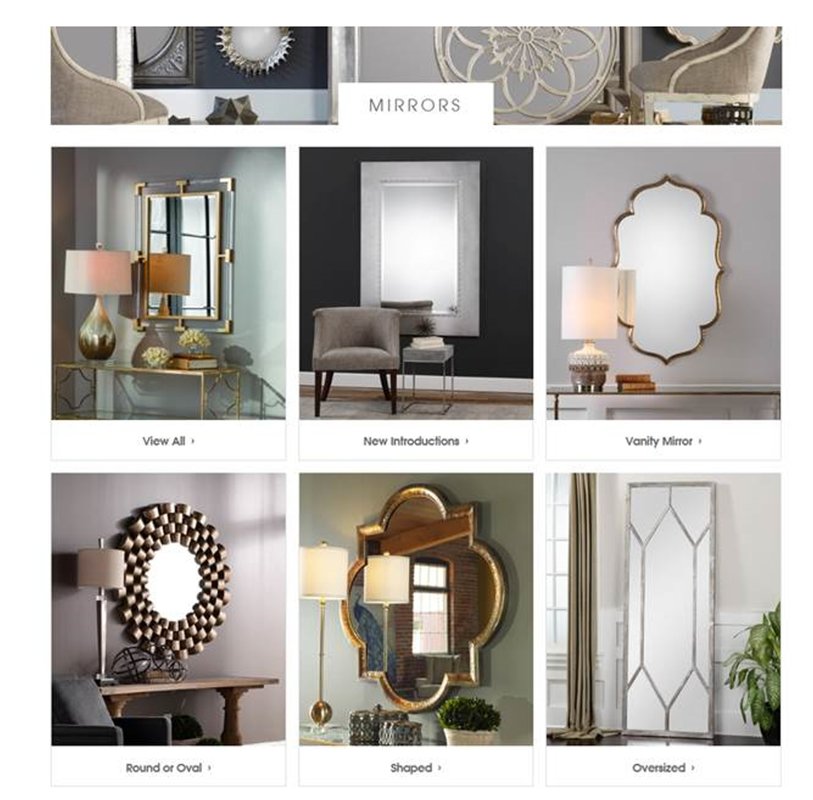 In fact, during the past two weeks I have been busy setting up a design center showroom for a luxury residence community in Needham, MA (I’ll talk more about that in a future post), and I have used Uttermost artwork and lamps as shown in the photo below. 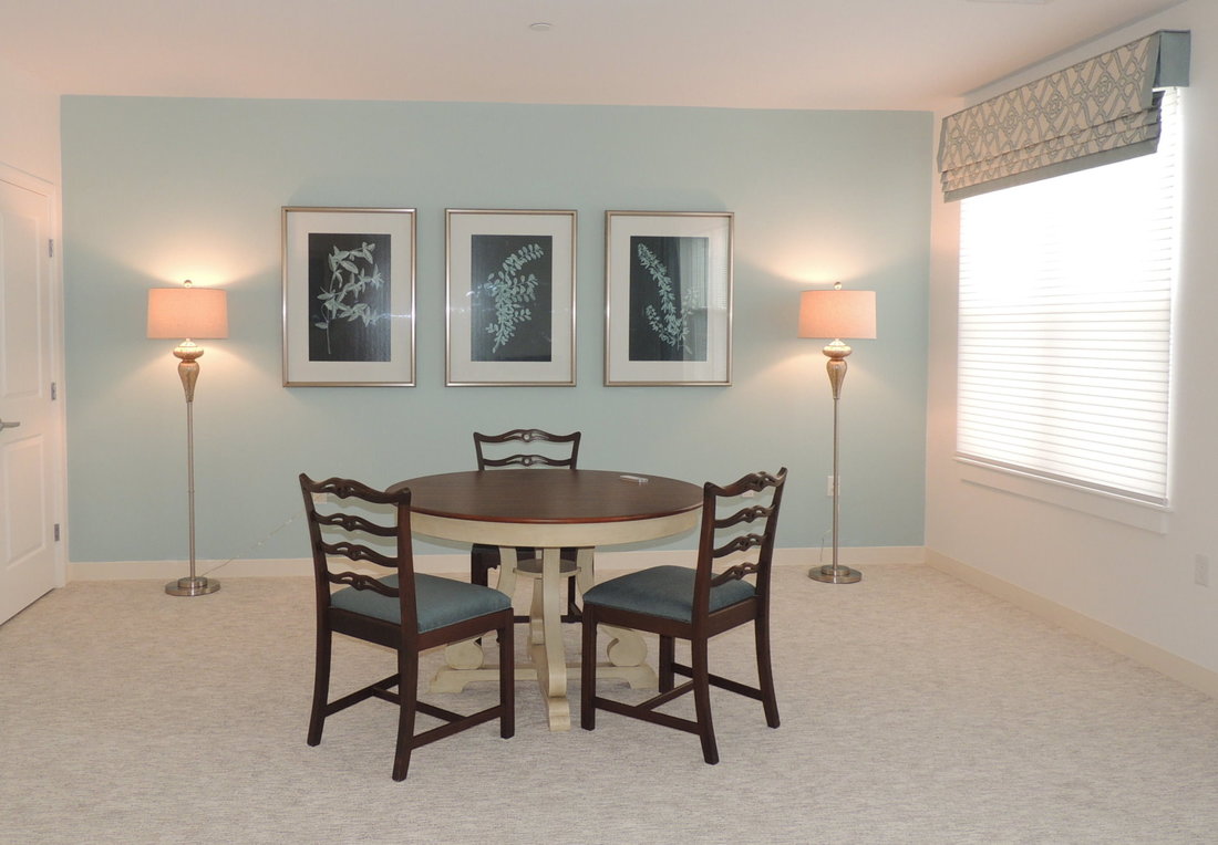 Hopefully you now know a little more about what your designer means when they say “I’m going to Market.” Or, very possibly they could mean the “Stop and Shop”, but I doubt it….. High Point Market with a capital M!  I’m a fairly plain spoken person, wishing to communicate and be understood by my clients on the first go-round, rather than using esoteric industry and design terms. But we all have our trade lingo, and I’m sure I’ve thrown out a few terms during client meetings that left my clients perplexed. Mutually understood reference terms are essential to effective communication so that the “message sent” equals the “message received.” If you are the client, and you don’t understand an interior design term that someone uses, it’s useful, and entirely appropriate, to ask, “Can you give me a specific example or visual of that style?” So what are all those interior designers, bloggers, and magazine article writers talking about? With the goal of more effective communication, here are some interior design definitions that get used all the time:
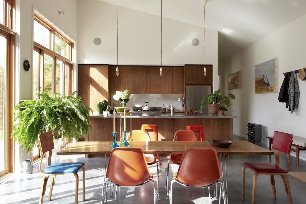
If you’re a client and you aren’t familiar with an interior design term someone uses when speaking with you don’t be afraid to ask for clarification. In today’s fast-paced world, who has time to get lines crossed? And remember – Photos speak volumes!  These days there are five very popular interior design styles in the interior design trade: Traditional, Arts and Crafts, Mid-Century Modern, Modern and Transitional. So that you know what each of them looks like I thought that I would give you a brief overview of the defining characteristic of each design style.
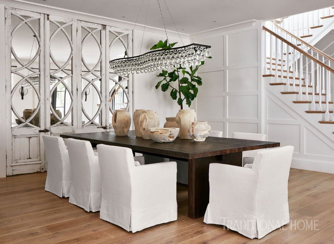
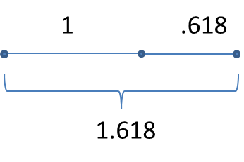
to add dimension; a blend of shiny and matte finishes help layer a room; and leather, burlap, chenille and rattan add further interest. Transitional interior design blends masculine and feminine elements to create a comfortable space for everyone. Accessories are kept to a minimum and aren’t too fussy. Wood is used to balance softer carpets and drapes. The overall feeling of the room is comfortable. (Dwell Candy). This dining room from Lisa Peterson and Melanie Hayes in Traditional Home shows the traditional architecture in the mirrored wall cabinets, paired with the modern chandelier and industrial-like table base, all done in neutrals. I hope this post helps you interpret the nuances of today's most popular interior design styles. If it does - great!! If not - please don't hesitate to send me your questions.  A designer friend of mine recently asked if I had any reference material to help her determine the proper proportion and scale for pillows on a sectional sofa for a client. “Well, yes,” I replied, “I did an article for a window coverings trade magazine a little while ago that addressed proportion and scale, and what a “pleasing proportion” is all about.” For definition purposes, scale is the size of something in relation or comparison to other things, and proportion is the relationship of the part or parts of something to the whole). So, here’s a little tidbit from that article to give you a small taste of proportion. Spoiler alert…there is math up ahead…but it’s algebra, and you can handle it… It all started with those genius Greeks Way back when the Greeks were building their masterpieces of sculpture and architecture like the Parthenon, they developed some “pleasing proportions” and a concept called the “Golden Section” or “Golden Mean.” From a geometric model, they developed a progression of numbers ― 1, 2, 3, 5, 8, 13, 21, 34 ― in which the two preceding numbers added to each other develop the next number in the progression. Thus, 1+2 makes 3, 2+3 makes 5, and so on. And this sequence forms the basis of proportions we’re all familiar with (think photo processing: 3x5, 5x8, 8x13, 13x21, etc.). They further developed the Golden Rectangle, also known as the Golden Mean, Golden Ratio and Divine Proportion. It’s a ratio or proportion defined by the number Phi (=1.618). Now that we know about Phi, our magic number, how do designers apply this to concept? Well, phi is everywhere--science, nature, human form, architecture, art, and everything beautiful, including your interiors! In the photo from Antiquefireplace.net, we see the graphic depiction of the golden mean ratio (looks like a nautilus) overlaid on a classic door opening. Such beautiful architecture, love that classic look and the floors. When we’re not designing the Parthenon, we can use the proportion of .618 when we are determining where to place something, and symmetric, right smack dab at the center, isn’t right. Think chair rail height. Think size of rectangular pillows. Think architecture of doorways and windows. Think placing your drapery pole either .618 of the space down from the ceiling, or up from the window (never exactly in between!) The Golden Mean applies to anything, vertically or horizontally…a 3x5-foot table or art piece is in a pleasing proportion, as are multiples of these dimensions (a room 12x20 feet or 15x25 feet). 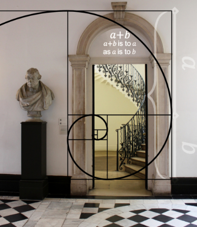 The Golden Standard The Golden Mean/Golden Ratio/Divine Proportion can be derived with a number of geometric constructions, each of which divides a line segment at the unique point where:
Phi = (a + b) / a = a / b = 1.618 If you take a line as 1, then a =.618, and b = .382 This division of a line at 0.618 makes a pleasing proportion versus an exact division of the line. Now, going back to our pleasing proportions of 3/5, 5/8, 8/13, etc, you will see these ratios are always very close to the Golden Mean of 0.618. Summing Up Thanks for getting through my Math rant. Can you tell I was a Math major for my undergraduate degree and geometry was pretty important in my mental marriage of math and design? All you need to remember is .618. Trust me.  |

Barbara PhillipsBarbara Phillips, interior designer and owner of Center Stage Interior Designs, has delivered impeccable window treatments and design services to both residential and commercial clients in Massachusetts since 2001. Categories
All
Archives
March 2021
|


 RSS Feed